
Bootstrap 3 Tutorial - An Ultimate Guide for Beginners. Bootstrap is the most popular and powerful front-end (HTML, CSS, and JavaScript) framework for faster and easier responsive web development.
Bootstrap is a powerful front-end framework for faster and easier web development. It includes HTML and CSS based design templates for creating common user interface components like forms, buttons, navigations, dropdowns, alerts, modals, tabs, accordions, carousels, tooltips, and so on. Bootstrap gives you ability to create flexible and responsive web layouts with much less efforts.
Bootstrap was originally created by a designer and a developer at Twitter in mid-2010. Before being an open-sourced framework, Bootstrap was known as Twitter Blueprint. You can save a lot of time and effort with Bootstrap. Tip: Our Bootstrap tutorials will help you to learn the basic as well as advanced features of the Bootstrap step-by-step through easy-to-understand explanation of every topic. What You Can Do with Bootstrap You can easily create responsive websites. Target a specific device. JQuery Image Zoom In Zoom Out Effect Script. Two Column Portfolio - Free Bootstrap Template. License & Author Details: Apache 2.0 by Start Bootstrap Theme Comments: Please enable JavaScript to view the <a href=" powered by Disqus.

</a> Theme Description: 2 Col Portfolio is a basic, unstyled portfolio grid template with a responsive, two column layout. Theme Features: Two column portfolio layout Item headings and description areas Placeholder images by Placehold.it Similar Themes & Templates: Tags: Please visit our resources page for design ideas and our help page if you need assistance with this theme. Special Hosting Offer: Need hosting for your new website? Has plans starting at $3.95/month! See Hosting Plans! Tabs. This example illustrates how the responsive tabs works.
It uses the standard Bootstrap 3.0.0 responsive CSS and HTML, so it also adapts to your viewport and device. To see the difference just resize the width of your window. Steps Include bootstrap css and js. Include responsive-tabs.js. Example Markup Note: The only difference from the standard bootstrap tab markup to the responsive markup is the addition of the responsive, and calling the fakewaffle.responsiveTabs(); function. <ul class="nav nav-tabs responsive" id="myTab"><li class="active"><a href="#home">Home</a></li><li><a href="#profile">Profile</a></li><li><a href="#messages">Messages</a></li></ul><div class="tab-content responsive"><div class="tab-pane active" id="home">...content...
Uses standard bootstrap tab markup Accordion is created with jquery Tabs and Accordion are the fully accessible via keyboard Supports multiple tabs on a page, with or without being responsive Source code You may download the source code from github. Edit fiddle. André Abt » How to use the Bootstrap 3 grid system with column margins. Bootstrap’s new grid system is quite cool, but the documentation leaves some questions un-answered.
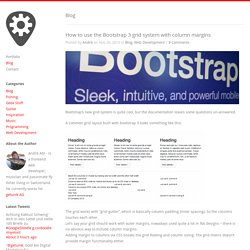
A common grid layout built with bootstrap 3 looks something like this: The grid works with “grid-gutter”, which is basically column padding (inner spacing). So the columns touches each other. Let’s say your grid should work with outer margins, nowadays used quite a lot in flat designs – there is no obvious way to include column margins. Adding margin to columns via CSS breaks the grid floating and column sizing. So a nice way to do this is to first add a additional container class for in including your custom styles.
Viewing snippet No more tables (responsive table) Deform Bootstrap Demo Site. Edit fiddle. jQuery Tutorial – A jQuery guide for beginners with examples. What is jQuery jQuery is a JavaScript based library that makes using the JavaScript much easier for your web based applications.
The JQuery is fast, much easy to use, small in size – around 32Kb, and contains a lot of features. You have to write lots of JavaScript code to accomplish tasks that jQuery enables you to write with much less code. Its aim is to write less do more. The jQuery is cross platform compatible, i.e. supported by many popular browsers like Chrome, Firefox, IE, Safari and others. jQuery makes things quite simple like HTML document transversal and manipulation, handling events (like clicking on links, mouse up, mouse down etc.), animations for your applications (like slider, loader) and Asynchronous JavaScript and XML (AJAX) operations with an easy to use API.
You can do many things like cool jQuery sliders, slideshows, menus, fade-in/fade-out effects, beautiful dropdowns… just a few examples that can be done with jQuery. Perquisites to work with jQuery. Viewing snippet Minimal Preview Thumbnails.