
AuthaGraph Map, The World's Most Accurate Map, Wins Prestigious Design Award. Authagraph You probably don’t realize it, but virtually every world map you’ve ever seen is wrong.
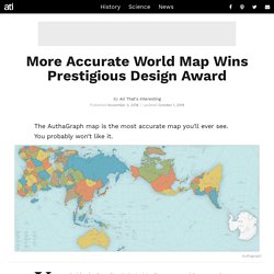
And while the new AuthaGraph World Map may look strange, it is in fact the most accurate map you’ve ever seen. The world maps we’re all used to operate off of the Mercator projection, a cartographic technique developed by Flemish geographer Gerardus Mercator in 1569. This imperfect technique gave us a map that was “right side up,” orderly, and useful for ship navigation (because it kept longitudes consistent and the angle from any point to the North Pole constant) — but also one that distorted both the size of many landmasses and the distances between them. To correct these distortions, Tokyo-based architect and artist Hajime Narukawa created the AuthaGraph map over the course of several years using a complex process that essentially amounts to taking the globe (more accurate than any Mercator map) and flattening it out: Cartographies interactives - Cartoviz. Franceculture.
Inventée par les Grecs à l'Antiquité, la cartographie a subi au fil du temps nombre d'évolutions : passant d'une approche scientifique à une conception religieuse, pour finir par être définie comme une science quasi-exacte. Au delà du progrès technique et scientifique qu'elle incarne, la cartographie est aussi et surtout un outil de domination politique et militaire essentiel aux jeux de pouvoir plus que d'actualité aujourd'hui. A lire : Comment Google dessine sa carte du monde La connaissance dans ce domaine s'est particulièrement illustrée au fil de quatre siècles, du globe de Benhaim, en 1492, à celui de Kiepert, en 1879, comme le montre cette vidéo réalisée par la BnF :
The true size. Amis et ennemis au Moyen-Orient: une incroyable visualisation du Guardian vous explique tout. Pas facile d'y voir clair au Moyen-Orient.
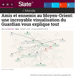
A moins d'être un spécialiste de la région, il est complexe de saisir les relations entre les Etats, les différentes organisations et groupes djihadistes, ainsi que les affiliations liées à la confession religieuse, chiite ou sunnite. The Guardian, asssocié à l'excellent David McCandless, auteur du site Information is beautiful et de nombreuses infographies, tentent de mieux nous faire comprendre, à l'aide d'une très dense visualisation.
A première vue, l'ensemble paraît aussi embrouillé que notre esprit: un univers réticulaire où toute entité semble interconnectée. Global Maps. Google Maps. Cartes : pourquoi Google biaise notre vision du monde. MONSTRE.
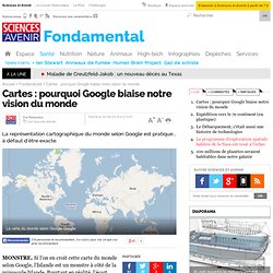
Si l'on en croit cette carte du monde selon Google, l'Islande est un monstre à côté de la minuscule Irlande. Pourtant en réalité, l'écart entre les deux pays n'est pas si énorme que cela : 103.000 km2 pour le premier contre un peu plus de 70.000 pour le second. Amusez vous maintenant à taper "Groenland" dans Google maps. Vous obtiendrez alors quelque chose comme ceci : BIAIS. Ce biais visuel est dû à la difficulté à reproduire la surface d'une sphère sur une carte en deux dimensions. Toutes les explications sont sur le blog "Statistiquement Vôtre" d'Avner Bar-Hen, mathématicien à l'université Paris Descartes.
25 Fascinating Charts Of Negotiation Styles Around The World. Language is only the most obvious part of the global communication gap.

Different cultures also have distinct approaches to communication during meetings, as described by British linguist Richard D. Lewis, whose best-selling book, “When Cultures Collide,” charts these as well as leadership styles and cultural identities. Lewis, who speaks ten languages, acknowledges the danger of cultural comparisons in his book: “Determining national characteristics is treading a minefield of inaccurate assessment and surprising exception.
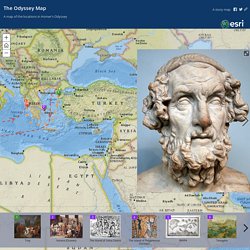
There is, however, such a thing as a national norm.” In support of cross-cultural studies, he writes: “By focusing on the cultural roots of national behaviour, both in society and business, we can foresee and calculate with a surprising degree of accuracy how others will react to our plans for them, and we can make certain assumptions as to how they will approach us. Canadians tend to be more low-key and inclined to seek harmony, though they are similarly direct. Cartomanie. Odysseus' Journey. Edit × A story map.
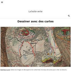
Natural Earth. Philippe Rekacewicz : la cartographie entre art, politique et manipulation. Dessiner avec des cartes. Matthew Cusick réalise ces images en découpant et en collant des morceaux de cartes pour créer ces dessins.
How to Use Maps in Data Visualization. Maps are probably the biggest subsection of visualization types.
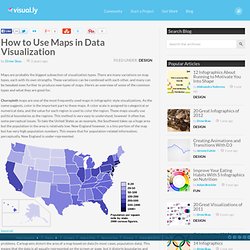
There are many variations on map types, each with its own strengths. These variations can be combined with each other, and many can be tweaked even further to produce new types of maps. Here’s an overview of some of the common types and what they are good for.Choropleth maps are one of the most frequently used maps in infographic style visualizations. As the name suggests, color is the important part to these maps. A color scale is assigned to categorical or numerical data, and the value for each region is used to color the region. (source) Cartograms alleviate the area issues involved with choropleth maps, but they have their own problems. (source) Proportional Symbol maps are another method used to alleviate the region area issues in choropleth maps. Via Some people have combined proportional symbol maps with cartograms to produce a hybrid. (source) Pinpoint maps show the exact location of things. (source) Map Porn, for interesting maps.
Géoportail - Le portail des territoires et des citoyens.
Cartes bizzares et amazing. Cartes anciennes. Plans de métro. Cartes temps réel. Cartes diverses / à classer. Données géographiques. Cartes animées/vidéo. Logiciels et applis carto. Sites ressources carto. Cartotrees. Dataviz. Mind mapping. Visualisation.