

Browse by Category. Cardigan Empire: Phoenix Fashion Stylist: Color Analysis: Cool and Delicate. Grace Kelly Somewhere in the middle of the chart, but slightly to the chilled left, is the delicate blend of cool and delicate.
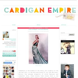
Without the extreme disparity of vivid features and alabaster skin, these mildly hued sirens have a low contrast between their softly rosed lips, ashy hued hair, and mildly-toned skin. Their eyes have the texture of crackled glass, glinting and catching the colors of the sun. And while they may have some warm features, the overall effect is still dominantly cool. These lambs look best in pastel or sun-drenched colors, anything too intense will overwhelm their subtle color harmony. 1 hundred 98 cents = your own Color Type fashion look book cheat sheetProcure your own empire constitution. Cardigan Empire: Phoenix Fashion Stylist: Color Analysis: 3 Degrees of Warm & Fresh. Color Analysis: 3 Degrees of Warm & Fresh Posted by Reachel Bagley, Fashion Consultant Warm and Fresh can be further broken down into three varieties: Warm Spring (flowing into Warm & Rich), Light Spring (sharing pale similarities with Cool & Delicate), and Clear Spring (tilting into Cool & Brilliant).
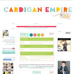
Procure your own empire constitution. How to Wear Floral Patterns in Subtle Ways - YLF. I’ve found that floral patterns evoke a myriad of emotions with my clientele.
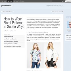
Some wear them frequently as the focal point of an outfit. Others won’t wear them at all because they’re too twee, precious or frivolous. Some will wear them casually over the weekend, but not to work. And many will wear a very specific floral pattern in a more subtle way. It’s the subtle ways that I’m going to run through here because they might tickle your fancy for Spring and Summer dressing. 1. The floral top on the left is layered under a topper on the right, so that a small portion of the pattern peeks through the open moto jacket in the front of the outfit. 2. If you don’t like to wear floral patterns close to your face, sport them on shoes. 3. The concept is similar to floral footwear. Blue Striped Floral. Statement necklace for that bit of glam?
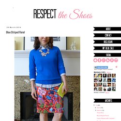
Check. Colorful skirt? Check. Layered shirt under sweater? How To Dress Thinner, The French Woman's Way: Part Deux - How To Be Chic And Elegant. Personal Seasonal Color Analysis. Creating a New Harmonious YOU.
Harmony equals order and balance. Have you ever worn clothing that was given to you as a gift and it fits well and you like the overall style and design but you just don’t feel good in it? When you study nature’s color qualities, you will see that there is an ordered relationship in the way the combinations of color are presented. The colors you see in a rainbow create a natural order and a basis for the relationships of color. Nature gives us seemingly endless harmonious color arrangements. 1) Harmonies based on similarity of qualities such as hue, value, or chroma. 2) Harmonies based on contrast of qualities such as complimentary pairs or light and dark values. 3) Harmonies that unite color qualities by using both similarity and contrast.
According to Kathryn Kalisz, (Munsell Color Expert and the author of, “Understanding Your Color”), “Beauty will always present itself as one unified whole.” Impressionism Claude Monet's, "Impression, Sunrise. " 1872 Autumn Pros. Why do some color schemes work, and others don’t? The one question that comes up the most about using color is “why do some color schemes work and others don’t?”
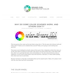
Maybe you’ve wondered that yourself? Today, we’re going to start tackling that question. The answer you’re looking for actually comes in three parts. One, it depends on where the colors are on the color wheel in relation to each other. This means you need to know what a color wheel looks like, what’s on it, and what the basic color relationships are. Because each part is a big topic, I’m breaking them up into separate posts. The Color Wheel The first thing you need to know is that color is made up of three parts: hue, value, and saturation. All three parts work together to create a color, but of the three, the one part that absolutely has to be present is hue.
That’s why color wheels use bright, fully saturated, undiluted hues. Most artist color wheels will have 12 basic hues on it – 3 primary colors, 3 secondary colors, and 6 tertiary colors. Makes sense, right? Suki Waterhouse Covers L'Officiel Singapore April 2014. Suki Waterhouse Covers L'Officiel Singapore April 2014.