
Data Visualization for Human Perception. Data, Information, Knowledge, Wisdom? Pretty pictures: Can images stop data overload? 16 April 2012Last updated at 19:01 ET By Fiona Graham Technology of business reporter, BBC News Brain scan: Research suggests that one way to avoid being overloaded by data is by presenting it visually rather than text or numbers Sitting at your desk in the middle of the day, yet another email notification pops up in the corner of the screen, covering the figures you're trying to digest in the complicated spreadsheet in front of you.
Your laptop is open on the desk next to you with another set of figures you need - meanwhile you're frantically tabbing through different documents on the main screen. What is Mind Mapping? (and How to Get Started Immediately) A mind map is a graphical way to represent ideas and concepts.
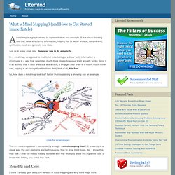
It is a visual thinking tool that helps structuring information, helping you to better analyze, comprehend, synthesize, recall and generate new ideas. Just as in every great idea, its power lies in its simplicity. In a mind map, as opposed to traditional note taking or a linear text, information is structured in a way that resembles much more closely how your brain actually works.
Since it is an activity that is both analytical and artistic, it engages your brain in a much, much richer way, helping in all its cognitive functions. How to Use Mind Maps to Unleash Your Brain's Creativity and Potential. Pearltrees. Make a Mind Map to Keep on Top of Everything in Your Life. Thinking Map. A Periodic Table of Visualization Methods. Interactive News Graphics. Datavisualization.ch Selected Tools. NodeXL Graph Gallery. Exploratree - Exploratree by FutureLab. The Anatomy Of An Infographic: 5 Steps To Create A Powerful Visual. Information is very powerful but for the most bit it is bland and unimaginative.

Infographics channel information in a visually pleasing, instantly understandable manner, making it not only powerful, but extremely beautiful. Infographics & Data Visualization. Visual Thinking. Vintage data visualization: 35 examples from before the Digital Era. This is a guest post by Tiago Veloso, the founder of Visual Loop, a collaborative digital environment for everything related to information design and data visualization.
He lives in Brazil, and you can connect with him online on Twitter and LinkedIn. If you follow us regularly on Visual Loop, you’ve probably noticed we like to featured not only modern interactive visualizations and infographics, but also examples from the past, from the time when there were no computer softwares to help analyzing and designing and no Internet to access and share data. 43 Intricate Mind Map Illustrations. For the uninitiated, a mind map is a graphical organization of ideas and concepts that can be used to facilitate the generation of ideas and the learning process.
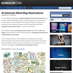
The reason why this has been argued to be more effective than the traditional method of learning (e.g. rote learning, linear text reading, etc) is because such structuring of ideas and concepts resembles the way our brain works – i.e. via links or associations. Mind mapping is done by connecting one idea to another with the aid of colors and images to tap both sides of our brains. 15 Stunning Examples of Data Visualization. Data Visualization is a method of presenting information in a graphical form.

Good data visualization should appear as if it is a work of art. This intrigues the viewer and draws them in so that they can further investigate the data and info that the graphic represents. An Atlas of Cyberspaces. This is an atlas of maps and graphic representations of the geographies of the new electronic territories of the Internet, the World-Wide Web and other emerging Cyberspaces.
These maps of Cyberspaces - cybermaps - help us visualise and comprehend the new digital landscapes beyond our computer screen, in the wires of the global communications networks and vast online information resources. The cybermaps, like maps of the real-world, help us navigate the new information landscapes, as well being objects of aesthetic interest. They have been created by 'cyber-explorers' of many different disciplines, and from all corners of the world. Some of the maps you will see in the Atlas of Cyberspaces will appear familiar, using the cartographic conventions of real-world maps, however, many of the maps are much more abstract representations of electronic spaces, using new metrics and grids. The atlas comprises separate pages, covering different types of cybermaps.
Marketing Technology Landscape Supergraphic (2012) UPDATE: A new 2014 Version of the Marketing Technology Landscape Supergraphic is now available.
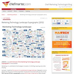
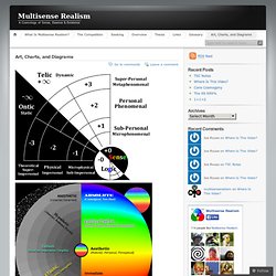
Marketing is in a whirlwind of technological innovation. It’s thrilling, inspiring, and a little dizzying. Last year, I made the first version of a marketing technology landscape infographic to try to glimpse the “big picture” of this broad field. I’m pleased to now share with you the all-new 2012 version of this supergraphic above (click to open a large version that’s actually readable). Art, Charts, and Diagrams. Eternity and Consciousness Mind-Matter Relation Western Cosmology Like this: Like Loading...
TextArc.org Home. Visual Design. We develop new ways to tell stories with data through visual representations.
We create aesthetic depictions for complex patterns and relationships that summarize visually the output of our information signatures. Research Topics and Products. DIY Chart Builder - Free online create and design charts and graphs. Infographics. Over 100 Incredible Infographic Tools and Resources (Categorized) This post is #6 in DailyTekk’s famous Top 100 series which explores the best startups, gadgets, apps, websites and services in a given category.
Total items listed: 112. Time to compile: 8+ hours. Follow @DailyTekk on Twitter to make sure you don’t miss a week! Update: Be sure to check out our latest post on infographics: Infographics Are Everywhere – Here’s How to Make Yours Go Viral. The top 20 data visualisation tools. Create and share visual ideas online. 46 Tools To Make Infographics In The Classroom. Infographics are interesting–a mash of (hopefully) easily-consumed visuals (so, symbols, shapes, and images) and added relevant character-based data (so, numbers, words, and brief sentences).
The learning application for them is clear, with many academic standards–including the Common Core standards–requiring teachers to use a variety of media forms, charts, and other data for both information reading as well as general fluency. Many Eyes. Data Visualization, Infographics, and Statistics. Information Is Beautiful. XMind: Professional & Powerful Mind Mapping Software. Glogster: make a poster online. It's free!
Tools. Nonsense. The Beauty Of Cinemagraph GIFs. Developed in 2011 by Jamie Beck and Kevin Burg, cinemagraphs are GIF images that combine still photography and video to produce a stunning effect. Typically, the entire GIF is motionless except for one or two elements, providing a brilliant juxtaposition between the motion and the motionless. MINDMAPPING. Mind Maps/Thinking Maps/Graphic Organizers. Mind Mapping. Mind Mapping. Collaboration is to Reduce Asymmetrical Information. Mind Mapping. 50 Animated Gifs for Every Situation Ever.
If a picture is worth a thousand words, then an animated gif must be worth some kind of number I can’t even begin to comprehend. If you’ve ever found yourself browsing the Internet and felt compelled to respond with a witty reply, only to come up: wow, mind. blown., golf clap, etc. Then these animated gifs are for you! With the simple copy and paste of one of the images below you can make your feelings resonate while bathing in the adulation of Internet pundits the world over. This is the Sifter’s seventh installment of the Awesome Animated Gif Series. If you’re a fan of animated gifs you may want to check out the other installments for more animated excellence. 1. 2.
Information aesthetics - Data Visualization & Information Design. A visual exploration on mapping complex networks. Chart Porn. Visual.ly. D3.js - Data-Driven Documents. Www.unity.net.au/padwheel/padwheelposterV3.pdf. Afbeelding+13.png (1513×949) How Animals See the World.
The human eye is pretty amazing, but there are some things it cannot do such as see ultraviolet light or detect images at a great distance. The visual capabilities on non-human creatures can help to open our eyes to the possibilities beyond our limited sight. This infographic, published by Mezzmer, looks at vision from some animal’s point of view. [Click here for full size version] Embed This Image On Your Site (copy code below):
Visual Thinking. Piktochart- Infographic & Presentation Tool. Five Best Mind Mapping Tools. Demos - JavaScript InfoVis Toolkit. JavaScript InfoVis Toolkit Create Interactive Data Visualizations for the Web Home ● Download ● Builder ● Donate Area, Bar and Pie Charts. 22 Mind-Blowing Infographics on Education. Build Your Career Master Plan with a Mind Map. Build Better Habits with a Mind Map. Be More Productive Using A Mind Map As a Task List.