
http://www.teachthought.com/technology/46-tools-to-make-infographics-in-the-classroom/
Related: e-learning • na temat infografik • PBLMy Favorite WSQ Please see the "revisited" version of this post, published in July of 2016, by clicking here.*Please read my WSQing page for more details, descriptions, and workflow* A "WSQ" (pronounced wisk) in my class is what we call "homework" in my flipped classroom. It stands for this: [read an update on the WSQ after using it for several weeks in my classroom here] W - Watch Students must watch the video for the assigned lesson and take notes in their SSS packets (this stands for "Student Success Sheets" and I have them for each unit/chapter) I have created for them.
New planetary dashboard shows increasing human impact - Stockholm Resilience Centre One success story"Of all the socio-economic trends only construction of new large dams seems to show any sign of the bending of the curves – or a slowing of the Great Acceleration," says co-author Lisa Deutsch, Senior Lecturer at the Centre. "Only one Earth System trend indicates a curve that may be the result of intentional human intervention – the success story of ozone depletion. The levelling off of marine fisheries capture since the 1980s is unfortunately not due to marine stewardship, but to overfishing," she continues.
17 Free Awesome Data Visualization Tools: Free Software 1. StatPlanet StatPlanet is an easy-to-use, interactive data visualization and mapping software. StatPlanet can be used to create maps, dashboards, charts, and graphs to bring your data to life. In addition to being browser-based, StatPlanet also offers the following downloads for use offline: StatPlanet Map Maker to create fully customizable interactive maps and graphs with the ability to publish them online, StatPlanet World Database to visually explore over 250 development indicators to aid in the understanding of the world, and the Graph Maker to create interactive graphs and charts. 2. Educational Technology and Mobile Learning: The 16 Types of Social Media Personalities- Which One Are You ? With the massive uptake of social networking sites, social media has become part and parcel of our digital life.Your daily dose of social media depends on how much time you have to spend on such virtual networks. It also depends on the purpose behind you joining them, if you are using them solely for personal and socializing goals then you might find yourself running the risk of addiction to these platforms. A distinct new breed of social media personalities has been born, according to an extensive new study by conversation experts "first direst". Which one are you?
Rosemary Hipkins Print Rosemary Hipkins presented this session at the CORE Breakfast seminar in Dunedin, March 29 2011. The session: sketched the overall shape of curriculum change in CIES schools described typical professional learning actions and decisions in these schools outlined the early benefits of curriculum change in response to the NZC signaled emergent challenges and possible future directions for ongoing change suggested resources that could help achieve next steps towards building a 21st century curriculum in New Zealand schools. The PowerPoint, used by Rose during her session, is available as a PDF download: Rose Hipkins breakfast PowerPoint (PDF, 6 MB)
Teacher to Teacher: Critical Thinking in the College Classroom This web site provides personal, practical, and published materials collected to help you cultivate critical thinking skills in your students, especially first-year students. How these materials are organized These materials are contained in 14 modules--ten focused on specific critical thinking skills, and four on specific teaching methods. Experimental Design for Advanced Science Projects Please ensure you have JavaScript enabled in your browser. If you leave JavaScript disabled, you will only access a portion of the content we are providing. <a href="/help/javascript">Here's how.</a> Sandra Slutz, PhD, Vice President of STEM Education, Science Buddies Kenneth L. Hess, Founder and President, Science Buddies
Chart and image gallery: 30+ free tools for data visualization and analysis November 7, 2013 03:21 PM ET The chart below originally accompanied our story 22 free tools for data visualization and analysis (April 20, 2011). We're updating it as we cover additional tools, including 8 cool tools for data analysis, visualization and presentation (March 27, 2012) and Six useful JavaScript libraries for maps, charts and other data visualizations (March 6, 2013). Click through to those articles for full tool reviews. Features: You can sort the chart by clicking on any column header once to sort in ascending order and a second time to sort by descending (browser JavaScript required). Skill levels are represented as numbers from easiest to most difficult to learn and use:
Great Infographic Making Tools for Teachers 1- Visual.ly This is my favorite tool. It helps you easily create awesome infographics using pre-designed templates. It also lets you create an infographic out of any Twitter Hashtag provided you are signed in which you can do using your Twitter account. 2-Easel.ly This is another great web tool to create infographics.
No Dentist Left Behind I got this email today at school, thought I'd share. No Dentist Left Behind My dentist is great! He sends me reminders so I don't forget Check-ups. He uses the latest techniques based on research. 30 Superb Examples of Infographic Maps As you search the web you’ll come across a wide range of interactive and graphical maps. Deciding when, where and how to integrate or display a map on your site is the first step, the second should be what technology and illustrations to use. If you’re all about interaction, JQuery, Ajax, or Flash are all effective technologies that hold their own ground. Map illustrations are a dime a dozen however, a strong and balanced display of graphics, information, and colors is what makes an infographic stand out and reach its target audience effectively. As designers, we’re constantly searching for ways to improve and style our designs, this is exactly what the following 30 infographics and sites display below; the breaking of rules. Sites with Interactive Maps
What is 5G? The Next-Gen Network Explained It’s been nearly a decade in the making, but 5G is finally becoming a reality. Carriers started rolling out fixed 5G to select cities a few years ago, and mobile 5G has already made appearances in cities around the country, with a much more comprehensive rollout expected over the next few years. Yet, it may seem as though there are more questions about 5G than there are answers. Some wonder where 5G is available, and if they’ll ever see it in their city; others are more interested in which 5G smartphone they should buy (here are a few ideas).
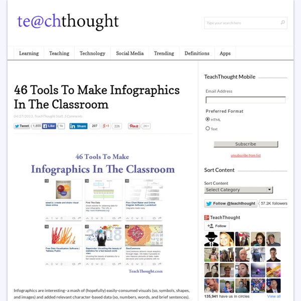
Top 50+ Tools for Creating Infographics Telling your story in visual form through the use of infographics has been one of the hottest trends in recent times. Given the tremendous information available online, people are now more interested to get information through colorful and interesting graphics, instead of words and numbers. Creating infographics, however, requires tremendous analytical and creative skills plus the ability to convert these data and information into interesting visuals. The good news is, there are available resources online that you can use to help you create infographics. In this post, we will list down all available resources and tools that you can use to simplify the process of creating infographics.