
This Is What Street Style Looks Like In Its Most Literal Form. Six Famous Thought Experiments, Animated in 60 Seconds Each. By Maria Popova From the fine folks at the Open University comes 60-Second Adventures in Thought, a fascinating and delightfully animated series exploring six famous thought experiments.
The Paradox of the Tortoise and Achilles comes from Ancient Greece and explores motion as an illusion: The Grandfather Paradox grapples with time travel: Chinese Room comes from the work of John Searle, originally published in 1980, and deals with artificial intelligence: Hilbert’s paradox of the Grand Hotel, proposed by German mathematician David Hilbert, tackles the gargantuan issue of infinity: How your face changes in different lighting.
Elements and Principles of Design-Color. Color is: A property of light Visible when light is emitted or reflected Determined by the wavelength of light Additive color is created from emitted light such as a video screen, a computer monitor or theatrical lights.
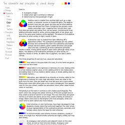
The additive primary colors are red, green and blue and all other additive colors are derived from them. Combining two primary colors yields a secondary color: magenta from red and blue, cyan from blue and green and yellow from red and green. Combining all three additive primaries results in white; shining stage lights of red, green and blue in the same area creates a white spotlight. 27 Incredibly Creative Print Ads You'll Love. With how often each of us are online or using our mobile phones, you would think that print advertising is an antiquated artwork that no one pays real attention to.
You’d be wrong, though. We found 27 of the most stunning or clever print ad campaigns out there. Visual Thinking Art. Nazihandicap. IENV1000/IENV7911 - Studio I - Contact Session Exercises. Visual Thinking Art. GUI Design by schematic visualization. Designing icons and visual symbols. William Horton William Horton Consulting, Inc. 838 Spruce Street Boulder, CO 80302 (303) 545-6964 william@horton.com With the proliferation of graphical user interfaces, the need for clearly designed icons has become critical.
Unfortunately, not all icons are clear and easy to understand. It is my belief that icon design should be more of a science and less of an art. Designing icons and visual symbols is for anyone-graphic artist, user-interface designer, human factors specialist, technical writer, product designer-who must design icons and visual symbols for use in computer displays, technical documents, and other media where a concept or idea must be communicated in a restricted area or to an international audience. Attendees will learn: Where and when to use icons, words, or both. Topics to be covered include: To help users work smarter To represent visual and spatial concepts To save space (See how much space these icons save?)
[Back to contents] Which is best? Reduce translation. » Search Results » logo. Today’s article is a subject I feel strongly about and part of the reason I started writing this blog.
That’s why when Sarah Cowley approached me about sharing her first hand experience with teaching others about design, I was so excited to allow her to share it with all of you. For more great articles by Sara be sure to check out her new blog: Hello deer! I Got Schooled by Teaching Being the Principal and sole designer for Sara Cowley Design has been a wonderful experience, albeit challenging at times. I can say whole-heartedly that I love running my teeny-tiny, home-based agency, but it can get lonely. 30 Clever Examples of Negative Space Logos. Those who read Bored Panda frequently already know how not to design a logo.
But instead of trying to avoid mistakes it’s much more productive to take a look at some of the best logo design examples. Remember Negative Space Art by Noma Bar and Tang Yau Hoong? The same negative space technique can be easily applied in logo design. Marketers say that a good logo should look good, be memorable and also communicate the idea of the business. By using negative space technique it is possible to kill two birds with one stone! Hidden message within your logo will not only “grab” viewer’s attention, but at the same time it’ll tell a lot about the company. 1. Designer: vasvari 2. Designer: Rajendra Prasad A 3. Designer: Mootto Studio 4. Designer: Abdallah Ahizoune 5. Designer: itsgareth 6.
Designer: reghardt 7. Designer: Matto 8. Designer: Jacob Cass 9. 10. Designer: Alexandre Nami 11. Designer: shtef sokolovich 12. Designer: jeriahblau 13. Designer: logotomy 14. Designer: Gert van Duinen 15. 16. 17. 18. 19. 30 Clever Examples of Negative Space Logos. What is a Logo? Definitions and discussion - it's not just a pretty picture! According to MIT Graphic Identity a logo is “Part of a graphic identity system, a logo is a symbol that embodies elements of an organization such as values, goals, mission, and culture.”
It usually consists of a striking typeface, shape, orientation and/or graphic image that is distinctive to that company. Unless your company manages to become the next Nike, you will most likely need to keep your business name in your logo. Rarely will someone see your logo out of context, so don’t worry about saying everything there is to say about your business in your logo.
That said, you do want the typeface and any graphic element, to appear stable and trustworthy. Perhaps you also want it to look modern, fun, or hip. Three Tips to Design The Best Logo. The logo of a company is one of the most important aspects, because that image will become the face of your business, which will be the main key to successful advertising and recognition.
The logo is so much more than simply an object consisting of shapes, colours, fonts and images. The logo reflects your business’ commercial brand which plays an extremely important role in whether you are met with success or failure. Graphic Design Lessons - A Short History of Logo Design. MILTON GLASER (b.1929) 'I Love New York', 1977 What is a Logo?
A logo is a sign, symbol, trademark or badge which conveys the identity or ownership of a product, company, campaign or concept in as memorable a way as possible. SOLAK KEDİ. The Gestalt Principles. The Gestalt Principles Gestalt is a psychology term which means "unified whole".
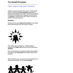
It refers to theories of visual perception developed by German psychologists in the 1920s. These theories attempt to describe how people tend to organize visual elements into groups or unified wholes when certain principles are applied. These principles are: Similarity. Technical Communications Primer: Gestalt Theory and Visual Design. When we design visual information, we have many tools at our disposal to increase the likelihood that our audience receives the message we want them to receive.
Gestalt theory helps us accomplish this by explaining key aspects of how we perceive images, and specifically how we identify the figure (the message part of the image) and separate it from the ground (the background or context on which the figure rests). Strictly speaking, it’s more correct to say that the figure is what emerges from the whole image, and that it is not truly separate from the ground.