
Data Illustrator: Create infographics and data visualizations without programming. Everything you ever wanted to know about Sparklines in Google Sheets. Sparklines are small, lightweight charts, typically without axes, which exist inside a single cell in your spreadsheets.
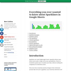
They’re a wonderful, quick way to visualize your data, without needing the complexity of a full-blown chart. They were first created by interface designer Peter Zelchenko around 1998. The term “sparkline” was coined by statistician and data visualization legend Edward Tufte. I’ve been building a lot of dashboards in Google Sheets recently, making heavy use of sparklines to show data trends. For example, here’s a column sparkline to show website users in the past 30 days: Facets - Visualizations for ML datasets. Better data leads to better models.
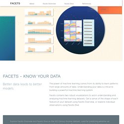
The power of machine learning comes from its ability to learn patterns from large amounts of data. Understanding your data is critical to building a powerful machine learning system. Facets contains two robust visualizations to aid in understanding and analyzing machine learning datasets. Get a sense of the shape of each feature of your dataset using Facets Overview, or explore individual observations using Facets Dive. Explore Facets Overview and Facets Dive on the UCI Census Income dataset, used for predicting whether an individual’s income exceeds $50K/yr based on their census data. Overview takes input feature data from any number of datasets, analyzes them feature by feature and visualizes the analysis. Overview gives users a quick understanding of the distribution of values across the features of their dataset(s).
Collection of data visualizations to get inspired and finding the right type. Emeeks/semiotic: A data visualization framework combining React & D3. Visualization Tools. Apache/incubator-superset: Apache Superset (incubating) is a modern, enterprise-ready business intelligence web application. Amazon QuickSight. Facets - Visualizations for ML datasets. Apache/incubator-superset: Apache Superset (incubating) is a modern, enterprise-ready business intelligence web application.
Dc.js - Dimensional Charting Javascript Library. Dc.js - Dimensional Charting Javascript Library dc.js is a javascript charting library with native crossfilter support, allowing highly efficient exploration on large multi-dimensional datasets (inspired by crossfilter's demo).
It leverages d3 to render charts in CSS-friendly SVG format. d3-annotation.susielu. Deck.gl. Dataviz.toolsdataviz.tools - a curated guide to the best tools, resources and technologies for data visualization. p5.js. Bl.ock Builder. Atlas. Juice Analytics. Dashboard software for fast insights. Home · alexandersimoes/d3plus Wiki. Lyra: An Interactive Visualization Design Environment. Introducing Ogma, the Javascript library for large-scale graph visualization and interaction - Linkurious - Understand the connections in your data.
Linkurious announces the release of Ogma, the Javascript library for large-scale graph visualization and interaction.
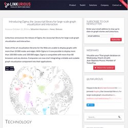
State of the art visualization libraries for the Web are unable to display graphs with more than 10 000 nodes and edges. With Ogma is it now possible to display more than 100 000 nodes and 100 000 edges. Ogma is compatible with more than 80 browsers and any devices. Companies can now start integrating a reliable and scalable graph visualization component into their applications. Technology Modular architecture Ogma makes it possible by leveraging the full performances of WebGL combined with a modular architecture. Dynamic graphs The library is designed for graphs with living data where nodes, edges, and their properties can change in real time due to user interactions or updates from data sources. Level-of-details A key challenge in visualizing large dynamic graphs is to display the less information possible on screen to avoid getting overwhelmed by the amount of data.
Roadmap. Data Wrangler. UPDATE: The Stanford/Berkeley Wrangler research project is complete, and the software is no longer actively supported.
Instead, we have started a commercial venture, Trifacta. For the most recent version of the tool, see the free Trifacta Wrangler. Why wrangle? Too much time is spent manipulating data just to get analysis and visualization tools to read it. iVisDesigner. iVisDesigner stands for Information Visualization Designer, which is a platform in which users can interactively create customized information visualization designs for a wide range of data structure. iVisDesigner was started around March 2013 as the undergraduate thesis project of Donghao Ren, its overall goal comes partially from the previous Visualization Assembly Line project, which allows users to freely create axis-based visualizations for multidimensional datasets, like scatterplots and parallel coordinates.
In iVisDesigner, we employed a new approach. By allowing users to interactively create mappings from data elements to graphical elements, we support interactive creation of information visualization designs. iVisDesigner is much more expressive, allowing a wide range of visualization designs for different data structures be accomplished without any programming. Welcome. DataBasic.io. Ly.js Open-Source Announcement. November 17, 2015 A growing number of graphing tools and libraries allow anyone to make beautiful, interactive web-based graphs.
By interactively visualizing our data online, we share complex ideas in an exploratory, visual, open, and collaborative way. Today, Plotly is announcing that we have open-sourced plotly.js, the core technology and JavaScript graphing library behind Plotly’s products (MIT license). It's all out there and free. Any developer can now integrate Plotly’s library into their own applications unencumbered.
We’re big fans of collaboration, freedom, and perpetual motion. Despite the possibilities that the web offers, the core plotting libraries in scientific software like MATLAB, R, and Python still create static image files rather than dynamic, interactive charts. Plotly.js was instigated by Dr. Tilegrams: More Human Maps. About a month ago, while plotting demographic data on a US county map, we became frustrated.
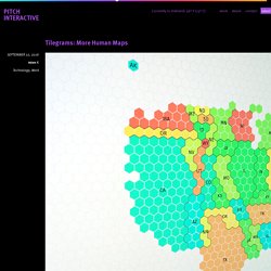
The data was about employment in the financial industry, and we expected to see Manhattan light up—but on our map, Manhattan was barely bigger than a freckle. Meanwhile, thinly populated rural counties (ahem, Lincoln County, Nevada) occupied vast swaths of screen space. Much of the West was visually over-represented, while urban areas were not represented enough. There’s an essential rural bias in geographic visualizations that we needed to overcome. Visdown - Markdown for Visualisation. Introducing Vega-Lite — HCI & Design at UW. Provide sensible defaults, but allow customization.
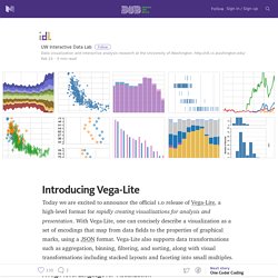
Vega-Lite’s compiler automatically chooses default properties of a visualization based on a set of carefully designed rules. However, one can specify additional properties to customize the visualization. For example, the stacked bar chart on the left has a custom color palette. Vega-Lite uses a concise syntax, enabling rapid creation of visualizations without unduly restricting subsequent customization.
Caravel: Airbnb’s data exploration platform — Airbnb Engineering & Data Science. At Airbnb, we love data, and we like to think that analytics belongs everywhere.
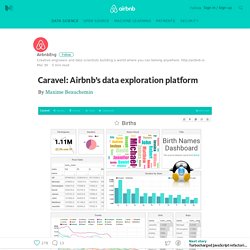
For us to be data-driven, we need data to be fluid, fast flowing, and crystal clear. As a vector for data exploration, discovery, and collaborative analytics, we have built and are now open sourcing, a data exploration and dashboarding platform named Caravel. Caravel allows data exploration through rich visualizations while performing fast and intuitive “slicing and dicing” against just about any dataset. Visualization Tools. Cheat Sheet: Data Visualization with R. Data Visualization & Reporting. One Chart, Twelve Charting Libraries · Lisa Charlotte Rost. 17 May 2016 Charting Libraries. Gosh, there are so many out there. On Wikipedia and other websites, one can find a comparison of ca. 50 libraries – and these are only JavaScript libraries; not mentioning languages like Processing and libraries for Python and R. In the following blog post, I will try to get to know a few ones out of the great sea of possibilities.
I want to understand their differences and how easy it is to learn them. I’m fairly new to most of these libraries. R – native R is the hippest statistical language around these days. One Chart, Twelve Tools · Lisa Charlotte Rost. 17 May 2016 Which tool or charting framework do you use to visualize data? Everybody I’ve met so far has personal preferences (“I got introduced to data vis with that tool!” , “My hero uses that tool and she makes the best charts!”).
Often we keep working with the first not-entirely-bad tool or language that we encountered. I think it can’t hurt to have a wider view of the options out there: To maybe discover better tools than the ones we use; but also to reassure us that the tools we use ARE really the best (so far). If they are important tools I missed, or if I missed some features in a tool or a better way to get to the bubble chart, or if I’m wrong about a thing or two, or if you completely disagree with my opinion about these tools (which, I’m sure, will happen): Let me know on Twitter or via email (lisacharlotterost@gmail.com)! Data visualization & presentation tool. Data visualization & presentation tool. Data Preparation: Self-Service Data Prep Tool from Talend. DataBasic.io. Awesome Data Viz - Curated List of Data Viz Frameworks, Libraries, Software. Cloud Datalab - Interactive Data Insights Tool Wrangler - Trifacta. Martin Grandjean » Digital humanities, Data visualization, Network analysis » GEPHI – Introduction to Network Analysis and Visualization.
Network Analysis and visualization appears to be an interesting tool to give the researcher the ability to see its data from a new angle. Because Gephi is an easy access and powerful network analysis tool, we propose a tutorial designed to allow everyone to make his first experiments on two complementary datasets. After a short introduction about the basis of SNA and some examples which shows the potential of this tool and gives some inspiration, this tutorial is divided into 2 main “exercices”: a geographical network of 1000 individuals sending letters all over Europe and a 2-mode network of 100 members of 10 different institutions. 1.1 A short introduction to Social Network Analysis A network is made of two components : a list of the actors composing the network, and a list of the relations (the interactions between actors).
As part of a mathematical object, actors will then be called vertices (nodes, in Gephi), and relations will be denoted as tiles (edges, in Gephi). 2.2 A few plugins. BETA): Build a diagram. <svg id="sankey_svg" height="600" width="600" xmlns=" version="1.1"><title>Your Diagram Title</title><! Copy the code above to embed your diagram. Save it in a “.svg” file to edit it in another application. Datavisualization.ch Selected Tools. Vega: A Visualization Grammar. iNZight for Data Analysis. The 38 best tools for data visualization. It's often said that data is the new world currency, and the web is the exchange bureau through which it's traded.
Vischeck: Home. Welcome. p5.js. Makinguse - carlo zapponi. Flik - Business Intelligence. Tableau - Business Intelligence and Analytics. Make charts and dashboards online.