
Responsive CSS Framework Comparison: Bootstrap, Foundation, Skeleton. Bootstrap 4.0.0-alpha is a fairly large update to the framework.
It has dropped Less support in favor of Sass, converted from px-based to rem-based sizing, improved its grid system, and dropped IE8 support. Also, all its JS plugins were re-written in ES6, it now uses a customized reset CSS file called Reboot, and offers flexbox support via a Sass boolean variable. In addition to this update, Bootstrap now offers themes at themes.getbootstrap.com. Also, Bootstrap will continue supporting version 3, unlike the dropping of version 2 support after the release of version 3. You can read more here. Foundation 6 is a fairly major update which includes more grid flexibility, custom breakpoints, optional flexbox, and more. Like Bootstrap 4, Flexbox is now toggleable via Sass in Foundation 6. The Sass/CSS has been reworked and consolidated, and there are fewer default styles to override on common elements.
Responsive Navigation: Optimizing for Touch Across Devices. As more diverse devices embrace touch as a primary input method, it may be time to revisit navigation standards on the Web.
How can a navigation menu be designed to work across a wide range of touch screen sizes? In these demos, Jason Weaver and I decided to find out. The Demos Why do these navigation menus work across a wide range of touch screen sizes? Why do we care about touch across a wide range of screen sizes? Across Screen Sizes First, why do we care about touch across a wide range of screen sizes? Tablets are no different. And the very notion of what defines a tablet is being challenged by laptop/tablet convertibles and touch-enabled Ultrabooks. Even beyond 13 inches, touch and gesture interfaces are possible. Accounting For Touch So what does it mean to consider touch across all screen sizes?
Touch target sizes are relatively easy: just make things big enough to prevent accidental taps and errors. CSS Style Guides. As we wrap up our recent poll on ordering CSS properties, it brings up the larger issue of CSS style guides.
Ordering properties is just one choice you have to make that makes up a complete styling strategy. Naming is a part of it. Sectioning is a part of it. Commenting, indentation, overall file structure... it all makes up a complete CSS style guide. Let's round up some existing ones. But first... I love pattern libraries. The List I'll list some excerpts from each that I like below.
GitHub GitHub CSS Style Guide → As a rule of thumb, don't nest further than 3 levels deep. The 30 CSS Selectors you Must Memorize. CSS. Experiments with cascading style sheets. XyCSS.com. The 30 CSS Selectors you Must Memorize.
CSS Pseudo-classes. CSS2 - :first-child and :last-child. Slider with Sliding Backgrounds. Among the many super nice design features of the Yahoo!
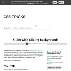
Weather app for iOS is the transition between city screens. The background image doesn't just move away as the screen moves from one screen to the next, the background image itself slides. It appears to be hiding some of the "old" screen and revealing more of the "new" screen those closer you have it to being in full view. Let's try and pull it off on the web. The HTML Like any slider, there are three main components: The container that holds everything into shapeA sliding container that is as wide as all the slides in a rowEach individual side container We won't bother too much with content inside the slide.
Responsive Table. Slider with Sliding Backgrounds. HTML5 and CSS3 in Dreamweaver CS5—Part 2: Styling the web page. This is Part 2 of a three-part tutorial series exploring the HTML5 and CSS3 features in Dreamweaver CS5.5.
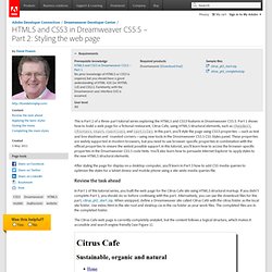
Part 1 shows how to build a web page for a fictional restaurant, Citrus Cafe, using HTML5 structural elements, such as <header>, <footer>, <nav>, <section>, and <article>. In this part, you'll style the page using CSS3 properties —such as text and box shadows and rounded corners—using new tools in the Dreamweaver CS5.5 CSS Styles panel. These properties are widely supported in modern browsers, but you need to use browser-specific properties in combination with the official properties to ensure the widest possible support.In this tutorial, you'll learn how to access the browser-specific properties in the Dreamweaver CS5.5 code hints. You'll also learn how to persuade Internet Explorer to apply styles to the new HTML5 structural elements.
In Part 1 of this tutorial series, you built the web page for the Citrus Cafe site using HTML5 structural markup. Sexy Drop Down Menu w/ jQuery & CSS. Jun 02 2009 Studies show that top navigations tend to get the most visual attention when a user first visits a site.
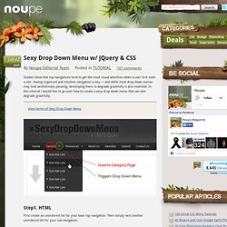
Having organized and intuitive navigation is key — and while most drop down menus may look aesthetically pleasing, developing them to degrade gracefully is also essential. In this tutorial I would like to go over how to create a sexy drop down menu that can also degrade gracefully. View Demo of Sexy Drop Down Menu.