
Create the Illusion of Stacked Elements with CSS3 Pseudo-Elements. HTML5: Hype vs. Reality. Editor - sharing creativity. Super Sweet CSS 3D Text Effects With Sass and LESS. I was recently discussing the merits and various features of CSS preprocessors with a colleague.
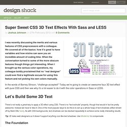
We covered all of the basics: how it’s great to have variables and how mixins can save you an incredible amount of coding time. When the conversation turned to some of the more obscure features though things got interesting. When I brought up the various color operations, my colleague boldly proclaimed that no “real designer” could ever find a legitimate excuse for using this feature and not picking his own colors manually. In the words of Barney Stinson, “challenge accepted!” Today we’re going to create an awesome faux 3D text effect with pure CSS and then see why it’s a lot easier to do it with the color operations in Sass or LESS. Let’s Build Some 3D Text There’s not really a great way to apply a 3D effect using CSS. Tip: IE hates web designers so it doesn’t support anything cool like text-shadows. The Foundation Now for some CSS.
Applying a Text-Shadow. 3D Gallery with CSS3 and jQuery. Today, we want to share an experimental 3D gallery with you that uses CSS 3D transforms.

View demo Download source With 3D transforms, we can make simple elements more interesting by setting them into three dimensional space. Together with CSS transitions, these elements can be moved in 3D space and create a realistic effect. Today, we want to share an experimental 3D gallery with you that uses CSS 3D transforms. The main idea is to create a circular gallery where we have an image in the center and two on the sides.
Please note that this will only work in browsers that support CSS 3D transforms. How it works The following HTML structure is used for the gallery: And this is how the gallery is initialized: Les ombres en CSS3 avec box-shadow. Ce tutoriel a pour but de détailler l’utilisation de la nouvelle propriété du CSS3 “box-shadow”.
Cette puissante propriété permet des réaliser de très beaux effets de volume ou de creux tout en conservant un code d’un poids minimal pour la page, et sans utiliser la moindre image. Avant de commencer Afin d’exploiter les possibilités de la propriété CSS3 box-shadow, nous allons tout d’abord créer un simple div : avec pour propriété de style : Nous allons appliquer la propriété box-shadow à cet élément.
Sur ce point, il est important de préciser qu’il y a un ordre à respecter lorsque vous utilisez ces préfixes. Lorsque les propriétés CSS3 en questions seront parfaitement supportées, vous pourrez n’écrire que : C’est donc sous cette forme que les exemples suivants seront écrits. HTML5 widget - ready for the big time! Almost 3 months ago we announced our new HTML5 widget player.
Since then we have spent a lot of time gathering your feedback, testing, bug fixing, talking to the browser vendors and improving the user interface. We were glad to hear about your experiences using the widget, we have seen an incredible uptake in sharing of the sounds played in the new widgets. With the mobile browser support we were finally able to fullfil one the main feature requests. From the very beginning of this project we were convinced that we should bring as much of the SoundCloud experience to our widgets as possible, features that go beyond just listening to the sounds. Today we are adding two major new features to our HTML5 widgets – Comments and Likes.
Filter Functionality with CSS3. Using the general sibling combinator and the :checked pseudo-class, we can toggle states of other elements by checking a checkbox or a radio button.

In this tutorial we will be exploring those CSS3 properties by creating a experimental portfolio filter that will toggle the states of items of a specific type. View demo Download source The idea is inspired by Roman Komarov’s brilliant “Filtering elements without JS” experiment where he uses checkboxes and radio buttons for filtering colored shapes. The beautiful Dribbble shots used in the demos are by Mike from Creative Mints. The Markup Let’s start with the markup. The unordered list will contain all the portfolio items as anchors with an image and a span. The CSS We’ll be going through three example effects, but first, let’s take a look at the common style.
I will omit all the vendor prefixes, but you will, of course, find them in the files. Create progressively enhanced 3D CSS rollovers. CSS3 Responsive Slider / Carousel Using Radio Buttons. Select catcher Created by Ian Hansson (@teapoted) Art from Brendan Zabarauskas (@bjzaba_).
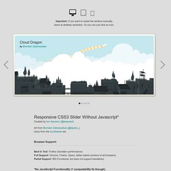
Icons from the iconSweets set. Browser Support: Best In Test: Firefox (transition performance) Full Support: Chrome, Firefox, Opera, Safari (latest versions of all browsers) Partial Support: IE9 (Functional, but does not support transitions) *No JavaScript Functionality (1 compatability fix though) iOS devices don't handle labels properly.
You can view this page without the js iOS fix here. How Does It Work? The actual slider is much like any JavaScript slider. To save our input we are using radio buttons. We put the radio buttons at the top so when they are :checked we can use a general sibling selectors (~) to change our slider. That is all the essential CSS, the other gaff is just styling and animation. Created by Ian Hansson (@teapoted), Feb 2012.