
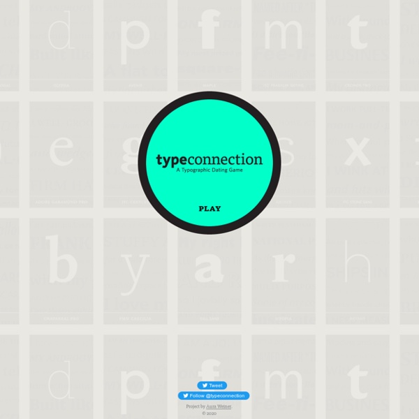
http://www.typeconnection.com/index.php
Related: Lettering • Ressources graphismeA 7-Step Typography Lesson for First-time eLearning Developers Despite the utility of multimedia in eLearning, images and even videos can only go so far: the core source of information remains text. Accordingly, a basic knowledge of typography is a must for any eLearning designer. Good typography enhances readability, encourages information processing, creates a visual hierarchy, and even engages readers' emotions. Here is a 7-step guide to making your course more effective—with typography in mind.
The 69 Rules of Punctuation: All the ways to use each of the punctuation marks The title is a bit a misleading. Sadly, there are more than sixty-nine “rules” of punctuation. When it comes to punctuation rules, there are probably countless guidelines about how NOT to use them. GivingTuesday - 14 Android & iPhone Apps to Achieve Design Nirvana Without imagination, we’d still be living in a cave with that lingering feeling that we are missing out on something phenomenally life-altering. But where will be this gnawing sense to explore things? To draw?
10 expert font kerning tips Kerning is the process of adjusting the spacing between letters to achieve a visually pleasing result. Some designers find it easy, others find it a tricky process where success is achieved more by luck than real judgement. But follow these tips and you should find yourself on the right track... 01. Font vs. Typeface (And 14 Other Design Terms We Always Get Wrong) ~ Creative Market Blog Designers talk in fancy technical terms all the time, but how often do we get it right? Well, that's a good question, and with that in mind, we came up with 15 design terms that we always seem to screw up, then put them in one convenient place — right here! 1.
5 tips for taking control of your fonts Fonts are tricky. On the one hand, they are the result of many thousands of hours of skilful work, created by someone who should be fairly compensated. On the other hand, most of us have to consciously remind ourselves that fonts must be licensed, in almost exactly the same way as the software you use on your Mac or PC. In fact, fonts are even harder to keep track of because it's not a simple binary 'it's licensed/it's not licensed' issue.
#CreativeBranding - The Ruckus over the ‘new’ Tennessee State Logo Welcome to another episode of our Creative Branding series of posts where we get the experts to opine, chime in, critique and discuss everything from design faux passes to wow-inducing design techniques. Previously, we analyzed the YouTube-KitKat collaboration making news over the internet and how that went down with the design folks and ordinary consumers alike. Today we’ll look at something new, something fresh and something controversial that deserves some intense scrutiny from the design industry leaders. So, let’s get this show on the road with today’s question. Does the Tennessee State Logo seem worth it for the price it was designed for? What is a client thinking when he hands over an incredulous $46,000 to a designer?
What's that font? 8 tools that let you identify typefaces Have you found some pretty fonts while browsing through websites but do not know which font it is? “Inspect element” may not be a good option for everyone and it can be hectic to go through the HTML line, look out for the CSS class and identify a font. And in the case of image based text, it’s not possible to identify through inspecting. That is why to make your work much easier, here we have a collection of font identifier tools. Have a look at them below! 1. 18 rules for using text We visited The Visual Communication Guy and found this – one of the best infographics we've seen that provides designers with 18 rules for using text – so we had to share it with you. The use of typography can be confusing – which font do you choose, and what size? If you follow these 18 rules you won't go wrong and quickly start to see a world of difference in your designs.
Type sketch series is full of font fun Starting out as a few simple doodles, graphic designer Andrew Gregory turned his typography sketches into a series; with volume one proving a hit, he's embarked on volume two for more font-fun. "I try to post doodles to my Instagram account on a daily basis to see if people like the basic concept," he says. Download the best free fonts "From the doodle stage, I work primarily in Illustrator and then jump over to Photoshop to apply distressed textures." FindA.Photo Stock photo search made easy Browse through over 1 million high-quality stock photos across multiple free and paid stock photo sites - from one tab. Enter your search term here ALL Filter by All, Findaphoto (Click again on filter that you want to exclude) Pixabay Filter by All, Findaphoto (Click again on filter that you want to exclude) Splashbase Filter by All, Findaphoto (Click again on filter that you want to exclude)