
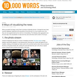
Datavisualization color. 8 Ways of visualizing the news. When journalists first began using Flash to produce multimedia stories, it changed the way news could be displayed.
Decoding Data. Huge Solar Storm Triggers Unusual Auroras. In Deep – Pictory. A Gun for Everyone. 7 Basic Rules for Making Charts and Graphs. Charts and graphs have found their way into news, presentations, and comics, with users from art to design to statistics.
The design principles for these data graphics will vary depending on what you're using it for. Making something for a presentation? You'll want to keep it extremely simple and avoid using a lot of text. The Sketchpad: Personal Finance on a Napkin - Interactive Feature. The 2010 Social Networking Map. Visual Overviews for Cultural Heritage: Interactive Exploration for Scholars in the Humanities, Arts, and Beyond.
The Year of InfoVis Theory. 2010 is The Year of Information Visualization Theory.

Here’s why. Discuss: Why collect data about yourself? Personal data fascinates me.
I collect data about myself mostly as a way to journal and document the present so that I can look back on it later - similar to how someone else might flip through an old photo album. In just about every interview I've read with Nicholas Felton, author of several personal annual reports, he's asked how the data, or rather the information from that data, has changed his behavior. Project: Create an Infographic About Childhood Obesity, Submissions - Projects.
Our latest infographic contest asked you to create an infographic about childhood obesity, in partnership with the Let's Move!
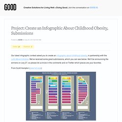
Initiative. We've received some great submissions, which you can see below. We'll be announcing the winners on July 27, so please let us know in the comments and on Twitter which pieces are your favorites. From Scott Hampton (view full size): Home. The Gulf Oil Spill: 88 Days Later – woorkup.com. Telling Stories with Data - A VisWeek 2010 Workshop. Best of FlowingData – July 2010. Many Eyes. Cool Infographics - Cool Infographics - Automotive Family Tree: Update, Interview and Poster GIVEAWAY! #autotree. Andy Harris from TooManyCars.info has updated (a few times) his fantastic Automotive Family Tree map of who owns the car companies since the last time I posted about it a couple years ago.
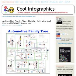
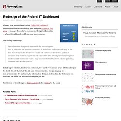
The map is so big and detailed that you have to click on specific ownership corporations to zoom into just their connections. The colored connection lines indicate the nature of each relationship (Joint Venture, License, Ownership or Sharing Technology). Redesign of the Federal IT Dashboard. About a year after the launch of the Federal IT Dashboard, business intelligence consultancy Juice Analytics focuses on five areas — message, flow, charts, context, and design fundamentals — where the dashboard could use some improvement.
The first tip on message: Infographic of the Day: The Mobile-Ad Market Explodes. Branding, like you see in ads on TV and the Internet, won't work on mobile phones--the displays are simply too small, and the user's attention too focused, for a tiny brand banner to sink into the consciousness.
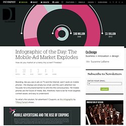
Yet mobile phones are the future of media. Ads, therefore, have to be far more targeted, context aware, and easy to understand. So what's the solution, for advertisers? Coupons, as this infographic by Tiffany Farrant shows: Maybe the most stunning stat is about the U.S. market: Mobile coupons were a teeny, $90 million market in the U.S. in 2009. Publications: Journal Papers. Information is Beautiful hacks in India with David Cameron. This week, I was lucky enough to accompany UK Prime Minister's delegation to India.
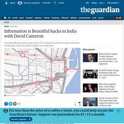
I was part of a small contingent of politically active programmers and civic-minded dataheads out to explore links between tech, transparency and community-based democracy in India. The raw stuff of David Cameron's 'Big Society' initiative. The Art of Complex Problem Solving. AmCharts: flash charts, stock charting software.
Free Visualization Software. Dygraphs JavaScript Visualization Library. How Do You Visualize Progress? on Datavisualization. Fernanda Cozzi, a graphic designer from Buenos Aires, Argentina strived to analyze and display her professional achievements during her studies.
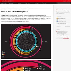
The result is a set of analytical schemes of concepts and projects developed in college. The first visualization shows the work made in the first quarter and the second shows one complete year. Both visualizations include objective and subjective aspects, representing a personal interpretation of the obtained knowledge and achieved results. SIMILE Project. Data Visualization for the Web. OpenHeatMap. Guardian/ICM polls: every one since 1984. Cool Infographics - Cool Infographics - How Does Diet Soda Cause Weight Gain? [infographic video] Numbers, Words and Colors. Instant Oil Spill. Au Bon Pain = To The Good Pain? - Long-winded: A Blog for People Who Read. Inside insides. 26 Infographics on Child Obesity. Our Aging World. According to the United Nations, the elderly population of the world is growing at its fastest rate ever.
By 2050, there will be more than 2 billion people aged 60 or over. The age of a country's population can reveal insights about that country's history, and can provide a glimpse towards the economic and healthcare trends that will challenge their societies in the future. Explore the visualization below to learn more about how the populations of eight countries will grow and change over time. Infographic Design on the Behance Network. 2012: The End Of The World? Imptwitch.com. Pulse of the Nation: U.S. Mood Throughout the Day inferred from Twitter. Click for high-resolution PDF version (11MB) Video A time-lapse video of the maps, cycled twice, is available below (best viewed at 720p): Mood Variations. Flowing Media: Your Data Has Something To Say. Impressive data visualization tool to be released as open source.
The former leaders of IBM's Visual Communications Lab have been hard at work on a "summer project" -- desktop software that will display large amounts of information in a number of visual formats. Fernanda Viégas and Martin Wattenberg touted version "0.5" of their Time Flow tool as a way to create visual timelines from textual data.
And indeed the software can import a table of data -- presidential appointments, political contributions -- and show it as a timeline or a calendar, with color- and size-coded entries that make it easier to spot patterns. The Art of Complex Problem Solving. Yahoo Charts Control Library Now Available. Yahoo User Interface 2.4.0 was recently released which includes the new YUI Charts Control. Josh Tynjala of the Yahoo! Flash Platform team contributes the new YUI Charts Control, a hybrid JavaScript/Flash component that supports bar, line, and pie charts. The Charts Control draws data from the same DataSource Utility that underpins the YUI DataTable Control, making it possible to do combined chart/table visualizations. The Charts Control accepts CSS style information, allowing you to skin the chart itself without touching the underlying .swf file.
What Simple Rules Should You Always Follow When Designing Infographics? A Protovis Primer, Part 2. Review: The Wall Street Journal Guide to Information Graphics. 20 Recipes For Fancypants Coffee Drinks. 2010 Tour De France Visualization on Datavisualization. After seeing a ton of great graphic work being done looking at the FIFA World Cup 2010, Jerome Daksiewicz realized that he had not seen any interesting graphic work visualizing the 2010 Tour de France, his personal major sporting event of choice. 7 Basic Rules for Making Charts and Graphs.
Where are the billionaires? [Jordi Planas Manzano] What BP Could Have Bought With All the Money They Lost. Share this infographic on your website, simply copy and paste the source code in the box below to your website. Decoding Data. Juan Osborne. FTSE 100 – A 26 Year History on Datavisualization. In the current financial climate, the FTSE 100 is regularly in the media, and is the most widely used indicator of economic prosperity in the United Kingdom. Old 19th Century Chart of the Solar System. Communication Design & Complexity. 9 Ways to Visualize Proportions – A Guide. 2012: The End Of The World? A Protovis Primer, Part 3. After covering some Protovis basics in part 1, and some more advanced techniques plus data loading in part 2, this part is devoted mostly to using what we’ve already discussed in a more complex example. 27 Visualizations and Infographics to Understand the Financial C. I've said it before, and I'll say it again.
GOOD Magazine Visualizations. A Periodic Table of Visualization Methods. Chronological work - Florent Guerlain. Information goes out to play. 30 Artistic and Creative Résumés. Many Eyes. Credit Scoring, Data Mining, Predictive Analytics, Statistics, StatSoft Electronic Textbook. A Protovis Primer, Part 1. A Tour through the Visualization Zoo. Propositional density in visualization. US Federal Contract Spending Data Visualization. Chris Harrison - Visualizing the Bible. Global Corruption Map. Well-formed.eigenfactor.org : Visualizing information flow in science. Cambridge.
Open Science, H1N1, Processing, and the Google Spreadsheet API. The Anatomy Of An Infographic: 5 Steps To Create A Powerful Visual. A Periodic Table of Visualization Methods. Data Visualization, Infographics, and Statistics. Software Assisted Illustration in the Form of Information Visualization. 11 Ways to Visualize Changes Over Time – A Guide. Graphical perception – learn the fundamentals first. 9 Ways to Visualize Proportions – A Guide. 16 Awesome Data Visualization Tools.
Data. Visualization and Visual Communication. Applications. Hex Color Codes. InfoGraphic Designs: Overview, Examples and Best Practices. 28 Rich Data Visualization Tools - InsideRIA. The illustrated guide to a Ph.D.