
GigPosters.com - Peter Bjorn And John - El Perro Del Mar. SmartHeart / Crowdsourcing in Japanese. Interesting / Ars Electronica Poster. הכנת יין - Google Search. TV Quotes on Typography Served. Vbg.si - creative design studio. Flickr - Photo Sharing! 28 — Friends of Type. Drommelab. (short story poster. by klas ernflo) MWM Graphics Update. MWM Graphics webfolio update with 2+ years of new work across disciplines.
Dozens of new product collaborations, apparel designs, vectorfunk abstractions, custom typography, gallery exhibitions all around the globe, large public murals, and various personal work explorations by Matt W. Moore. Fonts In Use – All About Tea. Flickr - Photo Sharing! Google Reader (1000+) Gridness - Part 7. "Ode to Carl" Chicago Poster Series. 2010 Loeb Fellows at Work Poster. Client The Loeb Fellowship, Harvard University Graduate School of Design Quantity Produced Production Cost Production Time Design: 2 days Printing: 2 days Dimensions (Width × Height × Depth) 24 in × 36 in Page Count Paper Stock Neenah Environment, 100 lb Text, 100% PCW.
AIGA Pulp, Ink and Hops Poster. Client AIGA Baltimore Quantity Produced Production Cost Production Time 1 Week Dimensions (Width × Height × Depth) 18 in × 24 in Page Count Paper Stock French Durotone Butcher, Offwhite, 80 lb Cover. The Rural Alberta Advantage Poster. To promote a show by Canadian indie band The Rural Alberta Advantage at the Cedar Cultural Center in Minneapolis, local designer Brian Danaher went to the roots, literally and metaphorically, of the band and its debut album to create an intricate and saturated poster.
This poster was inspired by the band’s personal connection with Alberta as well as the content of the lyrics from songs their debut album “Hometowns” (many of which use the word “heart” as a metaphor). Eat This! Promotional Poster. Online Brand New / Displaying opinions and focusing solely on corporate and brand identity work. Art of the Menu / Cataloguing the underrated creativity of menus from around the world. Quipsologies / Chronicling the most curious, creative, and notable projects, stories, and events of the graphic design industry on a daily basis. Speak Up (2002 – 2009) / Discussing, and looking for, what is relevant in, and the relevance of, graphic design. Archives Only . Word It (2003 – 2010) / Encouraging creative diversity in the community through monthly, one-word challenges.
Brand New Classroom (2010 – 2011) / Providing a space for critique and opinions on student identity work Archives Only . graphic design. Three-01-ebook-by-mrcup-11. Culture for Tolerance Poster. Nicely executed in illustration and production, I love that when you unravel this custom-fold, and extra long poster you realize fox and flamingo are together as one. — Bryony Client Culture for Tolerance. ARTCRANK Free Range Poster. ARTCRANK is a travelling show of bicycle inspired poster art that features work from local artists in each city it visits. Boasting over 300 miles of bikeways, designer Cat Cheng’s route map cum chicken poster makes ARTCRANK feel right at home. — Kelly Cree Client Quantity Produced Production Cost Production Time 3 Days Dimensions (Width × Height × Depth) 19 × 25 in.
Page Count Paper Stock French Paper / Construction / Charcoal Brown / 100 C Number of Colors Varnishes Binding Typography This piece is available for purchase for $35 (plus shipping + handling) Project Description ARTCRANK is a traveling bike party and art show featuring local artists who create bicycle-inspired artwork. Production Lesson(s) I learned screenprinting in hot weather is difficult. Post Author Kelly Cree Former intern at UnderConsideration LLC. Swinburne University Graduate Exhibition Invitation + Posters. Project Description The creative was inspired by the branding which consisted of four colours with three of them representing the different bodies of students that were exhibiting (orange, green and pink) with the fourth colour (blue) making up the master brand colour. The concept behind the invitation and the poster was to create a piece of communication that was striking and bold enough to grab attention, but at the same time emulate the style of the mark being very elegant and minimal.
Additionally the posters were created to be experience as a set; as once brought together creating the completed logo. We used this in a way to slowly unveil the identity of Set Sail to the Swinburne design community to create some mystique and interest around not only the exhibition but the additive nature of the poster installation.
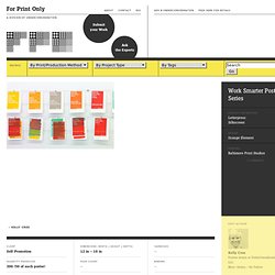
Work Smarter Poster Series. — Kelly Cree Client Self-Promotion Quantity Produced.
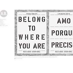
Segal Centre Season Posters. A Bunch of Crock Poster Series. Client Self Quantity Produced 30 (× 12 posters) Production Cost. Jean Jullien's online portfolio. Comet Substance. Mgmt. design. ANTHONY BURRILL - MESA Y CALDERA. A series of silk-screen posters produced during a six day workshop in São Paulo, Brazil organised by Mesa & Cadeira (2012).
Tartakover.co.il. Tibor Kalman. Ikko Tanaka. Born in Nara, Japan in 1930, Ikko Tanaka created a style of graphic design that fused modernism principles and aesthetics with the Japanese tradition.
As a child he studied art and as a young adult he was involved in modern drama and theatrical study groups. In 1963 he formed Tanaka Design Studio where he worked for corporations such as Mazda, Hanae Mori, Issey Miyake and the International Garden and Greenery Exhibition. Joseph Müller-Brockmann. Joseph Müller-Brockmann As with most graphic designers that can be classified as part of the Swiss International Style, Joseph Müller-Brockmann was influenced by the ideas of several different design and art movements including Constructivism, De Stijl, Suprematism and the Bauhaus.
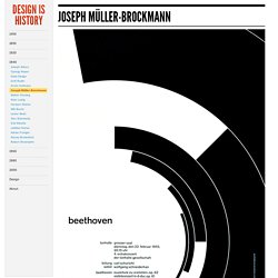
He is perhaps the most well-known Swiss designer and his name is probably the most easily recognized when talking about the period. He was born and raised in Switzerland and by the age of 43 he became a teacher at the Zurich school of arts and crafts. The above poster for the Zurich Town Hall is perhaps Müller-Brockmann's most recognized, and most ripped off, piece of work. Armin Hofmann. Armin Hofmann By the age of 27 Armin Hofmann had already completed an apprenticeship in lithography and had begun teaching typography at the Basel School of Design.
His colleagues and students were integral in adding to work and theories that surrounded the Swiss International Style, which stressed a belief in an absolute and universal style of graphic design. The style of design they created had a goal of communication above all else, practiced new techniques of photo-typesetting, photo-montage and experimental composition and heavily favored sans-serif typography. He taught for several years at the Basel School of Design and he was not there long before he replaced Emil Ruder as the head of the school.
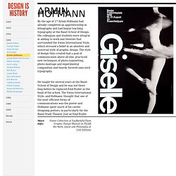
The Swiss International Style, and Hofmann, thought that one of the most efficient forms of communications was the poster and Hofmann spent much of his career designing posters, in particularly for the Basel Stadt Theater. A.M. Cassandre. A.M.
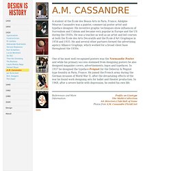
Cassandre A student of the École des Beaux-Arts in Paris, France, Adolphe Mouron Cassandre was a painter, commercial poster artist and typeface designer. His inventive graphic techniques show influences of Surrealism and Cubism and became very popular in Europe and the US during the 1930s. He was a teacher as well as an artist and led courses at both the École des Arts Décoratifs and the École d'Art Graphique in 1934 and 1935. Constructivism. Posters. Danreisinger. Russian constructivism. Food Film Festival on Behance. Melbourne Dance Company on Behance. Julien Vallée.
Schwarz März on Behance. Dubai Film Festival Rebrand Pitch on Behance. Casa da Musica Identity.