
Big Data : pourquoi nos métadonnées sont-elles plus personnelles que nos empreintes digitales. A l’occasion du colloque « la politique des données personnelles : Big Data ou contrôle individuel « organisé par l’Institut des systèmes complexes et l’Ecole normale supérieure de Lyon qui se tenait le 21 novembre dernier, Yves-Alexandre de Montjoye (@yvesalexandre) était venu présenter ses travaux, et à travers lui, ceux du MediaLab sur ce sujet (Cf. « D’autres outils et règles pour mieux contrôler les données » ).
Yves-Alexandre de Montjoye est doctorant au MIT. Il travaille au laboratoire de dynamique humaine du Media Lab, aux côtés de Sandy Pentland, dont nous avons plusieurs fois fait part des travaux. Nos données de déplacements sont encore plus personnelles que nos empreintes digitales Faire correspondre des empreintes digitales n’est pas si simple, rappelle Yves-Alexandre de Montjoye. Data Visualization. The Visual Leap - About Visual Thinking. >> Home • About Visual Thinking About Visual Thinking Visual thinking, also called visual learning, is a proven method of organizing ideas graphically - with concept maps, mind maps and webs.
Scientifically based research demonstrates that visual learning techniques improve memory, organization, critical thinking and planning. Visual thinking is an intuitive and easy-to-learn strategy that works for many academic and professional projects. The more complex the task or idea, the more useful this approach can be. Visual Thinking Software. Visual Thinking. Data Visualizations, Challenges, Community. Visual thinking basics.
Easel.ly. Are You A Visual Thinker? Tableau Desktop. SaaS Business Intelligence. Business Dashboard Software Solutions: Performance, Executive, KPI, Management, Reporting Dashboards. Visual Mining: Data Visualization and Business Intelligence Software Solutions. Business Intelligence Software. Needlebase. Information aesthetics. Ideas, issues, concepts, subjects - v. 37 Data-ish Blogs.
You might not know it, but there are actually a ton of data and visualization blogs out there.
I'm a bit of a feed addict subscribing to just about anything with a chart or a mention of statistics on it (and naturally have to do some feed-cleaning every now and then). In a follow up to my short list last year, here are the data-ish blogs, some old and some new, that continue to post interesting stuff. Data and Statistics By the Numbers - Column from The New York Times visual Op-ed columnist, Charles Blow, who also used to be NYT's graphics director.Data Mining - Matthew Hurst, scientist at Microsoft's MSN, also the co-creator of BlogPulse.Statistical Modeling - We might disagree on certain things, but Andrew's blog is one of the few active pure statistics blogs.The Numbers Guy - Data-minded reporting from Carl Bialik of the Wall Street Journal.Basketball Geek - Like statistical analysis and basketball? Konstanz Information Miner. How to become a data visualization ninja with 3 free tools for non-programmers.
We noticed many times between the lines of this blog how data visualization is in the hype and how this trend is growing and growing.
That’s good news guys! It’s fun and it’s … success! But as more and more people join this wild bunch we have to take care of those who are not as skilled as we are yet. There are many people out there who love data visualization but they think they are out of this business because they are not able to code. I personally think that this is a problem and that we have to be as inclusive as we can. La SNCF lance un défi aux Data Scientists. Data et Analytics : que nous réserve 2015 ? - Influencia. La big data n’est désormais plus un concept.

Les professionnels commencent à dompter la « bête » et 2015 devrait être une cuvée où on applique la théorie. Précisions avec Deloitte qui a identifié les nouveaux challenges que soulève l’utilisation de la Data et de l’analytics… Pratiquer. Tel pourrait être le maitre mot autour de la Data cette année. Car après avoir engrangé, analysé puis engrangé et encore analysé des milliards de datas, les professionnels vont peut-être commencer à appliquer leurs connaissances en la matière. Un document découpé en 5 parties qui permet de segmenter les différents champs de compétences qu’une entreprise a ou doit mettre en place pour optimiser sa connaissance des données. 1. Visualization-based data discovery tools. Visualization-based data discovery tools may account for less than 5 % of the Business Intelligence (BI) Market, but they are fighting above their weight in terms of profile.
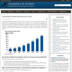
In 2011, Gartner placed Visualisation at the peak of the BI Hype Cycle. Despite this indicating the category may lose some of its lustre , Gartner are still predicting a compound annual growth rate of 30% in each of next 5 years. If true, this means the category will increase in value from $427 to $1,606 million over the period, a growth rate 3 times that of the overall BI market. Over 100 Incredible Infographic Tools and Resources (Categorized)
This post is #6 in DailyTekk’s famous Top 100 series which explores the best startups, gadgets, apps, websites and services in a given category.

Total items listed: 112. Time to compile: 8+ hours. Follow @DailyTekk on Twitter to make sure you don’t miss a week! Update: Be sure to check out our latest post on infographics: Infographics Are Everywhere – Here’s How to Make Yours Go Viral. Make Information Beautiful - Themes. Free Data Visualization Software.