
Gaphi Gephi is a tool for data analysts and scientists keen to explore and understand graphs. Like Photoshop™ but for graph data, the user interacts with the representation, manipulate the structures, shapes and colors to reveal hidden patterns. The goal is to help data analysts to make hypothesis, intuitively discover patterns, isolate structure singularities or faults during data sourcing. It is a complementary tool to traditional statistics, as visual thinking with interactive interfaces is now recognized to facilitate reasoning. This is a software for Exploratory Data Analysis, a paradigm appeared in the Visual Analytics field of research. Real-time visualization Profit from the fastest graph visualization engine to speed-up understanding and pattern discovery in large graphs. Layout Layout algorithms give the shape to the graph. Metrics The statistics and metrics framework offer the most common metrics for social network analysis (SNA) and scale-free networks. Networks over time Input/Output
business intelligence reporting tool: How to Choose the Right Business Intelligence Tool? Business Intelligence tool is software that allows user to draw meaningful insight from data for effective management decision-making. It is also used for analyzing data for operational purpose and these tools are best for predictive analysis. These business intelligence tools and solutions provide necessary information that helps firms to know more about their products, sales and market trends. So let’s discuss some tips to select the right business intelligence solutions and business intelligence reporting tool. Tips for Selecting the Right Business Intelligence Solutions Create a Business Intelligence strategy Before buying Business intelligence software, you need to have a proper understanding of business. Define criteria in business terms Once you have clear understanding of your business then you can easily define your business selection criteria. Invite Vendors for a Live Demonstration Negotiate With Business Intelligence Vendors Perform a Proof-Of-Concept Create a Short-List
CMMS For Facilities Maintenance The 38 best tools for data visualization It's often said that data is the new world currency, and the web is the exchange bureau through which it's traded. As consumers, we're positively swimming in data; it's everywhere from labels on food packaging design to World Health Organisation reports. As a result, for the designer it's becoming increasingly difficult to present data in a way that stands out from the mass of competing data streams. Get Adobe Creative Cloud One of the best ways to get your message across is to use a visualization to quickly draw attention to the key messages, and by presenting data visually it's also possible to uncover surprising patterns and observations that wouldn't be apparent from looking at stats alone. As author, data journalist and information designer David McCandless said in his TED talk: "By visualizing information, we turn it into a landscape that you can explore with your eyes, a sort of information map. There are many different ways of telling a story, but everything starts with an idea.
Top 5 Reasons to Use Data Visualization Software Data visualization plays an imperative role in data management and collection process. The relationship, patterns, and trends that are difficult to be detected in text-based data can be easily identified with data visualization software. Historical trends in the key performance metrics like monthly sales of business are readily visible to the users with the help of data visualization tool. Why to Use Data Visualization Software? Bar Charts Data visualization software comes with bar charts, and these charts are one of the best ways to display the data efficaciously. Interactive Map You can use interactive maps that are present in data visualization software to display data in an interactive and informative manner. Data Mapping Data visualization software comes with data mapping feature so that data can be easily mapped to a simple display. Flash Graphs Data visualization software come with flash graphs so that information can be presented in effective manner.
Business Reporting Tools Visualizing data: Mapping earthquakes with the Google Maps API | Google Maps JavaScript API | Google Developers Overview This tutorial shows you how to: Import data into your Maps application.Display that data on a map using simple markers.Use symbols and heatmaps to improve the appearance and legibility of your map, and to represent secondary information. At the end of this tutorial, you will have created a map that displays real-time earthquake data, including magnitude. You can use these same techniques with your own data source to help you tell a more powerful story with the Google Maps API. L to R: Basic markers, sized circles, and heatmaps. Importing your dataset For this example, we'll use real-time earthquake data from the United States Geological Survey (USGS). var map; map = new google.maps.Map(document.getElementById('map'), mapOptions); // Create a <script> tag and set the USGS URL as the source. var script = document.createElement('script'); Placing basic markers Once you've pulled the data into your application, you need to display it on the map. Beyond the basic marker Circle size Heatmaps
Real Time Business Intelligence | InetSoft Podcast A handful of years ago real time was really starting to get initial traction. We saw certain segments of the world or industries in our world starting to use it. The travel industry really liked real time, and there were great stories around successes there. Of course, financial services always tends lead the parade when it comes to innovation, especially around things with real time but do all industries or most industries have a space for real-time BI at this point, or are they starting to find valid reasons to have real time in some of the other sectors? There are certain industries that are a lot more obvious where the goods and services delivered are more perishable and the demand for information is much higher. For example, traditionally you wouldn’t associate utilities with real time, but they are benefiting heavily from being able to leverage real time information in terms of billing for the green projects. Not necessarily every function will benefit from real time information.
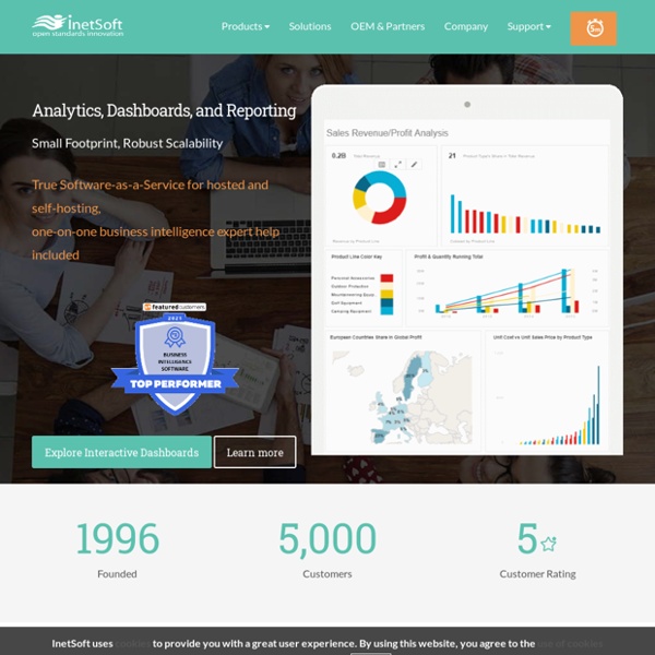
What is CMMS? A Resource for Computerized Maintenance Style Intelligence, Business Intelligence Software InetSoft's Style Intelligence™ is a data intelligence platform. At its foundation is a powerful data mashup engine that enables fast and flexible transformation of data from disparate sources, which can either supplement or obviate a data warehouse solution. At the development level, a unified interface allows for easy and advanced data manipulation and design of interactive dashboards, visual analyses, and published reporting. At the consumption level, self-service is maximized for a range of users from casual business or consumer-type browsers to power users and data scientists. As a cloud-ready, fully scalable enterprise-grade platform with granular security, multi-tenancy support, and multiple integration points, it serves both enterprises and solution providers. Headlining the dozens of enhancements in the latest release of Style Intelligence is the addtion of layout options for a single data visualization to optimally support various desktop and mobile device screen sizes.
CMMS Software, EAM Software - Computerized Maintenance Management | eMaint