
30 Simple Tools For Data Visualization. There have never been more technologies available to collect, examine, and render data.
Here are 30 different notable pieces of data visualization software good for any designer's repertoire. They're not just powerful; they're easy to use. In fact, most of these tools feature simple, point-and-click interfaces, and don’t require that you possess any particular coding knowledge or invest in any significant training. 30 Basic Tools For Data Visualization. Posted on FastCodeDesign. iCharts iCharts is a platform that connects the publishers of market research, economic and industry data with professional consumers. iCharts hosts tens of thousands of charts in business, economy, sports, and other categories. iChart makes it simple for people to discover and follow the world’s latest data insights. iCharts provides cloud-based and patented charting tool that enable companies and individuals to brand, market, and share their data as chart content to millions of viewers across the web. icharts provides free accounts to the users which let you create basic interactive charts, while you can buy the premium version as well with tons of features.
Charts can have interactive elements, and can pull data from Google Docs, Excel spreadsheets, and other sources. [Link] GitHub - airbnb/superset: Superset is a data exploration platform designed to be visual, intuitive, and interactive. DataViz. DataViz Mediaeater MMX Archive / RSS June 21 (Source: thedailywhat) May 26 April 30 December 5.
10 outils de dataviz : Datavizualization Open source et commercial. Visualiser les données - Visualiser les données La visualisation de données est primordiale en info-doc.
Lorsqu’on est noyé dans l’abondance de l’information, la visualisation permet d’en appréhender rapidement l’essentiel. Pour autant, créer des graphes n’est pas toujours évident. Many Eyes. 30 Templates & Vector Kits to Design Your Own Infographic. Infographics are always fun to read.
Making them, it’s something else. True, there are tools you can use to make infographics, or you can opt to create an infographic from scratch but often times there are workarounds that can help you with the ‘graphics’, so you can focus on the ‘info’. Choix du personnel. Les projets - Demosciences. Modéliser et analyser des systèmes continus sous Xcos à l'aide de la toolbox CPGEIl s’agit de voir comment Scilab et Xcos permettent de simuler les systèmes asservis de façon conviviale à l'aide de la toolbox CPGE qui est aujourd'hui suffisamment mature.
Ce tp permettra notamment de montrer comment réaliser un schéma-bloc, analyser l'influence de plusieurs paramètres, régler un correcteur par analyse fréquentielle. Nous verrons également à cette occasion les performances d'une commande en courant par rapport à une commande en tension. Modéliser des systèmes multiphysiques sous Xcos. À propos de Scilab / Scilab / Accueil. Qu'est-ce que Scilab ?
Scilab est un logiciel open source gratuit de calcul numérique qui fournit un puissant environnement de développement pour les applications scientifiques et l’ingénierie. Scilab est distribué sous la licence open source CeCILL (compatible GPL), et est téléchargeable gratuitement. Il est disponible sous GNU/Linux, Mac OS X et Windows XP/Vista/7/8 (voir les configurations système). Que peut-on faire avec Scilab ? Scilab contient des centaines de fonctions mathématiques, des fonctions graphiques 2D et 3D et un environnement de programmation. De nombreuses fonctionnalités sont incluses dans Scilab. NodeXL: Network Overview, Discovery and Exploration for Excel - Home. Over 100 Incredible Infographic Tools and Resources (Categorized) This post is #6 in DailyTekk’s famous Top 100 series which explores the best startups, gadgets, apps, websites and services in a given category.

Cartographier vos informations avec Gephi. Aujourd’hui, je vais vous présenter un outil très puissant d’analyse de l’information, le logiciel Gephi.
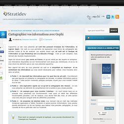
Cet outil va vous permettre de représenter sous forme de cartographie des données brutes et de les analyser. Les experts disent que cet outil est à l’analyse de l’information ce que Photoshop est à la retouche d’image : C’est un outil complexe, mais donnant des résultats impressionnants. Gephi est encore assez peu connu en France, et qui est utilisé par des experts en entreprise. The 20 best tools for data visualization. It's often said that data is the new world currency, and the web is the exchange bureau through which it's traded.
As consumers, we're positively swimming in data; it's everywhere from labels on food packaging design to World Health Organisation reports. As a result, for the designer it's becoming increasingly difficult to present data in a way that stands out from the mass of competing data streams. Get Adobe Creative Cloud One of the best ways to get your message across is to use a visualization to quickly draw attention to the key messages, and by presenting data visually it's also possible to uncover surprising patterns and observations that wouldn't be apparent from looking at stats alone.
And nowadays, there's plenty of free graphic design software to help you do just that. As author, data journalist and information designer David McCandless said in his TED talk: "By visualizing information, we turn it into a landscape that you can explore with your eyes, a sort of information map. Infographics & Data Visualization. Infographies. Cliquez pour agrandir. Cette infographie est disponible aux formats svg et pdf. “We are hackers” “hackers” : c’est le surnom que s’est donné un groupe d’étudiants d’une université américaine, le MIT.
Dès 1960, ils « bidouillent » (ou modifient) leur(s) ordinateur(s) pour en améliorer les performances. Mais pas seulement ! Les hackers, des méchants médiatiques « Vol d’argent, de données, failles de sécurité… » Depuis les années 1990, les médias à grande audience se passionnent pour les dangereux auto-proclamés « hackers » (ou pirates informatiques). Microsoft Office Visio Alternatives and Similar Software. Page de démarrage de Mozilla Firefox. Create Infographics online. La boite à outils. Looking 4 data visualization: Tools. . RAW est une nouvelle application web ouverte et gratuite qui permet de créer aisément des dataviz basées sur le framework D3.js de Mike Bostock (Data Designer au New York Times). .
Développé par l'institut de recherche italienne Density Design, l'outil permet de générer sans aucune ligne de code des visualisations avancées de type Treemap, Dendogram, Fineo Diagram. Les données peuvent être importées à partir de fichiers texte (.csv, .tsv) ou à partir d' Excel, TextEdit ou TextWrangler. . 6 types de layouts / composants graphiques sont disponibles à ce jour : Treemap, Bubble Chart, Dendogram, Hexagonal Binning, Alluvial Diagram (Fineo), Circle Packing. The top 20 data visualisation tools. Tools - WikiViz. DV Blogs « Data Visualization. Diagram Software to draw Flowcharts, UML & more Online.
Envisioning life. Many Eyes. Make your own infographics. WWW Visualization & Infographics. Visualization Data. D3.js - Data-Driven Documents. Collusion. Collusion is an experimental add-on for Firefox and allows you to see all the third parties that are tracking your movements across the Web. It will show, in real time, how that data creates a spider-web of interaction between companies and other trackers.
What we are working on now for Collusion includes: What do I do now? How to create a social network from a list of emails » Insights - by EYD. The question is simple. A typical email in my inbox looks like: - From : George Clooney <g.clooney@como.it>(GC) - To : Clement Levallois (CL) <info@exploreyourdata.com> - Cc : Matt Damon (MD) <md@hollywood.com>, Angelina Jolie (AJ)<angelina@brangelina.com> yEd - Graph Editor. yEd is a powerful desktop application that can be used to quickly and effectively generate high-quality diagrams. Create diagrams manually, or import your external data for analysis. Our automatic layout algorithms arrange even large data sets with just the press of a button. yEd is freely available and runs on all major platforms: Windows, Unix/Linux, and Mac OS X. R overtakes SAS and Matlab in programming language popularity. Enterprise Software Doesn't Have to Suck: Social Network Analysis using R and Gephis.
After learning the basics of R, I decided to learn something harder last week. I picked Social Network Analysis (SNA) to learn the concepts of SNA and R. My primary interest in SNA is visual exploration of networks, so I needed to find a tool first. Which tool to use for visual SNA? Visualization Tool. Create and share visual ideas online. IMPURE.