Let's meet for coffee #identity #packaging ... Gutfried (Concept) Designed by Baita Design Studio, Brazil.
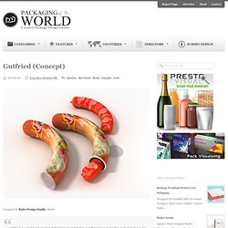
Gutfried is a traditional German delicatessen manufacturer, searching for an innovative packaging design for the poultry sausage in order to differentiate from the competitors.The new packaging concept should only be for the outer packaging of the product and should be innovative, modern, high quality, visually appealing, attention-grabbing and practical while being environmentally-friend and resource-saving packaging materials.A plastic cup in the form of the product, with a cap so the once opened sausage keeps fresh for a longer time. Share This Article. JUST. Mood Garden. Designed by Alexander Chin, designer/ founder of Mood Garden.
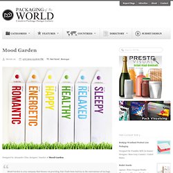
Mood Garden is a tea company that focuses on providing Fair Trade loose leaf tea in the convenience of tea bags. Because this is a fairly new concept, it was necessary to create entirely new packaging to differentiate ourselves from “regular” tea companies. Research showed customer irritation regarding the inconvenience of needing a separate infuser, while still yearning for the ritualistic nature of the brewing process. Each tea blend corresponds with a unique color and flower to help visualize these moods. When the tea drinker removes the tea bag from the stick, a prompt followed by a small flower is revealed. Share This Article. Packaging of the World: Creative Package Design Archive and Gallery. SS Jewelry Box. 5 Olive Oil. Kraft Macaroni and Cheese (Student Work) Key Cola. Point G. Designed by Chez Valois Branding & Design, Montreal, QC, Canada.
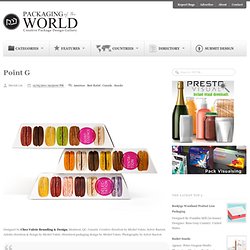
Creative direction by Michel Valois, Sylvie Racicot. Artistic direction & design by Michel Valois. Structural packaging design by Michel Valois. Photography by Sylvie Racicot Point G, Plaisirs Gourmands new brand identity Point G a French word, meaning the G spot… but make no mistake, don't get any ideas, we are talking here about a gourmet spot, the rallying spot of all foodies! Share This Article. Tea Set (Student Work) Designed by Daria Kuzmina, a student at the British High School of Arts and Design, Moscow.
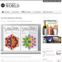
This is Packaging for the good quality organic tea with natural additives. It is a tea for people who likes organics and trust natural brands, harmonic and a little bit dreamy.Brand name is TEASET. Each pack contains black tea with various naturals additives.There are 4 different packs with berries, spices, flowers and herbs. Share This Article. 6 Brown Eggs (Concept) Designed by Sarah Machicado, a graduate from Maryland Institute College of Art.
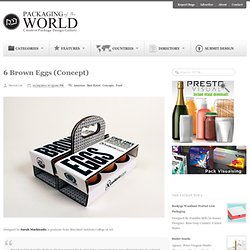
Brand and Sustainable Package Design concept for 6 extra large, organic brown eggs. Envisioned to be printed with soy based inks on 100% post consumer corrugated paper board, an environmentally conscience alternative to a plastic incased egg package. Share This Article. Mate Diet Tea. Designed by Kang Kyung-Ho, bld design, South Korea.
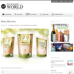
Mate tea is good for diet, known as 'green tea in Latin America'. Generally, mate tea is a diet healthy beverage, and it is considered an unharmful food product by the United States Food and Drug Administration.In the way that, we choose the well-being concept for a package of mate tea. By utilizing the shape of the bowl while drinking, this package can provide an impression that makes a feeling of slimmer than before.This is the concept that makes consumers help to feel the effect of losing weight indirectly. Share This Article. Help Remedies. Designed by Pearlfisher, United States.
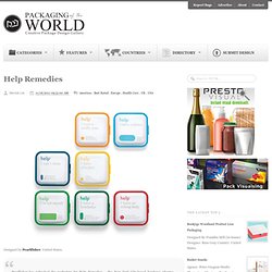
Pearlfisher has refreshed the packaging for Help Remedies – the New York City-based boutique pharma company and creator of minimalist medicine – as part of Help’s national Take Less campaign.As part of the rollout of the Take Less campaign, Pearlfisher was tasked with refreshing the packaging for the existing product range and for the addition of new variants to the portfolio – including Help I have a stuffy nose.Jonathan Ford, Pearlfisher Creative Partner, says, “We have refined the identity and colorcoded the embossed pill shape to make the overall brand architecture more visually strong and to give the brand better stand-out and immediacy of recognition.
The design evolution dials up Help’s equities, creating an ownable secondary language through the pill iconography, that will be used across further brand touchpoints and communications.