
Exploring R² and regression variance with Euler/Venn diagrams. Contents Regression is the core of my statistics and program evaluation/causal inference courses.

As I’ve taught different stats classes, I’ve found that one of the regression diagnostic statistics that students really glom onto is . Unlike lots of regression diagnostics like AIC, BIC, and the joint F-statistic, has a really intuitive interpretation—it’s the percent of variation in the outcome variable explained by all the explanatory variables. For instance, let’s explain global life expectancy using GDP per capita, based on data from the Gapminder project. Here’s the basic model: OddsPlotty has landed on CRAN – Hutsons-hacks. OddsPlotty – the first official package I have ‘officially’ launched – Hutsons-hacks. Some R Packages for ROC Curves. By Joseph Rickert In a recent post, I presented some of the theory underlying ROC curves, and outlined the history leading up to their present popularity for characterizing the performance of machine learning models.
In this post, I describe how to search CRAN for packages to plot ROC curves, and highlight six useful packages. Although I began with a few ideas about packages that I wanted to talk about, like ROCR and pROC, which I have found useful in the past, I decided to use Gábor Csárdi’s relatively new package pkgsearch to search through CRAN and see what’s out there. The package_search() function takes a text string as input and uses basic text mining techniques to search all of CRAN. The algorithm searches through package text fields, and produces a score for each package it finds that is weighted by the number of reverse dependencies and downloads. ROCit: An R Package for Performance Assessment of Binary Classifier with Visualization. ROC Curves. By Joseph Rickert I have been thinking about writing a short post on R resources for working with (ROC) curves, but first I thought it would be nice to review the basics.
In contrast to the usual (usual for data scientists anyway) machine learning point of view, I’ll frame the topic closer to its historical origins as a portrait of practical decision theory. ROC curves were invented during WWII to help radar operators decide whether the signal they were getting indicated the presence of an enemy aircraft or was just noise. (O’Hara et al. specifically refer to the Battle of Britain, but I haven’t been able to track that down.)
I am relying comes from James Egan’s classic text signal Detection Theory and ROC Analysis) for the basic setup of the problem. Visualizing (generalized) linear mixed effects models, part 2 #rstats #lme4. Visualizing (generalized) linear mixed effects models with ggplot #rstats #lme4. In the past week, colleagues of mine and me started using the lme4-package to compute multi level models.
This inspired me doing two new functions for visualizing random effects (as retrieved by ranef()) and fixed effects (as retrieved by fixed()) of (generalized) linear mixed effect models. The upcoming version of my sjPlot package will contain two new functions to plot fitted lmer and glmer models from the lme4 package: sjp.lmer and sjp.glmer (not that surprising function names). Comparing multiple (g)lm in one graph. It’s been a while since a user of my plotting-functions asked whether it would be possible to compare multiple (generalized) linear models in one graph (see comment).
While it is already possible to compare multiple models as table output, I now managed to build a function that plots several (g)lm-objects in a single ggplot-graph. The following examples are take from my sjPlot package which is available on CRAN. Once you’ve installed the package, you can run one of the examples provided in the function’s documentation: Thanks to the help of a stackoverflow user, I now know that the order of aes-parameters matters in case you have dodged positioning of geoms on a discrete scale. An example: I use following code in my function ggplot(finalodds, aes(y=OR, x=xpos, colour=grp, alpha=pa)) to apply different colours to each model and setting an alpha-level for geoms depending on the p-level. Linear in the logit graph. Binary classif. eval. in R via ROCR. A binary classifier makes decisions with confidence levels.
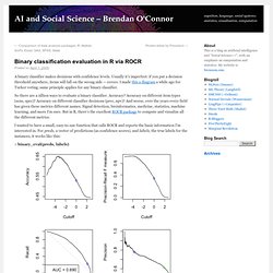
Usually it’s imperfect: if you put a decision threshold anywhere, items will fall on the wrong side — errors. I made this a diagram a while ago for Turker voting; same principle applies for any binary classifier. So there are a zillion ways to evaluate a binary classifier. Accuracy? Accuracy on different item types (sens, spec)? I wanted to have a small, easy-to-use function that calls ROCR and reports the basic information I’m interested in. > binary_eval(preds, labels) These are four graphs showing variation of classifier performance as the cutoff changes. The other thing binary_eval does is show one cutoff point across all the graphs — the blue circle — and display its associated performance metrics. Predictions seem to be real-valued scores, so using naive cutoff 0: Acc = 0.531 F = 0.338 Prec = 0.780 Rec = 0.216 Spec = 0.924 Balanced Acc = 0.570.
Plotting Odds Ratios (aka a forrestplot) with ggplot2 – Sustainable Research. Hi, if you like me work in medical research, you have to plot the results of multiple logistic regressions every once in a while.
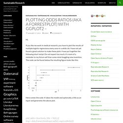
As I have not yet found a great solution to make these plots I have put together the following short skript. Do not expect too much, it’s more of a reminder to my future self than some mind-boggling new invention. The code can be found below the resulting figure looks like this: Here comes the code. Conditionning plot. Plotting lm and glm models with ggplot. Update I followed the advice from Tim’s comment and changed the scaling in the sjPlotOdds-function to logarithmic scaling.
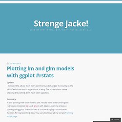
The screenshots below showing the plotted glm’s have been updated. Summary In this posting I will show how to plot results from linear and logistic regression models (lm and glm) with ggplot. As in my previous postings on ggplot, the main idea is to have a highly customizable function for representing data. You can download all my scripts from my script page. The inspiration source My following two functions are based on an idea which I saw at the Sustainable Research Blog.