
Michal Dziekan. Mark Behm. Mark Behm Troll.
Living in My Head. These are pen drawings and paintings by Pat Perry.
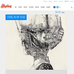
You can view his photography at Flickr. Artwork and photos © Pat Perry Link via Abduzeedo. How Light Works" Light is at once both obvious and mysterious.
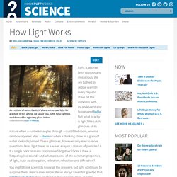
We are bathed in yellow warmth every day and stave off the darkness with incandescent and fluorescent bulbs. But what exactly is light? We catch glimpses of its nature when a sunbeam angles through a dust-filled room, when a rainbow appears after a storm or when a drinking straw in a glass of water looks disjointed. These glimpses, however, only lead to more questions. Does light travel as a wave, a ray or a stream of particles? Colortheory_screen_white.jpg (JPEG-Grafik, 1224 × 792 Pixel) PSG Art tutorial. Color, Value and Hue. Color is one of the most powerful of elements.
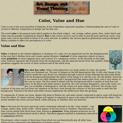
It has tremendous expressive qualities. Understanding the uses of color is crucial to effective composition in design and the fine arts. The word color is the general term which applies to the whole subject - red, orange, yellow, green, blue, violet, black and white and all possible combinations thereof. Hue is the correct word to use to refer to just the pure spectrum colors. Any given color can be described in terms of its value and hue. Forums - View Single Post - the life painting Thread. Ok, part two got busy so I posted before and after...if you can read my writing, there are things in there that might be helpful.A counterpoint is an accent of some kind, either a color or a lighter value that illuminates or colors an entire area a brighter hue or value without having to paint the entire area that color.Since the face is primarily warm, to make sure the highlight sings, it is opposite in temperature, offsetting the warms, making the head less analogous in the painting...The accents are the other big deal, they are pure out of the tube dark value colors, ultramarine blue, alizeron, viridian...colors that start almost black.

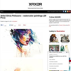
In little portions, the highlights and accents add the additional two values to the painting necessary to make it feel full value since we cannot go full value if you brighten the chroma.Anyway, the picture shows an observation to the two parts of each area of a surface so I can light it, or paint it correctly. Optical illusions. MICHAEL KUTSCHE. Artist Silvia Pelissero - watercolor paintings. Posted on August 16, 2011 in Illustration If you’re new here, you may want to subscribe to our RSS feed or follow us on Facebook or Twitter .
Thanks for visiting! Rate this Post (12 votes, average: 4.75 out of 5) Loading ... So... Check this out on our Partner Network. Untitled. Random Thumbnail View Image View.
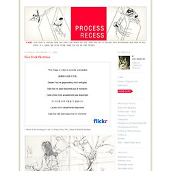
Daniel Lieske.com - Digital Art by Daniel Lieske - Sketchbook. Comission_artwork_for_megajump_by_brosa-d4a6joa.jpg 224×7.498 Pixel. The Retro of Tomorrow by ~Brosa. Process Recess. > The Black Parade Special Edition Box > Giro 2007 Bike Catalog I posted a large cache of new illustrations on www.jamesjean.com yesterday.
The Black Parade (My Chemical Romance) album just came out in the US, and I'm looking forward to seeing how the special edition box was put together. The final art was a bit more desaturated than my original version, but it should complement the photography in the overall package. Gerard Way had a very specific vision for the entire suite of images and characters, but my original contributions included the deer nursing the giant-headed baby and the massive heart pulsating in the background. Last month, I got a call on a Thursday from Atlantic records, saying they needed an album cover illustration for Monday. I love the type and colors in these posters. This was the art director's original idea/sketch for the packaging. A thumbnail sketch I did in photoshop over the AD's original sketch for the box.
My final sketch, with type treatment. Moleskine Sketchbook #01 on the Behance Network. Portraits on the Behance Network. Carne Griffiths’ artwork is born from a love of drawing and the journey of creating an image on the page.
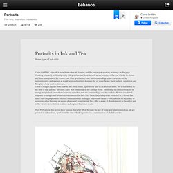
Working primarily with calligraphy ink, graphite and liquids, such as tea brandy, vodka and whisky he draws and then manipulates the drawn line. After graduating from Maidstone college of art Carne served an apprenticeship and worked as a gold wire embroidery designer for 12 years, hence floral pattern, repetition and flow play a large part in his work. Carne’s images explore both human and floral forms, figuratively and in an abstract sense. He is fascinated by the flow of line and the ‘invisible lines’ that connect us to the natural world. These may be considered lines of energy or spiritual connections between ourselves and our surroundings and his work is often an emotional response to images and situations encountered in daily life.
HPL on the Behance Network. Plague of Buzzards - Moleskine by ~scumbugg on deviantART. Sketching by ~Brosa on deviantART. First sketch on my moleskine by *novac on deviantART. Towneater sketch by *novac on deviantART.