
Bootply.com - Bootstrap 2.x to 3.0 Migration Guide. What's New in Bootstrap 3 Bootstrap 3 is a major overhaul, and there are a lot of changes from Bootstrap 2.x.
This guidance is intended to help 2.x developers transition to 3. What's New | Migration from 2.x | 3.0 Change List | Examples Everything has changed. Bootstrap-wysihtml5. Jquery-taxonomy-browser. Kenkeiter/skeuocard. Datepicker for Bootstrap, from Twitter. Example Attached to a field with the format specified via options.
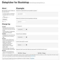
Attachet to a field with the format specified via data tag. DateTime Picker · Bootstrap. All options that take a "Date" can handle a Date object; a String formatted according to the given format; or a timedelta relative to today, eg '-1d', '+6m +1y', etc, where valid units are 'd' (day), 'w' (week), 'm' (month), and 'y' (year).
You can also specify an ISO-8601 valid datetime, despite of the given format : yyyy-mm-dd yyyy-mm-dd hh:ii yyyy-mm-ddThh:ii yyyy-mm-dd hh:ii:ss yyyy-mm-ddThh:ii:ssZ format String. Default: 'mm/dd/yyyy' * { box-sizing: border-box } FTW. One of my least favorite parts about layout with CSS is the relationship of width and padding.
You’re busy defining widths to match your grid or general column proportions, then down the line you start to add in text, which necessitates defining padding for those boxes. And ‘lo and behold, you now are subtracting pixels from your original width so the box doesn’t expand. Ugh. If I say the width is 200px, gosh darn it, it’s gonna be a 200px wide box even if I have 20px of padding. So as you know, this is NOT how the box model has worked for the past ten years. Resize Bootstrap's modal. Jschr/bootstrap-modal. Modernizr: the feature detection library for HTML5/CSS3. Html5shim - HTML5 IE enabling script. Dual licensed under the MIT or GPL Version 2 licenses Full original, uncompressed source available here: Source code adds new HTML5 elements (which is simple code), but also supports printing HTML5 elements and includes the default styles for HTML5 elements, like block on article and section.
Getting it to work in the browser was easy, @jon_neal and afarkas made IE actually print HTML5 elements - these guys are to take all the credit. Please take a moment to thank them! To use this script, download the html5shiv and roll it in to your own code (ideally minified). Common question: what's the difference between the html5shim and the html5shiv? Ie - content="IE=edge" Bootstrap Tutorials. « Return <h1 class="javascript-required">This page requires JavaScript.
</p><p>Please enable JavaScript if you would like to see this page's content. Why Use The Bootstrap Grid? Executive Developer Summary The Bootstrap grid system makes page layout fast and easy.
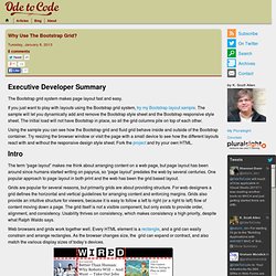
If you just want to play with layouts using the Bootstrap grid system, try my Bootstrap layout sample. The sample will let you dynamically add and remove the Bootstrap style sheet and the Bootstrap responsive style sheet. The initial load will not have Bootstrap in place, so all the grid columns pile on top of each other. Using the sample you can see how the Bootstrap grid and fluid grid behave inside and outside of the Bootstrap container. Intro The term “page layout” makes me think about arranging content on a web page, but page layout has been around since humans started writing on papyrus, so “page layout” predates the web by several centuries.
Grids are popular for several reasons, but primarily grids are about providing structure. Web browsers and grids work together well. Grids on the Web By default, the Bootstrap grid consists of 12 columns and is 940 pixels wide. Fluid and Responsive Grid Layouts. May 9, 2013.
Fluid and responsive layouts are becoming commonplace in modern web designs. It’s important that web applications are usable on all kinds of devices, ranging from smartphones to high-resolution desktop displays. I used to use the responsive grid system from Twitter Bootstrap to build these layouts, but there are a few problems with Bootstrap’s fluid grids: The width of the gutters between the columns depends on how deeply nested the columns are.
Visually, this looks incorrect.Bootstrap’s responsive grid styles make it difficult to apply vertical margins to the rows and columns consistently across screens of all sizes.On small displays, Bootstrap’s responsive margin on the body element forces you to add CSS fixes for any elements that should be full-width (such as a header bar or footer). So I decided to write my own fluid and responsive grid system which doesn’t have these issues. Jquery-ui-bootstrap. The Big Badass List of Twitter Bootstrap Resources. Bootstrap and jquery validate. jQuery validate: regular expression validation. Customizing Bootstrap. Twitter’s Bootstrap 1 has taken off like a rocket since its release a year ago. The popular CSS framework supplies a responsive grid system, pre-styled components and JavaScript plugins to a parade of websites 2 .
One of Bootstrap’s appeals is that it just works. It’s a significant time-saver when starting a website, so much so that major organizations such as NBC, NASA and the White House are adopting it. StyleBootstrap.info: Twitter Bootstrap theme generator. BootSwatchr.com.