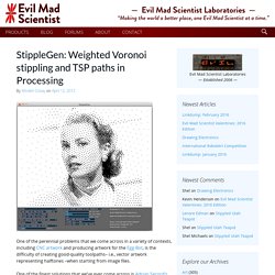
Web Designer. Custom T-Shirts - Design Your Own Custom Shirts Online at UberPrints.com. Diseño de logos, diseño web y mucho más. StippleGen: Weighted Voronoi stippling and TSP paths in Processing. One of the perennial problems that we come across in a variety of contexts, including CNC artwork and producing artwork for the Egg-Bot, is the difficulty of creating good-quality toolpaths– i.e., vector artwork representing halftones –when starting from image files.
El Bot Dibujo. Photovisi - Collage photo effects. Drawing Lessons - How to Draw the Portrait - Drawing Figure - Drawing Still Life. Dave Devries' The Monster Engine - A Journey Into Children's Imaginations. Theme Craft - About Us. 35 Tutorials To Get Your Awesome Design Print-Ready - 1stwebdesigner – Graphic and Web Design Blog. Print design is everywhere around us.
You can see it everyday on newspapers, advertisements, brochures, business cards, T-shirt designs, posters. But you need some skills to create good looking, catchy print design and usually it’s not an easy task. In this article you’re going to find some useful tutorials working with print products on Photoshop, Illustrator, InDesign, Acrobat Reader – print designing will not cause any more pain for you! 1. Inspirational Showcase of Logo Designs with Wings. History provides us with plenty of winged designs from old air force emblems and pin badges, but more recently we can see designers taking inspiration from military aviation and using the style of winged badges in their logo work to create prestigious designs.
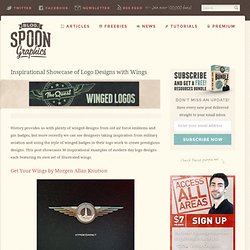
This post showcases 30 inspirational examples of modern day logo designs each featuring its own set of illustrated wings. Get Your Wings by Morgen Allan Knutson. 60+ Beautiful Logo Design Tutorials And Resources. When we talk about a famous brand, the first thing that comes to mind is its logo.
The logo is the most essential component of any personal brand and also the hardest part to execute. 50 Tutorials For Creating Vector Graphics Using Inskape. Inskape is the best vector graphics program available for free, and is a great alternative application to illustrator.
If you’re a designer on a shoestring money budget this is the perfect application for creating high quality vector graphics. If you’re familiar with Adobe Illustrator a lot of similar features are also implemented into inkscape. If you would like download Inskape, head over to thier website inksape.org to download the latest version. Logo Design Love. Royalty Free Icons & Clipart Stock Images ~ Icons Etc. Download vector logos and logotypes. Create a Cute Panda Bear Face Icon. Lately, I have been working on some children illustrations, creating some über cute creatures.
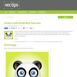
In the following easy tutorial, I’ll show you how to create a cute panda bear face icon all from ellipses (well, actually there is one rectangle for the background). The great part about this tutorial, is that you can easily apply the techniques to other icons, illustrations, logos, or other projects. Notes. How to Create a Cute Bunny Vector Character. In this Adobe Illustrator tutorial, I will show you how to create a cute bunny character.
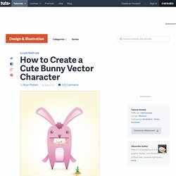
This tutorial uses simple shapes and gradients that are easy to apply to other character illustrations. The great thing about his tutorial is you don't have to be an amazing artist to create it! The Grid System. WhatTheFont! Lost Type Co-op. Build, Share, Download Fonts.
50 Best Free Fonts Having Commercial Use License - StumbleUpon. 10 Super Nice Fresh Free Fonts. Here at WDL we love to staying on the lookout for new freebies so we can show you the best out there. Pepakura Designer. Homepage. Paper Robot´s Paper Robots! Sketch-A-Day: Daily Sketches from Designer Spencer Nugent. Infographics & Data Visualizations. The Anatomy Of An Infographic: 5 Steps To Create A Powerful Visual. Information is very powerful but for the most bit it is bland and unimaginative.

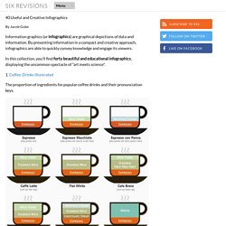
Infographics channel information in a visually pleasing, instantly understandable manner, making it not only powerful, but extremely beautiful. Once used predominantly to make maps more approachable, scientific charts less daunting and as key learning tools for children, inforgraphics have now permeated all aspects of the modern world. I designed a couple of infographics back in college, the need arising especially around the time Soccer World Cup fever spiked. It was a fun process representing the different groups, predicting winners in each group at each stage and creating a mock pairing of teams that would clash all the way leading upto the finals. I was a devout Argentinian supporter at the time. Infographics can appear daunting to some with the sheer amount of data they present, but designed in the right manner and step by step, they can actually be one of the most fun things you will ever create. 1. 40 Useful and Creative Infographics.
Six Revisions Menu Main Categories CSS HTML JavaScript.
Icon search engine and market place. Ready to Go Mo? Multi-Screen Resources Skip to content Make Your Website Work Across Multiple Devices Build a website that showcases your business on every screen from smartphones and tablets to computers and TVs.
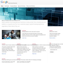
Your customers expect a great browsing experience regardless of what device they use. Whitepaper Building websites for the multi-screen consumer Learn about the most typical structures for multi-screen websites, with tips on how to create a great user experience and avoid some of the more common mistakes. Learn more. Case Study American Cancer Society mobilizes 7,000 web pages in one quarter The Society increased mobile visits by 250% and trippled mobile donations with a smart content strategy and deep understanding of visitor needs.
Read more. Case Study Baines & Ernst’s new site increase mobile conversions Baines & Ernst launched a Responsively Designed Site. Read more. Case Study Beyond the Rack’s mobile conversion rate doubles Read more. Case Study Plusnet sees traffic grow 2x and sales 10x Read more. Pragmatic UX Techniques For Smarter Websites. Advertisement What is “User Experience Design” exactly? Should you not start it unless you are fully dedicated, or should you embrace it in the process as soon as possible? Good day. Every day.