
Ggplot2 - r - Add significance level to correlation heatmap. Plotting lm and glm models with ggplot #rstats. Update I followed the advice from Tim’s comment and changed the scaling in the sjPlotOdds-function to logarithmic scaling.
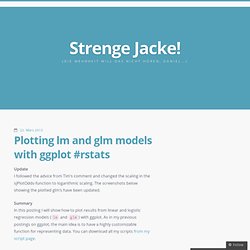
The screenshots below showing the plotted glm’s have been updated. Summary In this posting I will show how to plot results from linear and logistic regression models (lm and glm) with ggplot. As in my previous postings on ggplot, the main idea is to have a highly customizable function for representing data. You can download all my scripts from my script page. The inspiration source My following two functions are based on an idea which I saw at the Sustainable Research Blog. How to plot two histograms together in R.
Plotting means and error bars (ggplot2) This page was recently updated to reflect changes in the new version of ggplot2, 0.9.3.
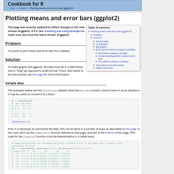
See Installing and using packages to make sure you have the latest version of ggplot2. Problem You want to plot means and error bars for a dataset. Introduction non élémentaire au logiciel R. From Data to Graphics. Sample dataQuantitative univariate dataOrdered univariate dataQualitative univariate variablesQuantitative bivariate dataQualitative/quantitative bivariate dataQualitative bivariate dataThree variables and moreMultivariate data, with some qualitative variablesFunTO SORT In this chapter, we explain how to turn data (heaps of numbers) into graphics, be they simple graphics for uni- or bi-variate data, or less straightforward ones, involving some linear algebra or non trivial algorithms.
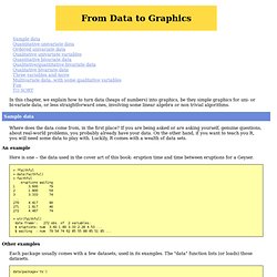
Sample data Where does the data come from, in the first place? If you are being asked or are asking yourself, genuine questions, about real-world problems, you probably already have your data. Legends (ggplot2) This page was recently updated to reflect changes in the new version of ggplot2, 0.9.3.
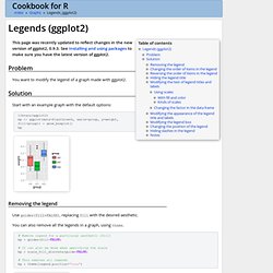
See Installing and using packages to make sure you have the latest version of ggplot2. Problem You want to modify the legend of a graph made with ggplot2. Solution Start with an example graph with the default options: Summer 2010 — R: ggplot2 Intro. Contents Intro When it comes to producing graphics in R, there are basically three options for your average user.

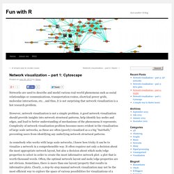
Network visualization – part 1: Cytoscape. # Plotting networks in R # An example how to plot networks and customize their appearance in Cytoscape directly from R, using RCytoscape package # Clear workspace rm(list = ls()) # Load libraries library("igraph") library("plyr") # Read a data set. # Data format: dataframe with 3 variables; variables 1 & 2 correspond to interactions; variable 3 corresponds to the weight of interaction.
Boxplot.tyerslab. Axes (ggplot2) This page was recently updated to reflect changes in the new version of ggplot2, 0.9.3.
See Installing and using packages to make sure you have the latest version of ggplot2. Problem You want to change the order or direction of the axes. Solution Note: In the examples below, where it says something like scale_y_continuous, scale_x_continuous, or ylim, the y can be replaced with x if you want to operate on the other axis. This is the basic boxplot that we will work with, using the built-in PlantGrowth data set. library(ggplot2) bp <- ggplot(PlantGrowth, aes(x=group, y=weight)) + geom_boxplot() bp Swapping X and Y axes Swap x and y axes (make x vertical, y horizontal): Discrete axis Changing the order of items Setting tick mark labels For discrete variables, the tick mark labels are taken directly from levels of the factor. Bp + scale_x_discrete(breaks=c("ctrl", "trt1", "trt2"), labels=c("Control", "Treat 1", "Treat 2")) Continuous axis Setting range and reversing direction of an axis Hiding gridlines.
Theme. ggplot2 0.9.2.1. Geom_text. ggplot2 0.9.3.1. P <- ggplot(mtcars, aes(x=wt, y=mpg, label=rownames(mtcars))) p + geom_text()
Mixing ggplot2 graphs with other graphical output · hadley/ggplot2 Wiki. Ggplot2 is based on Grid graphics, and is therefore mostly incompatible with standard R graphics functions.
In particular, par() is without effect to specify a layout (mfrow, etc.)idem for layout() and split.screen()standard R graphics such as plot(), image(), hist() will not easily be placed on the same device as a ggplot2 graph. The gridBase package may offer some help in this regard, however. Plot - Combine base and ggplot graphics in R figure window. Summer 2010 — R: ggplot2 Intro. Stat_density2d. ggplot2 0.9.3.1. Library("MASS") data(geyser, "MASS") Warning message: data set ‘MASS’ not found m <- ggplot(geyser, aes(x = duration, y = waiting)) + geom_point() + xlim(0.5, 6) + ylim(40, 110) m + geom_density2d() dens <- kde2d(geyser$duration, geyser$waiting, n = 50, lims = c(0.5, 6, 40, 110)) densdf <- data.frame(expand.grid(duration = dens$x, waiting = dens$y), z = as.vector(dens$z)) m + geom_contour(aes(z=z), data=densdf) m + geom_density2d() + scale_y_log10() Scale for 'y' is already present.
R - Plot correlation matrix into a graph. Boxplots in R. In this activity we show our readers how to create a boxplot in R. In preparation for this activity, we must first explore what statisticians call "measures of central tendency," specifically the mean and median of a data set. Measures of Central Tendency We first create a set of data that we will use throughout this activity. Although our data set is somewhat artificial, all of what we explain in this activity (as it relates to our data set) can also be applied to any set of data chosen by our readers. With this thought in mind, we enter our data set at the R prompt.