

(re)Brander sa startup – papernest. 8h02, mardi 17 octobre 2017, le coup d’envoi tant attendu est donné — c’est officiel et c’est dans le Journal du Net : Souscritoo lève le voile et devient (enfin !)
Papernest. Après 6 mois de travail acharné, de briefs créa, de moodboards, de pixel-perfect et de weekends passés sur Slack, notre jeune pousse germée en avril 2015 pouvait enfin éclore et fleurir dans un glorieux #5A52FF. C’était certes un moment de grande fierté, mais c’était également un grand soulagement, après avoir accumulé les retards et connu les affres du doute et de la frustration. Car pour une startup early stage, l’exercice du branding n’est pas facile : on sait qu’il est important, mais on sait que c’est un effort de long terme, et que les résultats s’en mesurent mal. On sait qu’il est structurant, mais que si jamais on pivote, il peut nous coincer. UX Design Defined. By Ritch Macefield Published: June 18, 2012 “In the field of user experience, people often confuse terms like information architecture, interaction design, visual design, usability engineering, and UX design.”
Unfortunately, in the field of user experience, people often confuse terms like information architecture, interaction design, visual design, usability engineering, and UX design. In some cases, people use these terms almost interchangeably. The Do’s and Don’ts of Dark Web Design. Dark web designs are very popular and can have an elegant and creative appeal.
They are also perfect for many types of client work however, they are not suitable for every website and should be used only when appropriate. In spite of the striking visual impact that these dark designs can have, many designers don’t know how to effectively pull them off without turning off the visitor. With a dark design comes less readability, less appeal for most readers and less opportunity for conventional design elements. Can I use... Support tables for HTML5, CSS3, etc. Why You Should Build A Sitemap Before Designing Your Site. Designing a new website can be a daunting process, only made more complicated by the volume of information that sometimes needs to be organized and incorporated.
Sure, designers might create wireframes and mockups to plan out the site before they get started, but what about non-designers? How do you get the structure of the site figured out before you turn everything over to your designer? A sitemap can be an effective planning tool for both designers and non-designers alike. The dirty dozen of e-commerce. The dirty dozen of e-commerce Written By: Jeremy Swinfen Green , Managing Director At the User Experience conference in Brighton yesterday Harry Brignull ( was talking about underhand online design tricks some of which he has started to list at darkpatterns.org .
Well, I won’t pretend that I agreed with all his examples – some, such as preventing people from comparing prices easily, seem to be legitimate standard marketing practices while others, like intertia marketing, are commonplace, if aggressive, tools. But he came up with some interesting examples in his talk and, importantly, suggested that it would be beneficial to agree a set of best practice guidelines that “ethical” websites could follow. Perhaps some form of kitemark could then be awarded to sites that comply with the guidelines. It’s a good thought. I think it is possible to exclude “black hat” SEO practices from a list of underhand practices because Google is perfectly able to police this itself.
13 E-Commerce Website Mistakes - 13 Bad Habits of eCommerce Stores. 3inShareinShare3 E-tailers have a lot to learn from traditional retailers.
It seems that well-known eCommerce sites get away with atrocious usability mistakes simply because the internet as a shopping medium is growing so fast. Web managers may think that because sales numbers are up they must be doing everything right. For many online stores, nothing is further from the truth. Below I’ve listed what I consider to be the worst practices of eCommerce sites these days. Requiring Login to Order: I would agree with Get Elastic’s Linda Bustos that this is one of many e-tailers’ favorite usability mistakes. No Calls to Action: Don’t just assume your visitors will click on your image maps or “Click Here” links. How to Design a Mobile Responsive Website. To build a mobile site or not to build a mobile site; this is a question at the forefront of many a discussion.
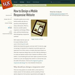
There is, however, another option: responsive web design. When, why, and how should you go about designing a responsive website? With mobile internet users set to surpass desktop internet users in the US by 2015, with tablets becoming more popular, and even with TV internet usage increasing, it’s important for companies to provide a great user experience for all their visitors no matter what device they’re on. 5 Tips to Improve Email Open Rates - Email Marketing Essentials. Is your message blending in or standing out in an inbox filled with emails?

Email marketing has become an essential part of engaging and targeting prospects and clients online. In fact, eMarketer reports that 97% of small businesses use email marketing to connect with customers. 10 Bizarre Things That Influence Customers Online. We know there are a lot of psychological factors that influence purchase behavior online and offline.
Here are just a handful of funny things that influence customers to behave the way they do: Bigger Buy Button It’s 2011, and by now you would think web users would be confident that every ecommerce site has an Add to Cart button, right? Why does color, size and even irregular shape have a proven, measurable impact on products added to cart, checkout initiation and checkout completion? The most likely answer is that big, bold, funky shaped buttons stand out and put the “call” in call-to-action. Mixed Case Ads According to testing by Mind Valley Labs and others, This Simple Tactic of capitalizing the First Letter of each word in your PPC headlines can Boost Click-Through Rate by 80%. Up To… Is it better to send an email promotion with “Sale! Twitter / Accueil. 30 e-commerce sites worth seeing. In this day and age, if you are not selling your product online or at least making it available online, you are missing out on a ton of money.
Unfortunately, the makers of these sites are most interested in making a dollar rather than making sense (did you catch the pun?). At any rate, some folks get the job down. 31 Extremely Impressive Web Icon Sets for Free. 31 Extremely Impressive Web Icon Sets for Free 13,185 views In Freebies by Sheila Mahusay Sep 28th, 2011 2 Comments Icons are one of the fundamental components of Graphical User Interface (GUI). In web applications, icons serve as an intuitive representation of hypertext links and quick navigation from a web page to another. Kiss.ly/rrITv1. Kiss.ly/qFeYen. What Impacts Web Form Conversion? There are many things you can do to improve the design of Web forms. But what can you do to really boost conversion?
Here’s a few case studies that illustrate how the removal, clarity, and even indication of requirements can have a real impact on form conversion. Removal of Requirements Every question you ask someone within a Web form forces them to decide what you are asking, come up with an answer, and then enter their answer into the affordance (form input) you have provided. Removing a question removes all of these considerations. A comparison study (PDF) of two Contact Us forms illustrates the point. 5 Ways To To Squeeze More Cash Out Of Your eCommerce Website. You have your shopping cart up and running, you’ve uploaded all your products and the website is finally starting to hum along nicely. Orders are coming in. But chances are, your e-commerce website can generate even more revenue. Here are five ways to make it happen. 1) Site speed In late 2010, Google announced that it would start to take the load time of your site into consideration when ranking your site in the overall organic search results.
Along with announcing this change, Google also launched Page Speed Online. The Anatomy of an Effective Homepage. As a general rule, your homepage will be the first encounter a visitor will have with your business. Great care, therefore, should be taken to design and structure your homepage so that readers will digest and act on your business message. Below we’ve identified certain qualities that compose an effective homepage.
We recommend you spend a few minutes with this infographic to see if your homepage’s current state is effective. Kiss.ly/qGmX3T. Why Rounded Corners are Easier on the Eyes. By anthony on 08/17/11 at 10:17 pm Designers use rounded corners so much today that they’re more of an industry standard than a design trend. They’re not only found on software user interfaces, but hardware product designs as well. So what is it about rounded corners that make them so popular? Les fautes d'orthographe coûtent cher sur Internet. Les fautes d’orthographe sur Internet font perdre beaucoup d’argent aux sociétés de vente en ligne, rapporte BBC News. When to Use White Text on a Dark Background.
By anthony on 04/28/11 at 11:11 am Many websites use black text on a light background to display their content because it’s easy to read. However, using white text on a dark background also has its advantages. Knowing when to use one over the other will allow you to safely apply these techniques to your design without hurting user readability. When it comes to text on websites, users either read or scan. Reading involves focusing on words for a thorough comprehension of the subject. Paragraph Text The kind of text that users read is paragraph text. White also reflects all wavelengths of light. That’s why a better choice for displaying paragraph text is black text on a light background with a tint of gray.