
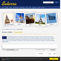
Geografia. Great Circle Mapper. Interactive Maps. Seterra/ geografispel. The game Europa: länder is available in the following languages: Seterra finns även som app för Android, iPhone och iPad !
I appen kan du följa dina egna framsteg via topplistorna, du kan spela utan internetförbindelse och du slipper se reklam! Johans geografilänkar - Geografilänkar. Geografi.nu - Foton från alla länder i världen. Free Vector Maps. Landguiden - länder i fickformat.
Världskarta. Blindkarta över Världen. Digitala kartor och källkritik. Digitala kartor förändrar undervisningen Den digitala tekniken har fullständigt revolutionerat användningen av kartor, inte minst inom skolans undervisning.
Tidigare var vi lärare hänvisade till de väggkartor som råkade finnas i klassrummet, de kartböcker skolan hade köpt in, de kartbilder som fanns i läroböckerna samt de köpta eller egenhändigt tillverkade overhead-bilder vi hade tillgång till. Antalet möjliga kartor att studera i klassrummet var därför starkt begränsat.
Genom internet och annan digital teknik har både lärare och elever tillgång till ett mycket stort antal kartor från i stort sett hela världen på ett sätt som var helt otänkbart tidigare. Allt fler webbplatser publicerar digitala kartor och läromedelsförlagen har också följt med i utvecklingen och erbjuder sedan flera år kartor i digitalt format på cd-skivor eller via förlagens webbplatser. Kompletterar de tryckta kartorna Hur kan vi bedöma trovärdigheten? Huvudsidan - Globalis.se.
Huvudsidan - Globalis.se. 38 maps that explain Europe. 40 maps that explain the world. By Max Fisher By Max Fisher August 12, 2013 Maps can be a remarkably powerful tool for understanding the world and how it works, but they show only what you ask them to.
So when we saw a post sweeping the Web titled "40 maps they didn't teach you in school," one of which happens to be a WorldViews original, I thought we might be able to contribute our own collection. Some of these are pretty nerdy, but I think they're no less fascinating and easily understandable. A majority are original to this blog, with others from a variety of sources.
I've included a link for further reading on close to every one. UCDP - Uppsala Conflict Data Program. Jordens befolkningstillväxt genom tiderna. En prick är en miljon människor.
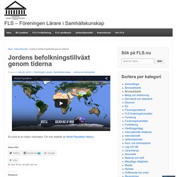
För mer statistik se World Population History Tagged with: befolkning, datavisualisering, jordens befolkning, världen, världsdata, världsstatistik, världsvisualisering Publicerat i Internationellt, läromedel, Material och stoff, Statistik. Earth. Atlas for a Changing Planet. Understanding natural and human systems is an essential first step toward reducing the severity of climate change and adapting to a warmer future.
Maps and geographic information systems are the primary tools by which scientists, policymakers, planners, and activists visualize and understand our rapidly changing world. Spatial information informs decisions about how to build a better future. Scroll down or click below to explore a sampling of maps from Esri's ArcGIS Online resource on these themes: 1. Understanding Natural Systems 2. 3. 32 maps that will teach you something new about the world. EVER THOUGHT TO YOURSELF, “How many smaller countries could you fit into Australia?”
Or possibly, “Which countries in the western hemisphere have legit secessionist movements?” Or, perhaps most pressing of all, “Where does it pay best to be a lifeguard?” Climate Change Knowledge Portal 2.0. The #1 reason people die early, in each country. You're probably aware that heart disease and cancer are far and away the leading causes of death in America.
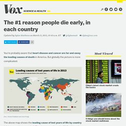
But globally the picture is more complicated: (Vox / Anand Katakam and Joss Fong) It's worth stressing that "cause of lost years of life" and "cause of death" aren't identical. For example, deaths from preterm births may cause more lost years of life in a country than deaths from heart disease even if heart disease is the leading cause of death. Deaths from preterm births amount to many decades of lost life, whereas heart disease tends to develop much later on. But that makes the fact that heart disease is the leading cause of lost life in so many countries all the more striking, and indicative of those countries' successes in reducing childhood mortality. On the flipside, the world is getting better in a great number of ways: 9 Excellent Free Map Creation Tools for Teachers and Students. 1- Umapper UMapper is a great mapping tool for educators.
Story Maps. 40 Maps That Will Help You Make Sense of the World. If you’re a visual learner like myself, then you know maps, charts and infographics can really help bring data and information to life. Maps can make a point resonate with readers and this collection aims to do just that. Hopefully some of these maps will surprise you and you’ll learn something new. A few are important to know, some interpret and display data in a beautiful or creative way, and a few may even make you chuckle or shake your head. If you enjoy this collection of maps, the Sifter highly recommends the r/MapPorn sub reddit. You should also check out ChartsBin.com. 1. 2. 3. 4. Pangea was a supercontinent that existed during the late Paleozoic and early Mesozoic eras, forming about 300 million years ago. 5. Map Projection Transitions. World by Map: Statistics, Maps and Charts.
World by Map: Statistics, Maps and Charts.