
3 questions to ask yourself next time you see a graph, chart or map. Since the days of painting on cave walls, people have been representing information through figures and images.
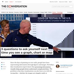
Nowadays, data visualization experts know that presenting information visually helps people better understand complicated data. The problem is that data visualizations can also leave you with the wrong idea – whether the images are sloppily made or intentionally misleading. Take for example the bar graph presented at an April 6 press briefing by members of the White House Coronavirus Task Force. It’s titled “COVID-19 testing in the U.S.” and illustrates almost 2 million coronavirus tests completed up to that point. President Trump used the graph to support his assertion that testing was “going up at a rapid rate.” The graph shows the total cumulative number of tests performed over months, not the number of new tests each day. As a researcher of hazard and risk communication, I think a lot about how people interpret the charts, graphs and maps they encounter daily. Misleading graph. Graph that misrepresents data In statistics, a misleading graph, also known as a distorted graph, is a graph that misrepresents data, constituting a misuse of statistics and with the result that an incorrect conclusion may be derived from it.
Graphs may be misleading through being excessively complex or poorly constructed. Even when constructed to accurately display the characteristics of their data, graphs can be subject to different interpretation, or unintended kind of data can seemingly and ultimately erroneously be derived.[1] Misleading graphs may be created intentionally to hinder the proper interpretation of data or accidentally due to unfamiliarity with graphing software, misinterpretation of data, or because data cannot be accurately conveyed. Misleading graphs are often used in false advertising.
The field of data visualization describes ways to present information that avoids creating misleading graphs. Misleading graph methods[edit] --How to Lie with Statistics (1954)[2] where. Misleading Graphs: Real Life Examples - Statistics How To. Descriptive Statistics > Misleading Graphs Real Life Examples Misleading Graphs in Real Life: Overview Misleading graphs are sometimes deliberately misleading and sometimes it’s just a case of people not understanding the data behind the graph they create.
The “classic” types of misleading graphs include cases where: The Vertical scale is too big or too small, or skips numbers, or doesn’t start at zero.The graph isn’t labeled properly.Data is left out. But some real life misleading graphs go above and beyond the classic types. Misleading Graphs: The Missing Baseline. The Times leaves the rest behind…or does it? You might be thinking that the graph on the right shows The Times makes double the sales of The Daily Telegraph. USA Today USA today is notorious for fussy graphs that have too much information and mislead. This one has the correct figures, but that BIG HEADLINE makes you think that 5.3% of children get spinal cord injuries…a pretty scary statistic for parents: Those d%$n Liberals! Data Is Ugly. 5 Ways Writers Use Misleading Graphs To Manipulate You [INFOGRAPHIC] In this post-truth era, graphs are being used to skew data and spin narrative like never before.
Especially with the velocity at which some of these topics spread across social media. All it takes is a single graph from a less-than-reputable source, blasted out to a list of followers, to spread a false narrative around the world. We have already seen this happen many times during the COVID-19 response, which is why we added a new section featuring a few of those misleading graphs! Now the data doesn’t even have to be bad–it could just be presented in a misleading way. I mean, there is a whole Wikipedia page, Reddit community, and hundreds of articles about how graphs can be used to misinform readers. Now, I can’t make these data-skewing creators stop, but I can help you spot these misleading graphs when they crop up. Not a designer? Also, following data visualization best practices ensures that your graphs are always clear and understandable.
Use the links below to jump to each section: 1. Graphs can be misleading.