
Typography in 7 Minutes: A PBS Micro-Documentary. By Maria Popova Visibility, invisibility, and what the spirit of letters has to do with the meaning of text.

On Monday, we featured 10 essential books on typography. Today, we turn to this fantastic short documentary on, you guessed it, typography from the excellent Off Book series by PBS Arts. In just 7 minutes, the film explores type — ubiquitous yet often unnoticed and misunderstood — through the work of some of today’s most iconic type designers and freshest voices, from Brain Pickings favorite Paula Scher to our friends at Hyperakt, masters of the infographic form, as well as legendary duo Jonathan Hoefler and Tobias Frere-Jones, and Pentagram prodigy Eddie Opara.
Words have meaning and type has spirit, and the combination is spectacular.” ~ Paula Scher The most challenging part of working on an infographic is taking all the available data and deciding what is the most important bit of information that we need to communicate. Divina proportione : opera a tutti glingegni pe... Butterick’s Practical Typography.
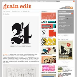
Kern Type, the kerning game. How To Use Bitmap Tiff Textures in Adobe Illustrator. Long Exposure Techniques. FROM PAPER TO SCREEN. Grain editIll Studio. Ill Studio is a Parisian design studio with an incredibly experimental edge.
They have just released a massive update featuring some beautiful typography-based projects. I’ve been a fan of theirs for years, and love their effortless propensity for creating an inspiring and very new set of work. With each new iteration of their portfolio they get better & better at honing their craft, while maintaining a very specific nod to the past with classic styling and type choices. Beyond Helvetica: The Real Story Behind Fonts in iOS 7. This article by Jürgen Siebert was first posted on June 17, 2013 to the German Fontblog.de.
The English translation for Typographica.org is by Maurice Meilleur. There was no shortage of long-distance diagnoses of the typography in Apple’s recently presented mobile interface, iOS 7. The live-streaming keynote address from the WWDC developer’s conference last Monday hadn’t even started before the first typophiles started sharing their concerns on Twitter. The day before the announcement, our friend Stephen Coles was already deeply worried about the light weight of Helvetica on the display banners hanging at the WWDC venue in San Francisco: The next morning former New York Times art director Khoi Vinh compared the look of the new iOS to a cosmetics department: And two days later, Thomas Phinney (formerly in the type team at Adobe) also took iOS 7’s typography to task:
Digitizing Hand Lettering: From Sketch to Vector. Do you love making hand lettering, but feel that there must to be a better way to approach digitizing your work?

I want to show you the methods and processes I've discovered for getting the best results when converting hand lettering into digital format. I'm going to share the different techniques I use for various types of projects so you can apply what works best for you. BRIEM.NET. Guide to Typestyles: Didone Typefaces. Didone typefaces (also referred to as Neoclassical and Modern) enjoyed great popularity from the late 18th through the 19th centuries.
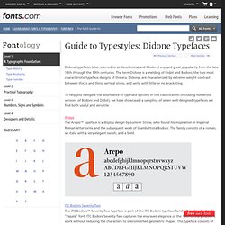
The term Didone is a melding of Didot and Bodoni, the two most characteristic typeface designs of this era. Didones are characterized by extreme weight contrast between thicks and thins, vertical stress, and serifs with little or no bracketing. To help you navigate the abundance of typeface options in this classification (including numerous versions of Bodoni and Didot), we have showcased a sampling of seven well-designed typefaces we find both useful and versatile.
Claire Coullon // Graphic Design & Typography Portfolio. Typographic Sketchbook on Behance. Type and Media. Image: Graduation project 'Covik' | James Edmondson, Master TypeMedia 2014, Nominee Department Award In September 2002 the Royal Academy of Art in The Hague started its post-graduate course in Type and Media, formerly the course in Type Design and Typography.
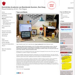
It is a full-time one year course that gives participants the possibility of delving deeper in type design for different media: not only type for print, but also for film, television, video and interactive media. Although we live in an increasingly pictorial culture, type design and typography have lost none of their value. Since its Accreditation it is a Master of Design in Type and Media. At Type and Media, students work intensively in small groups of no more than twelve persons. TypeMedia TypeCooker Digitisation. © 2004-2012, v.8, TypeCooker is a project by Erik van Blokland, LettError.com TypeMedia.org This is the process of reconstructing drawn shapes in digital lines and splines.
This process is not necessarily exclusive to the TypeCooker assignment, any kind of shape can be drawn using Bezier paths. The most common way to draw curves with modern software is using Bezier paths. Many programs use Bezier paths, you can find them in (for instance) Illustrator and PhotoShop, but also in specialised font programs as FontLab and Fontographer. Shillington Graphic Design Blog - No more 4 letter words with 3 letter kerning technique. Category: Blogs, Design / Typography, Resources / Educational, Resources / Online Tutorials, Resources / Reference, Posted by: Lee Posted: Sep 19th 2011 No. of comments: 0 Great article on Kerning via www.creativepro.com.
Sign Painters: What a Disappearing Art Teaches Us About Creative Purpose and Process. By Maria Popova “It is at the moment o f a craft’s disappearance that its cultural value suddenly becomes plain to see.”
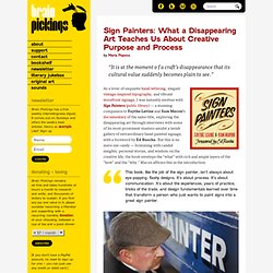
As a lover of exquisite hand-lettering, elegant vintage-inspired typography, and vibrant storefront signage, I was instantly smitten with Sign Painters (public library) — a stunning companion to Faythe Levine and Sam Macon’s documentary of the same title, exploring the disappearing art through interviews with some of its most prominent masters amidst a lavish gallery of extraordinary hand-painted signage, with a foreword by Ed Ruscha.
But this is no mere eye candy — brimming with candid insights, personal stories, and wisdom on the creative life, the book envelops the “what” with rich and ample layers of the “how” and the “why.” Macon affirms this in the introduction: Five Simple Steps - Welcome. TYPO Talks » Blog Archiv » Erik Spiekermann: Life is in Beta. Anne Ulku. Montague Script. Montague Script takes its name from a small hilltown of western Massachusetts rich in culture and history.
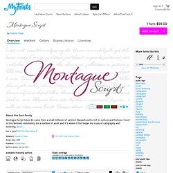
I lived in this beloved community for a number of years and it’s where I first began my study of calligraphy and lettering. More… While most brush scripts take their cue from mid-twentieth century samples, Montague Script is a fresh, contemporary alternative. It comes directly from lettering written with a #3 sable brush on smooth vellum and is digitized with the same sensibility a lettering artist writes with. Montague reflects a dynamic interplay between form and rhythm not usually associated with type. Montague Script is a natural for advertising, point of purchase displays, packaging and logo design, cards, invitations, journals and much more.
Distinguishing differences between a didot and a bodoni. The Type Studio. Typographic Checklist March 26th, 2013 I always recommend that designers and students make a typographic checklist to help avoid committing type crimes, as well as to aid in finessing their typography.
At long last, I finally created a checklist that covers issues I’m most frequently […] ALL CAPS: To set or not to set? March 23rd, 2013. 54 Typography Resources Every Designer Should Bookmark. 54 Typography Resources Every Designer Should Bookmark If you are a web designer, or a passionate CSS hobbyist, you must be aware of the impact well structured typography can have on your overall design. Though, optimizing your typography to work on old and new versions of plethora of web browsers on various operating systems can prove to be quite a headache. Typography Tips, History of Typography. Type Worship — Wireframe letters These delicately structured... DUNWICH TYPE FOUNDERS. This FAQ covers typeface/font design. It should be regarded a work in progress and not as a replacement for serious study or hands-on training. Education. Type and Media Master at the Royal Academy of Art. Typefaces by Category. We carry over 150,000 fonts in every style and category.
Browse by the general type categories in this list or fine tune your search using the subcategories below. Subclass » Genre » Webfonts » Alternatives » New Fonts » Classification Vox-Atypi. Wiescher Design. Création de typographies: Romain du Roi: Épreuve des caractères de l’Imprimerie royale (1760) On snot and fonts. Africa: ⦿ Africa ⦿ Berber ⦿ Coptic ⦿ Egypt ⦿ Hieroglyphics ⦿ Mauritius ⦿ Morocco ⦿ Other ⦿ South-Africa ⦿ Tunisia Oceania: ⦿ Australia ⦿ Maori ⦿ New Caledonia ⦿ New Zealand ⦿ Rongo Rongo Europe + the old USSR: ⦿ Albania ⦿ Austria ⦿ Basque ⦿ Belarus ⦿ Belgium ⦿ Bosnia ⦿ Bulgaria ⦿ Catalunya ⦿ Celtic/Gaelic ⦿ Croatia ⦿ Cyprus ⦿ Cyrillic ⦿ Czechia ⦿ Denmark ⦿ Eastern European ⦿ Esperanto ⦿ Estonia ⦿ Finland ⦿ France ⦿ Georgian ⦿ Germany ⦿ Greece ⦿ Greek ⦿ Hungary ⦿ Iceland ⦿ Ireland ⦿ Italy ⦿ Kazakhstan ⦿ Kosovo ⦿ Kyrgyzstan ⦿ Latvia ⦿ Liechtenstein ⦿ Lithuania ⦿ Luxemburg ⦿ Macedonia ⦿ Malta ⦿ Moldova ⦿ Montenegro ⦿ The Netherlands ⦿ Northern Ireland ⦿ Norway ⦿ Ogham ⦿ Old Italic ⦿ Poland ⦿ Portugal ⦿ Romania ⦿ Russia ⦿ Scotland ⦿ Serbia ⦿ Slovakia ⦿ Slovenia ⦿ Spain ⦿ Sweden ⦿ Switzerland ⦿ Turkey ⦿ United Kingdom ⦿ Ukraine ⦿ Uzbekistan ⦿ Wales Far East: ⦿ China ⦿ Hong-Kong ⦿ Japan ⦿ Korea ⦿ Macao ⦿ Mongolia ⦿ Taiwan.
Search Results: Items matching typography (results page 2) Type: Note to Teachers. Typography. Typography Terms. Basic Typography Terminology – Basic Terminology in Typography. Typography // ABC's & 123's. Download fonts from classic to cool - Linotype.com. Typographic Design: Form and Communication, 5th Edition. ISTD Members - International Society of Typographic Designers. Chris MacGregor's Internet Type Foundry Index.
Typographic Design: Form and Communication 4th Edition. Handwritten Typographers. Hit pause for a moment and consider how greatly we – people in the digital age – are indebted to typographers. Almost all of our visual communication is delivered using the products of their craft: newspapers, SMSes, instant messages, emails, web pages, signs, posters, billboards; the list of purposes is endless. In these days where looping strokes have been replaced by keyboard clickety-clack, typographers define the style and tone of our missives. Would you like to be elegant, modern, childish or ... disturbed? Then you can choose between Garamond, Montag, Comic Sans, Zebraflesh, and a thousand more. There's great power in a typeface, but what's always interested me more than the typeface is the designer behind it – why did they create the typeface? Lately, I've been asking just one question, though.
The handwriting of typographers intrigues me because it raises so many questions, big and small: Do typographers exert some extraordinary control of the pen that laypersons don't? James T. Edmondson. // The Chic-Type Blog. Country Maps Made From Their Iconic Foods I have to admit Buzzfeed is an addiction of mine. Welcome to joeyponce.com » Typographic Illustrations. Mastering Type. FontExplorer X Pro 3.0. Typography: Lesson TWO. S Best Photos of woodtype. H&FJ News. Share Your Passion by Hamrick. TypeDecon (typedecon) Fonts, Typography, Lettering, Design. Doyald Young. Letterpress stationery & awesome papergoods by orangebeautiful. Doyald Young, Logotype Designer. Becoming a teacher. Sort of a Chalky Little Wine Label. KarenKavett.com. Thinking with Type. A lesson on typography. Et Lettera. ABCDEFridays. Keep Calm Gallery.
Beautiful Type. About.