
DataVis.ca. R code style guide. How to format plots for publication using ggplot2 (with some help from Inkscape) The following is the code from a presentation made by Rosemary Hartman to the Davis R Users’ Group.
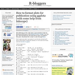
I’ve run the code through the spin function in knitr to produce this post. Download the script to walk through here. First, make your plot. I am going to use the data already in R about sleep habits of different animals. It’s the same one Noam used for his intro to ggplot. library(ggplot2) str(msleep) Let’s say we have written a groundbreaking paper on the relationship between body size and sleep time. Sleepplot = ggplot(data = msleep, aes(x = log(bodywt), y = sleep_total)) + geom_point(aes(color = vore)) sleepplot We made a beautiful model of this relationship slp = lm(sleep_total ~ log(bodywt), data = msleep) summary(slp) ## ## Call: ## lm(formula = sleep_total ~ log(bodywt), data = msleep) ## ## Residuals: ## Min 1Q Median 3Q Max ## -6.499 -2.567 -0.168 2.047 10.193 ## ## Coefficients: ## Estimate Std.
Let’s put the model on the plot It’s beautiful! So we have several problems: Oh, crap! ?? ? Fantastic presentations from R using slidify and rCharts. Dr.
Ramnath Vaidyanathan of McGill University gave an excellent presentation at a joint Data Visualization DC/Statistical Programming DC event on Monday, August 19 at nclud, on two R projects he leads — slidify and rCharts. After the evening, all I can say is, Wow!! It’s truly impressive to see what can be achieved in presentation and information-rich graphics directly from R. Again, wow!! (I think many of the attendees shared this sentiment) Slidify Slidify is a R package that helps create, customize and share elegant, dynamic and interactive HTML5 documents through R Markdown. We have blogged about slidify, but it was great to get an overview of slidify directly from the creator. You start with a modified R Markdown file as seen here. One really neat feature he demonstrated is the ability to embed an interactive R console within a slidify presentation. rCharts rCharts is an R package to create, customize and share interactive visualizations, using a lattice-like formula interface.
rCharts. rCharts is an R package to create, customize and publish interactive javascript visualizations from R using a familiar lattice style plotting interface.
Installation You can install rCharts from github using the devtools package require(devtools)install_github('rCharts', 'ramnathv') Features The design philosophy behind rCharts is to make the process of creating, customizing and sharing interactive visualizations easy. Create rCharts uses a formula interface to specify plots, just like the lattice package. ## Example 1 Facetted Scatterplotnames(iris) = gsub("\\ Customize rCharts supports multiple javascript charting libraries, each with its own strengths. GGPLOT2. Ggplot. had.co.nz. Package NeatMap.