
The Great Wave of Kanagawa. The Great Wave off Kanagawa The Great Wave off Kanagawa (神奈川沖浪裏) is one of the most well-known Japanese prints of all time.
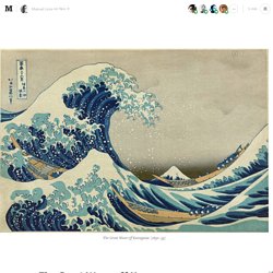
It’s also a great metaphor for better understanding the diverse nature of data visualization. Created around 1830 by Japanese artist Katsushika Hokusai (1760–1849), The Great Wave is a remarkable example of the ukiyo-e style, an expressive genre of woodblock printing that flourished in 17th-century Japan. Due to its widespread popularity, there’s hardly anyone who cannot immediately recognize the painting, but when it comes to its portrayed subject, the understanding is often not as clear.
Due to Japan’s historical vulnerability to tsunamis — a word itself of Japanese origin (tsu “harbor” + nami “wave” 津波) — and the painting’s explicit title, some believe The Great Wave aims at depicting the mighty force of a tsunami, or perhaps the fishermen’s struggle with the sea. 5 Methods for Visualizing Unstructured Data. World Map of Social Networks. January 2017: a new edition of my World Map of Social Networks, showing the most popular social networking sites by country, according to Alexa & SimilarWeb traffic data (caveat: it’s hard to understand the impact of Google+ because it is part of Google domain traffic).
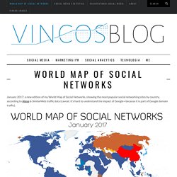
There are a lot of news since last January: Facebook is still the leading social network in 119 out of 149 countries analyzed, but it was stopped in 9 territories by Odnoklassniki, Vkontakte and Linkedin. It’s interesting to see that in some countries, like Botwana, Mozambique, Namibia, Iran e Indonesia, Instagram wins and that some African territories prefer LinkedIn. Overall LinkedIn conquers 9 countries, Instagram 7, meanwhile VKontakte and Odnoklassniki (part of the same group Mail.ru) grow up in Russian territories. In China QZone still dominates the Asian landscape with 632 million users and Japan is the only country where Twitter is the leader. 10 Awesome Tools To Make Infographics. Advertisement Who can resist a colourful, thoughtful venn diagram anyway?

In terms of blogging success, infographics are far more likely to be shared than your average blog post. This means more eyeballs on your important information, more people rallying for your cause, more backlinks and more visits to your blog. In short, a quality infographic done well could be what your blog needs right now. Tree Visualization. Links and reference. 38 Tools For Beautiful Data Visualisations. As we enter the Big Data era, it becomes more important to properly expand our capacity to process information for analysis and communication purposes.
In a business context, this is evident as good visualisation techniques can support statistical treatment of data, or even become an analysis technique. But also, can be used as a communication tool to report insights that inform decisions. Revelation. Word Tree. The Data Visualisation Catalogue. 15 Tools Every Social Media Manager Should Use. This post was originally published on Feb 4, 2014 Smart businesses know that social media is a power to be reckoned with: social media channels create a direct line of communication between your company and consumers and give anyone with an Internet connection instant access to the latest buzz around your products or services.
Not to mention, they can help you to generate revenue, while building your brand presence. Let that marinate for a second. This potential for a triple treat is no task to walk into empty handed or unprepared. Unless you want to turn your social media endeavors into a triple threat, you should develop a strategy, based on as much knowledge as possible about your audience and their behavior. The 16 tools below will help you and your social media manager take on the complexity of the job. 1. Pricing: Free 2. This free, easy-to-use Twitter management tool allows you to oversee all aspects of your Twitter account(s) in one interface. Playlist: 6 beautiful talks by data artists. In the information age we have access to more data and knowledge than at any previous point in human history.
But more accessible data doesn’t necessarily mean more processable data — tax returns, court cases and newspaper archives may be available to the public, but they are often hard to interpret and understand. Data artists process this mess of information for us and break it down into comprehensible pieces, often enhancing it by placing it in deeper contexts and by finding surprising patterns. The designers and artists below are on the cutting edge of this work, experimenting with new technologies to take numbers and facts and turn them into beautiful multimedia works of art and knowledge.
Information Visualization Manifesto. Posted: August 30th, 2009 | Author: Manuel Lima | Filed under: Uncategorized | – “The purpose of visualization is insight, not pictures” Ben Shneiderman (1999) – Over the past few months I’ve been talking with many people passionate about Information Visualization who share a sense of saturation over a growing number of frivolous projects.
The criticism is slightly different from person to person, but it usually goes along these lines: “It’s just visualization for the sake of visualization”, “It’s just eye-candy”, “They all look the same”. When Martin Wattenberg and Fernanda Viégas wrote about Vernacular Visualization, in their excellent article on the July-August 2008 edition of interactions magazine, they observed how the last couple of years have witnessed the tipping point of a field that used to be locked away in its academic vault, far from the public eye. Even though a clear divide is necessary, it doesn’t mean that Information Visualization and Information Art cannot coexist. David McCandless: The beauty of data visualization. Hans Rosling: The best stats you've ever seen. Datavisualization.ch Selected Tools.
A Periodic Table of Visualization Methods. Tableau. The top 20 data visualisation tools. Perceptual Edge - Library. Contents Books Articles Whitepapers Other Brief Publications Books.

Create and share visual ideas online. Visualization Options. Visual Literacy for Management by Sabrina Bresciani on Prezi. Over 100 Incredible Infographic Tools and Resources (Categorized) This post is #6 in DailyTekk’s famous Top 100 series which explores the best startups, gadgets, apps, websites and services in a given category.

Total items listed: 112. Time to compile: 8+ hours. Follow @DailyTekk on Twitter to make sure you don’t miss a week! DataVisTools. Tableau. Infographic tools. Most Popular Infographics.