
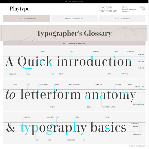
https://playtype.com/index.php?q=about/typefaces/glossary
Related: TypoTuesday's Tech of the Week: Type & Color Edition Since the world of design is about to get quite a bit cloud-ier with the release of Adobe Creative Cloud, we decided to take today's tech roundup to pay homage to 10 websites, apps, and games that help designers become better designers. As purveyors of color, creativity, and tech innovation, our team refers to almost all of these sites on a weekly basis! First, the world of type. 1. Kern Type: A Kerning Game: This kerning game is great for helping designers practice the art of type kerning. If you don't know what kerning is, it is the art of making sure all the letters in a given word are evenly spaced.
The making of an action hero body - Entertainment - Movies When I was hired to train an actor for an action film, the studio executives would express how important it was to transform their body so they looked like an action hero. That's why I made the decision to utilize the same method of dieting and training I used to win many of my champion body building competitions. Matt Damon and Kevin Spacey were extremely excited to work with me, which made my job a lot easier than it had been with some of my other celebrity clients. I have the actors do weight training in the morning and cardio at night. The purpose of separating the weight training and cardiovascular training for 6 to 9 hours is because weight training causes the body to secrete anabolic hormones (muscle building) and cardiovascular exercises cause the body to secrete catabolic hormones (fat burning). This way my client got the most effective results from their workouts and fast results.
How to To Make Your Food Taste Awesome Posted by admin on Aug 19, 2012 in Food Preparation | 211 comments In case you are not skilled with the food recipes and preparation, listed bellow are some of the easy food tips to make your meals delicious easy way. No matter you prepare breakfast, dinner or just a snack, the easy food tips are here to make your food even more attractive and awesome. Idea by Janice Kamide Images Source BuzzFeed 12 Top Quality Photoshop Light Effect Tutorials Below are a few Photoshop light effect tutorials that have caught my eye while looking over the tutorial sites, for me these produce the best results while using brushes, blurs and other media such as textures to create a top quality effect. Create Awesome Abstract Nebula Circle Shape in Photoshop Covers using filters with textures such as the twirl filter and warp filter with a Nebula star texture making for impressive results. Create a Colorful Aged Poster With Special Lighting Effects
How Typography Affects Conversions As an Internet marketer, conversion is our bread and butter. I can guarantee you spend a large part of your time pondering ways to optimize landing pages. Things like copy and design are the obvious features we all like to play around with. But there is one element often underestimated in its affect on conversions. I am talking about typography. For most marketers, it is an unknown topic, but its importance in marketing has been scientifically proven.
21 Fonts That Shouldn’t Be Free…But Are! 21 Fonts That Shouldn’t Be Free…But Are! 13 July 2009 by Jordan Hall Using the right type in your designs, both in type and web, is vital to an attractive and successful design. With so many free fonts out there (Da Font currently has over 9000 fonts to choose from) it’s hard to wade through the varying levels of quality available. We’ve picked out some great fonts that shouldn’t be free, but are! 1. 5,000 Free Loops – Drums, Guitar , Orchestra, Heavy Metal, & More - Hip Hop Makers Here are over 3 gigabytes of free loops of drum samples, guitar loops, Dubstep loops, bass loops, Hip Hop loops, and many more free loops. Please share this post and follow us to show support. New free downloads added weekly. Get our free newsletter. Free Loops to Download
Chalkboard Wall Calendar - Martha Stewart Home & Garden Thanks to paint that dries into a chalkboard finish, your board can be whatever size you desire and placed wherever you like. Store-bought formulas come in traditional green and black. But you can also follow our recipe to mix your own batch in any shade. Cleverly applied chalkboard paint means new places to track appointments, keep lists, and leave messages. Or simply use the surface to draw or doodle, which will appeal to kids and the kid in everyone. Choose from the following ideas or come up with your own homemade chalkboard location.
Create a Badass Gas Mask in Illustrator Hi everyone, it's been a while since I dropped my last illustrator tutorial and so I decided to teach a really classy lesson this time. I've been a huge fan of vector art ever since I started working as an art director then as an illustrator. And I always appreciated the work of some of the masters like Pale Horse Design, Hydro 74 and Chris Vector. Their extremely detailed illustrations are really eye catching and sharp, I always wanted to understand how they do that. Years and lots of hours of illustrating later, I think I can finally understand aspects such as sketching, outlining, shading, hachures and filling that are most used to make great artworks. So, today we are going to learn how to create this gas mask using only vectors.
Design Charts for Better Typography and Color - Noupe Design Blog Mar 21 2011 We’re designers, so it makes sense that a lot of us are visual learners and do better looking at charts and graphs than reading an article or listening to a podcast. Typography and color are two great topics that are perfectly suited for infographics, charts, and other graphical learning tools. Below we’ve collected a good number of great infographics that will teach you how to use typefaces and colors effectively.