
Textwrap: June 2012. The Barbican Gallery in London is currently hosting 'Art As Life' - the biggest Bauhaus exhibition in the UK in over 40 years, and as part of our continuous professional development, the department has sanctioned a number of tutor visits to see it. 'Art As Life' is a visual narrative of the most influential art school of the last century, and features art, architecture, print design, textiles, film, interior & industrial design, and of course typography.
The exhibition documents the amazing experimentation that the school pioneered, and shows how the political landscape of Germany in the Weimar years influenced the movement and its teachings. The work on display also explains how the eventual breakup of the Bauhaus (at the hands of the National Socialists), ensured that its founders dispersed to other parts of Europe and the USA to spread the teachings of the school and set the blueprint for modern architecture and visual communication. Font-Wiki. Die von Paul Renner in den 1920er-Jahren geschaffene Futura gehört zu den bekanntesten und einflussreichsten Schriften des 20.
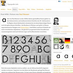
Jahrhunderts. Zu Beginn dieses Jahrhunderts dominierten im deutschsprachigen Raum noch die gebrochenen Schriften. My Dictionary. Joost Schmidt. News. Wunderkammer Carte blanche to graphic designer Marian Bantjes Musee de design et d'arts appliques contemporains mudacPl Cathedrale 6, Lausanne, Switzerland From July 2, 2014 to October 5, 2014 Marian Bantjes is a graphic designer, typographer, illustrator and blogger.
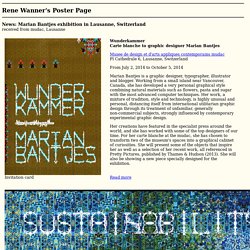
Working from a small island near Vancouver, Canada, she has developed a very personal graphical style combining natural materials such as flowers, pasta and sugar with the most advanced computer techniques. Her work, a mixture of tradition, style and technology, is highly unusual and personal, distancing itself from international utilitarian graphic design through its treatment of unfamiliar, generally non-commercial subjects, strongly influenced by contemporary experimental graphic design. Her creations have featured in the specialist press around the world, and she has worked with some of the top designers of our time. Quad typeface. Description: Quad typeface is applicable for any type of graphic design – web, print, motion graphics etc and perfect for t-shirts and other items like logos, pictograms.
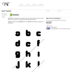
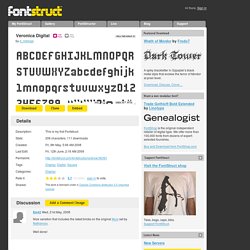
Format: Opentype (.otf) Compatible: PC & Mac Details: Manual Kerning, Tracking / Pairs Price: free /View License/ < Back With your donation we’ll be able to spend more time to improve and update our free fonts. Digital System. Digital Gothic. LED Digital 7. Digital 7. Digitalis. Continuous Digital Display. I Am An Alarm Clock. Veronica Digital. The designer of this FontStruction has chosen not to make it available for download from this website by choosing an “All Rights Reserved" license.
Please respect their decision and desist from requesting license changes in the comments. If you would like to use the FontStruction for a specific project, you may be able to contact the designer directly about obtaining a license. Copy the HTML from the box below and paste it into your website or blog. Hide HTML. Scoreboard Digits. Digitalis Obscura. Digitalis. The designer of this FontStruction has chosen not to make it available for download from this website by choosing an “All Rights Reserved" license.
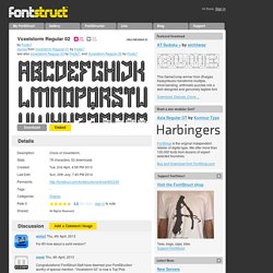
Please respect their decision and desist from requesting license changes in the comments. If you would like to use the FontStruction for a specific project, you may be able to contact the designer directly about obtaining a license. Copy the HTML from the box below and paste it into your website or blog. Voxelstorm Regular 02. DownloadEmbed.
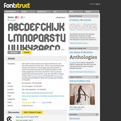
Soma. DownloadEmbed.
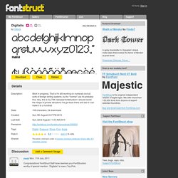
Foldstruct. The designer of this FontStruction has chosen not to make it available for download from this website by choosing an “All Rights Reserved" license.
Please respect their decision and desist from requesting license changes in the comments. If you would like to use the FontStruction for a specific project, you may be able to contact the designer directly about obtaining a license. Copy the HTML from the box below and paste it into your website or blog. Hide HTML. Ecthelion. DownloadEmbed The designer of this FontStruction has chosen not to make it available for download from this website by choosing an “All Rights Reserved" license.
Please respect their decision and desist from requesting license changes in the comments. If you would like to use the FontStruction for a specific project, you may be able to contact the designer directly about obtaining a license. Copy the HTML from the box below and paste it into your website or blog. Hide HTML. Typography Archives. Above is the business stationery that Robert Brownjohn designed in 1967 for photographer, Michael Cooper. Another example of conceptual art’s influence on graphic design. Rather than designing stationery with a logo and the usual typographic arrangement of name & address, Brownjohn labels each part of Cooper’s stationery system—letterhead, business card & label—with a conceptual-art-style declarative statement, which happens to include Cooper’s name & address. Letters of latin alphabet - matrix board font, 32850, Design elements, download Royalty-free vector clip art (eps)
Jakob Straub. Zuzana licko. WORKSHOP TYPO - Nathalie Favaro. Création d'un alphabet typographique visant à développer les possibilités de création à partir d'une seule et même grille de base. Il s'agit donc d'explorer les nombreuses possibilités qu'offre une telle grille, partant d'un alphabet dénué de tout artifice et allant vers un alphabet de plus en plus complexe, touchant même à l'illustrait.
La Basic_typographie modulaire _Superscript_ La Basic_typographie modulaire _Superscript_ Digital (ICG) 17:43 - LINETO – INVENTORS OF THE ALPHABET™ - 00:00. Les caractères modulaires. Les caractères modulaires sont construits à partir d’une ou de plusieurs formes simples, combinée(s) de façon à recréer tous les signes de l’alphabet. Ce sont des titrages, le plus souvent obtenus à partir de formes géométriques, le jeu étant de réduire au maximum le nombre d’éléments de base. Recherche personnelle pour une installation. Au Bauhaus (1919-33), Herbert Bayer, ancien élève de Kandinsky et Moholy Nagy, poursuit l’élaboration d’une théorie basique de la typographie, reposant sur la clarté, la lisibilité et l’impact visuel.
La lettre doit revêtir une forme internationale, universelle et se libérer des connotations culturelles restrictives. Isotype - Animated Typeface.