
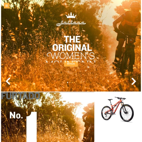
http://www.julianabicycles.com/
Magic Leap Hollywood, Florida February 5, 2014 - Magic Leap, Inc., a developer of novel human computing interfaces and software, announced today the recent closing of its A round of venture capital. Magic Leap has now raised more than$50 million in its series seed and A rounds to develop its proprietary technology platform. Magic Leap will use the funds to advance the product development and commercialization of its proprietary humancomputing interface technology, known as Cinematic Reality™. “Magic Leap’s mission is to develop and commercialize what we believe will be the most natural and human-friendlywearable computing interface in the world. What is remarkable is how well the human body and mind respond whentechnology respects biology, so truly magical experiences become possible.
The Story of Our Company - The Making of Teehan+Lax Growth 2004–2009 We moved to a larger office in 2005. We took a five year lease, which now eclipsed the printer as our biggest commitment. The office was 4000 sq ft. Kontrapunkt We’re happy to announce that we welcome three new partners to Kontrapunkt’s partner group: Head of Consumer Design, Mikael Tonning; Head of Consumer Brand Accounts, Ronnie Erik Greve and Head of Digital, Morten Gade. Their entry is a considerable reinforcement and supports our ambition to drive digital and consumer design. They all have an excellent track record at Kontrapunkt and are highly valued by our clients.
Showcase of Outstanding Responsive Web Designs This showcase rounds up a collection of the most inspiring and outstanding examples of responsive web design. These websites not only look great at full scale monitor resolution, but are designed to gracefully scale according to the user’s screen size. Resize you browser, view the site on a smartphone, tablet or netbook and you’ll see the same design in a range of well presented formats.
Sidr - A jQuery plugin for creating side menus You will be able to create multiple sidrs on both sides of your web to make responsives menus (or not, it works perfectly on desktop too). It uses CSS3 transitions (and fallbacks to $.animate with older browsers) and it supports multiple source types. Get started
Inspiration: Fluid & Responsive Design Responsive design all started with this article by Ethan Marcotte. Some people see it as a trend. But it is more than just a trend. It is a new design solution — it helps to resolve the design problems associated with the different resolutions and devices (desktop, laptop, tablet, and mobile). I'm going to share a list of responsive sites that I feel are nicely done.
Kitchen Remodeling Seattle Sawyer Maker Lab (SML) is a Seattle design build firm with over a decade of experience in all aspects of design, construction and fabrication. Our Work SML is dedicated to preserving the integrity of design through utility and the honesty of the construction through craft. Media Queries Hirondelle USA Pack Japan news Muumilaakso The Responsinator Responsinator · Make your own · About · Login iPhone 3+4 portrait · width: 320px We're hosted on Linode.com - signup, they're great. Remove these ads - make your own customised Responsinator. iPhone 3+4 landscape · width: 480px iPhone 5 portrait · width: 320px Apostrophe Copywriters Meet the family. Words work in so many ways - in magazines and brochures, on billboards, in scripts, and even on websites and social media. So it’s a good thing we have writers who specialise in each. Take a look below for a brief bio on the clever little Apostrophes that make up our collective. type:
The Story Congratulations! Nothing enhances your entertainment experience like a huge flat-panel TV. And while the size was definitely a selling point, it's also a dangerous one. Top Drawer - A smooth dropdown menu for responsive web design Tap the menu icon in the top right. The click event will assign the class of active to the drawer container which alters the translate value to bring it into view. Modernizr will detect whether the user's device is capable of CSS transforms, if it isn't we simply show and hide the menu after the button is pressed - no point in animating if it isn't going to work smoothly. To set up the experiment we need to create a scenario similar to a box of matches, the box (in our case the top black heading) covers the match drawer beneath (our div with a class of drawer). We build the page as normal but pull the drawer up and off the canvas using the CSS Translate property and show it again in the active state for the div using Translate back to it's regular position.