
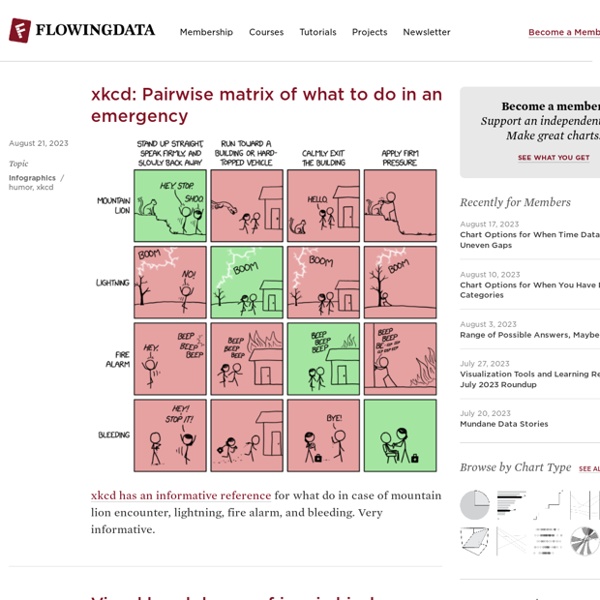
Best of the visualization web At the end of each month I pull together a collection of links to some of the most relevant, interesting or thought-provoking web content I've come across during the previous month. Here's the latest collection from January 2018. Visualisations & Infographics Includes static and interactive visualisation examples, infographics and galleries/collections of relevant imagery. SRF | 'Roger Federer: 20 Years, 20 Titles'
What is Visualization? A Definition What is a visualization? The word is problematic, and there have been very few definitions that try to define this field we are working in. More importantly: what is not a visualization? It is easy to argue that anything visual is a visualization in some way – but does that mean anything? Here is a definition of visualization and a few examples to illustrate the different criteria.
Visual Business Intelligence We typically think of quantitative scales as linear, with equal quantities from one labeled value to the next. For example, a quantitative scale ranging from 0 to 1000 might be subdivided into equal intervals of 100 each. Linear scales seem natural to us. If we took a car trip of 1000 miles, we might imagine that distance as subdivided into ten 100 mile segments. It isn’t likely that we would imagine it subdivided into four logarithmic segments consisting of 1, 9, 90, and 900 mile intervals. Similarly, we think of time’s passage—also quantitative—in terms of days, weeks, months, years, decades, centuries, or millennia; intervals that are equal (or in the case of months, roughly equal) in duration.
The ARCHive Sam Hardie - Masters Project 2 Final Model- “Sports Hall of Fame: a study of parametric architecture” - #usfsacd #sacd17 (at USF School of Architecture + Community Design) Green R&D - Hypergiant Algae is a single-celled organism that is capable of multiplying rapidly through the absorption of sunlight and carbon dioxide. It is considered one of nature’s most efficient machines. Algae can be grown nearly anywhere and it requires very few nutrients to survive. It is high in proteins, lipids, and starches, making it suitable for a variety of uses, including as food. The Hypergiant Eos Bioreactor uses algae, specifically Chlorella Vulgaris which is capable of pulling CO2 from the atmosphere at a much higher rate than any other plant. Algae is the central ingredient in our bioreactor.
Junk Charts This post is part 2 of an appreciation of the chart project by Google Newslab, advised by Alberto Cairo, on the gender and racial diversity of the newsroom. Part 1 can be read here. In the previous discussion, I left out the following scatter bubble plot. This plot is available in two versions, one for gender and one for race. The key question being asked is whether the leadership in the newsroom is more or less diverse than the rest of the staff. The story appears to be a happy one: in many newsrooms, the leadership roughly reflects the staff in terms of gender distribution (even though both parts of the whole compare disfavorably to the gender ratio in the neighborhoods, as we saw in the previous post.)
Data visualization books: How to start your personal library The Excel Charts Blog There are many approaches to data visualization. Take well-know authors like Tufte, Cleveland, Ware, Few, Bertin or McCandless. There is some overlap, but they all approach data visualization from a different angle. That’s great news for you: this means that you can come up with a unique point of view that reflects your interests and needs. I suppose the books you buy are consistent with that view.
How We Use Data to Inspire Design – Design x Data – Medium By Arianna McClain & Rohini Vibha When most people imagine good design, numbers probably don’t come to mind. In fact, anything quantitative might feel completely at odds with the concept of beautiful design. But at IDEO, in addition to connecting with people and learning their stories, designers use quantitative data as a tool to gain empathy and inspiration.
Special Project Venediktov uses colour to organise family home in Kiev Special Project Venediktov has reorganised an apartment inside a Kiev high-rise, using different shades of green and blue to define each area. Situated on the 30th floor of one of the highest buildings in the Ukrainian capital, the apartment features panoramic windows that offer expansive views of the city and Dnieper River. The Kiev-based architecture firm, headed up by Oleksii Venediktov, was asked to redesign the space to better suit a young family. Their brief was for an "individual design". "The customers asked us to create an individual design, for unique living quarters," said the designers. "While discussing the project, we quickly found out how lucky we were to have similar tastes in design."
Could humans be Earth's second civilization? “How do you know we’re the only time there’s been a civilization on our own planet?” [said Goddard Institute for Space Studies director Gavin Schmidt]. [T]hat first conversation launched a new study we’ve recently published in the International Journal of Astrobiology. Data Underload Most Common Occupation by Age As we get older, job options shift — along with experience, education, and wear on our bodies. Waiting For a Table A simulation to estimate how long until you are seated at a restaurant. How Different Income Groups Spend Money
I'm glad you found this useful - it looked like it had some really useful topics. by kiteflier98 May 19
would be nice :) at the moment i have an hard time understanding how this website is working.. :) by seo May 18
THANK YOU ! There are Team members who work hard on it! would you like to join ? by kay May 18
It exists as masterful art pieces and amazingly useful analysis tools. In both cases though it brings data -- which is oftentimes cryptic -- to the masses and shows that data is more than a bucket of numbers. by nicolas Aug 22