
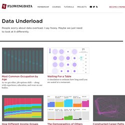
Data Underload. Most Common Occupation by Age As we get older, job options shift — along with experience, education, and wear on our bodies.
Waiting For a Table A simulation to estimate how long until you are seated at a restaurant. How Different Income Groups Spend Money After living expenses, where does the money go, and how does it change when you have more cash available? The Demographics of Others I think we can all benefit from knowing a little more about others these days.
Constructed Career Paths from Job Switching Data Shifting from one occupation to another can take a swing in the career path. Switching Jobs When people move to different jobs, here's where they go. Percentage of People Who Married, Given Your Age Or, given your age, the percentage of fish left in the sea. American Daily Routine Sleep. In 2017, No More than Five Days Without a Mass Shooting Unfortunately, while of varying magnitude, mass shootings are somewhat regular in the United States. Who Earns More Income in American Households? AWWWARDS Best Data Visualization Websites. Visual Business Intelligence. We typically think of quantitative scales as linear, with equal quantities from one labeled value to the next.
For example, a quantitative scale ranging from 0 to 1000 might be subdivided into equal intervals of 100 each. Linear scales seem natural to us. If we took a car trip of 1000 miles, we might imagine that distance as subdivided into ten 100 mile segments. It isn’t likely that we would imagine it subdivided into four logarithmic segments consisting of 1, 9, 90, and 900 mile intervals. Similarly, we think of time’s passage—also quantitative—in terms of days, weeks, months, years, decades, centuries, or millennia; intervals that are equal (or in the case of months, roughly equal) in duration.
Logarithms and their scales are quite useful in mathematics and at times in data analysis, but they are only useful for presenting data on those relatively rare cases when addressing an audience that consists of those who have been trained to think in logarithms. The Functional Art. Junk Charts. This post is part 2 of an appreciation of the chart project by Google Newslab, advised by Alberto Cairo, on the gender and racial diversity of the newsroom.

Part 1 can be read here. In the previous discussion, I left out the following scatter bubble plot. This plot is available in two versions, one for gender and one for race. The key question being asked is whether the leadership in the newsroom is more or less diverse than the rest of the staff. The story appears to be a happy one: in many newsrooms, the leadership roughly reflects the staff in terms of gender distribution (even though both parts of the whole compare disfavorably to the gender ratio in the neighborhoods, as we saw in the previous post.) Unfortunately, there are a few execution problems with this scatter plot. First, take a look at the vertical axis labels on the right side.
I find this decision confounding. The horizontal axis? Here is the same chart with improved axis labels: Re-labeling serves up a new issue. Storytelling with data. Best of the visualization web. At the end of each month I pull together a collection of links to some of the most relevant, interesting or thought-provoking web content I've come across during the previous month.
Here's the latest collection from January 2018. Visualisations & Infographics Includes static and interactive visualisation examples, infographics and galleries/collections of relevant imagery. SRF | 'Roger Federer: 20 Years, 20 Titles' Mapping Police Violence | '2017 Police Violence Report... collected data on over 1,100 killings by police in 2017.' SCMP | '2017: the safest skies record' SCMP | ... and here's a photo of the print version Economics | 'All the president’s tweets' Pixel Mixer | 'Anatomy of a Viz - The Level is in the Details' Mike Vizneros | 'A Chamber Divided: What We Can Learn By Using BioFabric Charts'
Chart Porn. Visualcomplexity.com: mapping complex networks. Information is Beautiful. Data Visualization > Stamen Design. CNN Money Interactives / Infographics. The Guardian Datablog.
NY Times 2017: The Year in Visual Stories and Graphics. Census.gov Data Visualization Gallery. Tableau Public Gallery. FlowingData. FiveThirtyEight. Indexed.com. WTF Visualizations.