
What Makes a Map Good – Modus. From its earliest days, humankind has put thought into the world: cave art depicting animals, tallies on sticks and bones, and especially a wide variety of maps, suited to different purposes, from a small portable stone map found in Spain that was used for navigation by foot to the floating bamboo-and-shell “stick” maps that the Marshall Islanders used for navigating the open ocean.
Different as they are, the best maps share core features. Curve-Fitting. Should you take a sick day? A Flow diagram – ErrantScience. Your Friendly Guide to Colors in Data Visualisation. Distances between Melbourne railway stations – a quick map. What data visualisation has taught me so far. The daily commute: travel times to cities around the world – mapped. Temperature anomalies arranged by country 1900 - 2016 □. #dataviz #climate #climatechange #globalwarming Download □ 10 ways icons from The Noun Project can impact learning. Icons can help students construct understanding and remember new ideas.
The Noun Project has the hook-up. Here’s how! (Icons via TheNounProject.com) Images are powerful and very brain friendly. Atlasobscura. Digital Literacy: Teaching Infographics, a sub-genre. During the past few months, I have had the pleasure of teaching a Digital Storytelling course.
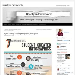
The focus was on how students can use digital modes to communicate their understanding of concepts, topics, and problems. Recently, the learning was on infographics. We live in a visual world, digital communication makes up most of the reading one does daily. Videos, images, and infographics are commonplace and examples of reading and writing digital literacies. Digital modes of communication are best taught as sub-genres in the classroom. Traveling Back in Time With Colorful Isochrone Maps - Atlas Obscura. In the early 1880s, the mapmaker Francis Galton began to imagine a series of ideal trips.
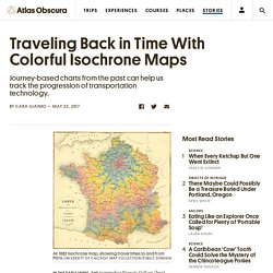
Each started in his home city, London, but from there they ranged far afield—to Greenland, or Morocco, or the distant reaches of the Pacific. By figuring out how long each of these trips would take, and drawing lines grouping those destinations that could be reached in an equal amount of time, he figured he could provide a service to travelers, sailors, and those who simply wanted to know how long it would take their mail to get someplace. Galton’s calculations presumed smooth sailing all the way: “I assume the seasons to be favorable, that immunity has been obtained from political obstructions, and that friends on the spot have made preparations to avoid delay,” he wrote.
For each trip, he consulted steamer timetables, estimated package-shipping times, and personal correspondence from friends at the Post Office. The above 1889 map, by J.G. Heather — Profile. Trend and variation.
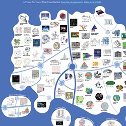
A Visual Survey of Tree Visualization. A Visual Survey of Tree Visualization Susanne Jürgensmann, Hans-Jörg Schulz Download Lo-Res Version of the Poster (PDF, 3.3 MByte) Download Hi-Res Version of the Poster (PDF, 56 MByte) Download the Poster Abstract (PDF, 1.4 MByte) Download the Bibliography (PDF, 125 kByte) Download the Bibliography Source (BibTeX, 130 kByte)Please feel free to contact us at hjschulz@informatik.uni-rostock.de, if you think that we've missed out on your particular tree visualization technique.
The Do's And Don'ts Of Infographic Design. Advertisement Today, too many websites are still inaccessible.
In our new book Inclusive Design Patterns, we explore how to craft flexible front-end design patterns and make future-proof and accessible interfaces without extra effort. The 100 best infographics. Every picture tells a story, as they say, but sometimes it takes a clever combination of words and pictures to tell a story quickly, concisely and in an entertaining fashion. The best infographics may look like they were simple to create in Photoshop, but designing an effective piece of data visualization is usually anything but. There are several great tools to create infographics, but these examples of infographics from around the web will show you how you can take it a step further and add a bit of style and personality to your data. Some are older than others, but they can still provide some inspiration for those of you looking to create an infographic from scratch. Some are funny, some more serious, and all are inspiring examples of the art.
If Star Wars: The Last Jedi has put you in the mood to immediately watch the original movie, hold your horses just one second. 13 of the Year’s Best Infographics. Whose ratings should you trust? IMDB, Rotten Tomatoes, Metacritic, or Fandango? Should you watch a movie?

Information Visualization Evaluation - WikiViz. Evaluations of Information Visualization is one of the hottest topic of the field.
Several visualization tools have been developed recently, but little effort has been made to evaluate the effectiveness and utility of the tools. Evaluation criteria. Evaluating Information - Citing and Writing Help - SJSU Research Guides at San José State University Library. When you search for information, you're going to find lots of it . . . but is it good information?
The five keys to a great infographic. Great infographics don't happen by accident; rather a carefully crafted infographic displays various attributes that contribute to its overall success.
I've come up with a simple way to summarize these attributes into what I call CHART: the five keys to a great infographic. The first key is Contrast; Contrast in a design creates tension and displays a clear distinction or difference offering no ambiguity. In graphic design, Contrast can be used to draw a viewer's attention to a specific area. Trends. Ngram Viewer. Sketchnotes: Tools and tactics for visual notetaking. About the presenter: Matt Miller has taught for more than a decade, integrating technology to engage students and create unique learning experiences.
He created the Ditch That Textbook blog, is a Google Certified Teacher and co-hosts a podcast on the BAM Radio Network. Matt’s book, Ditch That Textbook, was recently published. It’s all about upgrading your classroom with powerful technology and innovative mindsets to meet students in the 21st-century world where they live. The Surprising History of the Infographic. Tools - Misleading axes on graphs. The purpose of a publication-stage data visualization is to tell a story.
Subtle choices on the part of the author about how to represent a dataset graphically can have a substantial influence on the story that a visualization tells. Good visualization can bring out important aspects of data, but visualization can also be used to conceal or mislead. In this discussion, we'll look at some of the subtleties surrounding the seemingly straightforward issue of how to choose the range and scale for the axes of a graph.
Bar chart axes should include zero We begin with a well-known issue: drawing bar charts with a measurement (dependent variable) axis that does not go to zero. Tools - Proportional Ink. In this article we explore a basic rule for the design of data graphics, the principle of proportional ink. Hans Rosling: The best stats you've ever seen. The Joy of Stats. SAS enables visually impaired to 'visualize' data. Source: SAS. The Work of Edward Tufte and Graphics Press. Graphics Press LLC P.O. Data Viz for the Visually Impaired - Part 2: Colour Blindness - E-Tabs. Data Viz for the Visually Impaired - Part 1: Partially Sighted - E-Tabs. Data Visualization and the Blind.
The beauty of data visualization - David McCandless. Visual Business Intelligence. FlowingData. IEEE VIS 2017. InfoVis:Wiki. How We Use Data to Inspire Design – Design x Data – Medium. City Of Melbourne : Pedestrian Counting System. Wednesday 22 March 2017. 29 Maps Of Australia That Will Kinda Blow Your Mind. W. E. B. Du Bois’ Hand-Drawn Infographics of African-American Life (1900) William Edward Burghardt “W. The Rhythm of Food — by Google News Lab and Truth & Beauty. Gun Deaths In America. One Dataset, Visualized 25 Ways. 13 Great Data Science Infographics. An Interactive Experience - World Population.
Master statistician weaves Google images into visual quilts. Protovis gallery. Why the London of British Literature Barely Changed for 200 Years. 2016 Year in Search - Google Trends. Becoming More Human, One Dataset at a Time. Graphviz. Dataviz.tools.
RAWGraphs. Visual Vocabulary. Google open sources Embedding Projector to make high-dimensional data more manageable.