

Jerome McGann: Online. Humanities software, visualization and analysis. Santiago Ortiz portfolio. Portfolio - Marije Rooze. Creative computing group. Small Design Firm. NRC: Naturalist Tables, Raleigh, North Carolina, 2012 Small Design Firm developed two completely custom interactive tables for the Nature Research Center at the North Carolina Museum of Natural Sciences.
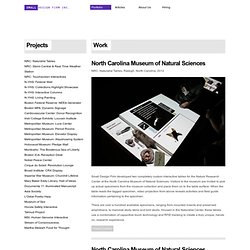
Visitors to the museum are invited to pick up actual specimens from the museum collection and place them on to the table surface. When the table reads the tagged specimen, video projection from above reveals activities and field guide information pertaining to the specimen. There are over a hundred available specimens, ranging from mounted insects and preserved amphibians, to mammal study skins and bird skulls. Housed in the Naturalist Center, these tables use a combination of capacitive touch technology and RFID tracking to create a truly unique, hands on, research experience. Project Details NRC: Storm Central & Real Time Weather Station, Raleigh, North Carolina, 2012 Nearby, a model of a weather station shows how meteorologists collect data in the field.
Art. ART+COM: Home. Foundation. Voyagers and Voyeurs: Supporting Asynchronous Collaborative Information Visualization. The sense.us collaborative visualization system.
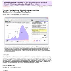
(a) An interactive visualization applet, with a graphical annotation for the currently selected comment. The visualization is a stacked time-series visualization of the U.S. labor force, broken down by gender. Here the percentage of the work force in military jobs is shown. (b) A set of graphical annotation tools. (c) A bookmark trail of saved views. Abstract. ガスバス. Well-formed data. Entrepreneur Centers. Galerie de Gwen Vanhee. Jürg Lehni. FORM+CODE In Design, Art, and Architecture by Casey Reas, Chandler McWilliams, and LUST. Advanced Beauty - Buy DVD. Www.dontclick.it. V // Pixelnerve. Amnon P5 – Experiments with Processing by Amnon Owed. Generative Art (AbandonedArt.org) Anthony Mattox - Interaction Design & Digital Art. IMPURE. Robert Hodgin. Designplaygrounds.com. DataArt - Visualisations.
REAS. Andreas Koller Portfolio. Looking 4 data visualization. Generative art and data visualization. Writtenimages.net. 40 Essential Tools and Resources to Visualize Data. Bureau d'études. Featured projects. Quantified Other Five weeks of my father's Nike Fuel data Tatelets Generative bracelet based on artworks from Tate Modern Threads.
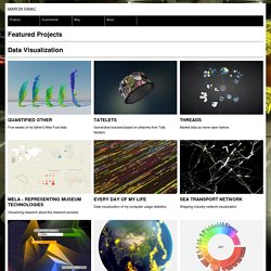
OECD – Your Better Life Index. Five Filters. Category : Graphic - Beautifl. Alexander Chen. Casey Reas . Works. Moritz.stefaner.eu - / Density Design. Unfolding - Interactive Map Library for Processing and Java. Swirls for CataRT. Interaction Design Lab Fachhochschule Potsdam.
Bestiario. Your.flowingdata / Capture your life in data. Data Visualization, Infographics, and Statistics. The Digital You. 20 visualisations de données en Motion design - motion_design. L'art de la visualisation de données progresse de plus en plus vite.
Chaque semaine de nouvelles infographies ou webdesigns font leur apparition sur la toile. Mais que devient la vidéo dans tout ça? Découvrez le dans la suite de l'article. My Big Brother [Infographie] Make Your Images Interactive. Qu'est-ce que Traque Traces? Traque traces est une fiction. Mais c'est votre vie (ou presque) Cette fiction est née d'un pari un peu fou : refaire une ville fictive sous la vraie ville.
Faire vivre et évoluer tout un peuple, écrit à partir des données qui nous écrivent, nous aussi, êtres de chair. De Paolo D'Iorio. Robert Darnton « OPEN REFLECTIONS. Stephan Thiel / interaction and information design. Stephan Thiel / understanding texts. Understanding Shakespeare / About. Poïétique du design » Data flow. La Société de Schématologie et de Bibliologie. Théorie générale de la ... Showcases on Datavisualization. Interactively Explore the YOLO Flip 12 Feb 2014 Showcases Animation, Interactive, Process, Sports In preparation of the Winter Olympic Games 2014 in Sochi, we helped the Swiss newspaper Neue Zürcher Zeitung publish a long-form article about Iouri Podladtchikov, a professional snowboarder and – since yesterday – freshly baked Olympic gold medalist.

To help readers better understand the sport, we created a series of illustrations and an interactive animation. Read more Analyzing Presidential Candidate’s Body Language 11 Oct 2012 Showcases Politics, Video The New York Times recently examined the body language of the US presidential candidates Barack Obama and Mitt Romney. The Champions Ring 18 Jul 2012 Showcases Print, Radial, Sports. Datasets on Datavisualization. Wikileaks US Embassy Cables 29 Nov 2010 Datasets Infographic, Politics Wikileaks began on Sunday November 28th publishing 251,287 leaked United States embassy cables, the largest set of confidential documents ever to be released into the public domain.
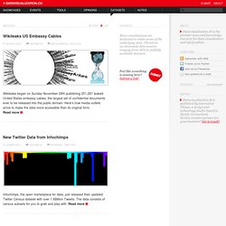
Here's how media outlets strive to make the data more accessible than its original form. Read more. 50 Great Examples of Data Visualization. Wrapping your brain around data online can be challenging, especially when dealing with huge volumes of information.
And trying to find related content can also be difficult, depending on what data you’re looking for. But data visualizations can make all of that much easier, allowing you to see the concepts that you’re learning about in a more interesting, and often more useful manner. Below are 50 of the best data visualizations and tools for creating your own visualizations out there, covering everything from Digg activity to network connectivity to what’s currently happening on Twitter. Journaliste de données : data as storytelling.
Working with Data in Protovis on Datavisualization. Protovis is an open-source Javascript visualization library by the Stanford Visualization Group and has become one of the preferred tools in our arsenal.
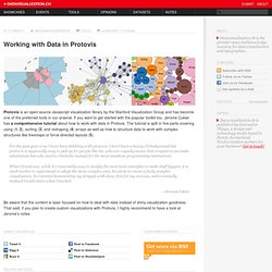
If you want to get started with the popular toolkit too, Jerome Cukier has a comprehensive tutorial about how to work with data in Protovis. We Feel Fine / by Jonathan Harris and Sep Kamvar. KJB de signets graphiques's Tumblelog. WriteFlow. Index - Lines.