
A Pocket Guide to Master Every Day’s Typographic Adventures. Ask H&FJ: Four Ways to Mix Fonts. A Quick Guide to Sans-Serif Fonts. If you go back and read my guide to serifs, you’ll notice a trend with the shape of serif type overtime.
As you move from old humanist type to the slick Modern serif, the stroke contrast is more apparent, the serifs become thinner, and lines and crossbars are straighter, losing their calligraphic nature. The track for sans-serifs isn’t as straightforward. The Sans-Serif has gained the reputation as a “modern” style of typography, but we can find some very early examples of sans-serif type, written in Latin, Estruscan, and Greek letterforms. The first documented usage of sans-serif type was in 1723, by Scottish scholar Thomas Dempster, in his book De Etruria regali libri VII. One of the earliest foundries to design sans-serif type was Caslon, a foundry that was making typefaces in the Estruscan language during the mid-18th Century.
The best way to understand the rise of the sans-serif is to understand its context. Making Geometric Type Work. For graphic designers beginning to experiment in type design, a geometric or modular typeface is a natural starting point.
Illustrator and other programs offer a simple collection of elements such as circles, squares, and triangles which can be combined to create a passable alphabet. This is the same route I took when dissatisfied with the limits of commercial fonts at the time. I twisted and distorted each character to fit into a few simple, incredibly strict rules of construction. Invariably this produced a wide range of exotic letterforms, some more legible that others. Type Connection. Type Study: Pairing typefaces. Type study is an ongoing series of guest posts about typography on the web.
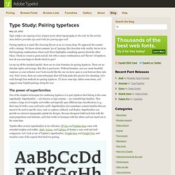
In this article, Aura Seltzer provides tips and tricks for pairing type well. Pairing typefaces is much like choosing flavors at an ice cream shop. We approach the counter with a strategy. We know about common “go-to” pairings like chocolate with vanilla, but we try to find inspiring combinations where each flavor highlights something special about the other. Okay, I think ice cream is great and all, but with so many combinations and “flavors” of typefaces, how do you even begin to decide which to pair? Let me rip off the bandaid quickly: there are no clear formulas for pairing typefaces. The power of superfamilies One of the simplest techniques for combining typefaces is to pair typefaces that belong to the same superfamily. Typekit offers several superfamilies in its collection.
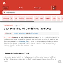
Letters of Freight SansPro and Freight Text, when overlaid, show similar structure. Butterick’s Practical Typography. Butterick’s Practical Typography. Typography: Common Myths and Mistakes. As graphic or web designers we work with typography all the time, and even if we don’t all call ourselves typographers, setting type in one form or another is unavoidable.

It’s a very large part of our job. And for hundreds of years it was our job alone (well, technically it was the type setter’s job, but bear with me here). Then desktop publishing came along and everything changed. DIY Graphic Design Recipes: Recipe for Font Success. I'm going to change things up here a bit today. Today's post is a recipe for typography success. I don't claim to be an expert typographer, but I've learned a few things about typographical in my experience as a designer and I'd like to share them with you.
Old Script VS. Zapfino I'm pretty sure I'm not the only one out there that absolutely HATES Zapfino. Learning Curve Pro VS. Curlz MT is another font that has made it's way into way too many invitations. Blokletters VS. Comic sans could probably die, too; it's over-used and old. Chantilli Antiqua VS. Ask H&FJ: Four Ways to Mix Fonts. "What Font Should I Use?": Five Principles for Choosing and Using Typefaces. Advertisement For many beginners, the task of picking fonts is a mystifying process.

There seem to be endless choices — from normal, conventional-looking fonts to novelty candy cane fonts and bunny fonts — with no way of understanding the options, only never-ending lists of categories and recommendations. Best Practices of Combining Typefaces. Advertisement Creating great typeface combinations is an art, not a science.
Indeed, the beauty of typography has no borders. While there are no absolute rules to follow, it is crucial that you understand and apply some best practices when combining fonts in a design. When used with diligence and attention, these principles will always yield suitable results. Effective Typography-Driven Web Design. Using type as a primary design element comes with a set of characteristics that are often found in clean and easy-to-read websites.
Not every design starts with a strong image. Sometimes a piece of type serves as the dominant art for your design project. The best text-driven design uses a minimal set of effects to create a word image with impact. Take a look at novelty typefaces, set a clean and limited font palette, play with bold or sharp color choices, make the letters big (or small), make type art and use strong words or catch phrases. Most text-driven designs are not limited to a single effect, although one effect may be dominant. TypeMedia TypeCooker: Generator. Open Font Library. Underware. Explorations in Typography / Typeface combinations. Type Connection. Www.fontshop.com/education/pdf/typeface_anatomy.pdf. Friends of Type. Fonts In Use – Type at work in the real world.
Learn: Typeface Classifications. Andrea Hiller's Advanced Type Blog. Type Connection. The 100 Best Fonts (in a Huge Sortable Table) Old Versus Neue @ TN. The study of a famous font and his bastard brother.

Five classic typefaces. So I’m well into the first book on my list, Designing with type: The Essential Guide to Typography.
This book is a mine of information and it’s not overwhelming at all, you just keep reading and reading and you learn! One very useful thing I have learned: the letters that will provide me the most design information when I want to determine what typeface I’m looking at are R, T, W for the uppercase letters and h, a, e, g and o for the lowercase letters. According to the book, the five classic typefaces are: Garamond - Claude Garamond was originally credited with this typeface but it was Jean Jannon who actually designed it in 1615 Old Style facelittle contrast between the thick and thin strokesheavily bracketed serifsoblique stresscapital letters are shorter than the ascenders of the lowercase lettersletterforms are open and round, making the face extremely readable.