
Variable fonts’ past, present and future, according to Dalton Maag. It's Nice That: When did variable fonts come to be, and why have they taken off recently?

Variable font technology is actually not that new. Adobe and Apple independently developed multiple master fonts and GX variations in the early 1990s, both were axis-based technologies similar to variable fonts. Adobe abandoned multiple master fonts by 2000, and GX Variations only ever had minimal support. This all changed when Apple, Adobe, Microsoft, Google, and a few independent foundries and typeface design studios, including Dalton Maag, came together to announce that OpenType Font Variations (better known as variable fonts) would be added to the OpenType specification mid-2016.
Since then, type designers have created hundreds of variable fonts, some experimental, testing the boundaries of the technology, and others highly functional, aimed at improving web performance. Sidebearings. Webfont & Desktop font. In 1968, Adrian Frutiger was commissioned to develop a sign and directional system for the new Charles de Gaulle Airport in Paris.
Though everyone thought he would want to use his successful Univers font family, Frutiger decided instead to make a new sans serif typeface that would be suitable for the specific legibility requirements of airport signage: easy recognition from the distances and angles of driving and walking. The resulting font was in accord with the modern architecture of the airport. In 1976, he expanded and completed the family for D.
Stempel AG in conjunction with Linotype, and it was named Frutiger. The Frutiger family is neither strictly geometric nor humanistic in construction; its forms are designed so that each individual character is quickly and easily recognized. Movement typeface – a variable font by NM type. Movement is a variable font created by Noel Pretorius and María Ramos.
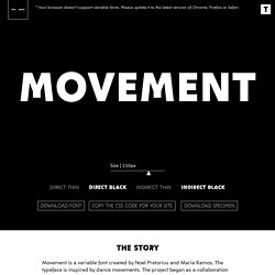
The typeface is inspired by dance movements. The project began as a collaboration with Design Indaba and the contemporary dancer Andile Vellem. Dance and other art disciplines use movement as a way of expression. The body of a dancer or the hand of a painter can perfectly be seen as creative tools. Andile’s performance became a departing point for the design. Inspiration was also found in the dance theories of the historical choreographer Rudolf Laban. The variable font has four design extremes, Direct Black, Direct Thin, Indirect Black and Indirect Thin. Please visit NM type site if you are interested in knowing more about their work. Axis-Praxis: Variable Fonts in the browser.
Variable Fonts. Matthew Ström: designer & developer. Ever since I first learned about variable fonts, I’ve wanted to use them in my own work.
After learning that Source Serif and Inter both had variable versions, I started switching this site over to use them. Here’s how I implemented the change, and what I learned along the way. Google Fonts. Popular Handwriting Fonts - Mostrelevance. Fonts In Use – Type at work in the real world. Buy Fonts — Good Type Foundry. Portfolio — 20 Best Google Web Fonts. Web typography is currently riding a wave of relentless creativity.
GT Super — Download Free Trial Fonts. Free Fonts. Free Fonts. 68 best free fonts for designers: Handwriting fonts. As a creative, you're always on the lookout for best free fonts.
But time is money, and if you spend too much time looking for them, it's going to be a false economy. With thousands of free fonts out there on the web, it can be a tricky business trying to sort the wheat from the chaff, and so to help you out, we've done the work for you. Gorgeous - Free Typeface. Adieu — Good Type Foundry. Digital Designers’ Secrets: Top Fonts. The bearded UX unicorn jumps over the drunk full stack developer.
Is it legible and versatile, does it tell a story? We demand a lot from our fonts.They can inspire a web project, deliver a punchy headline, make a statement logo or become a staple in our army of design tools. We wanted a collection of the most flexible and usable typefaces so we turned to our secret weapon, our crack team of designers, the Awwwards Jury, to share with us their typeface tendencies and answer the big question, what is your must have font?
Some of these fonts are free to download and others you have to pay for, enjoy! Digital Designers’ Secrets is the first in a series of curated content about web designer tools and recommendations according to the Awwwards jury - a group of international designers and developers responsible for some of the most innovative and exciting projects currently on the web. Fonts.com. Typekit.
Typography tips for a more comfortable read. There are 3 small changes you can make to your content to provide a more pleasurable read.
The tips don’t just apply to design—use them to make your text documents look great, too. The names of each principle may be complicated, but understanding and using them is simple. For demonstration purposes, I’m going to use an un-styled page from A Clockwork Orange by Anthony Burgess. Important note: every font is different, so if the content doesn’t feel right, go ahead and adjust your measurements. What’s important here is that the reader is getting a comfortable reading experience and that it looks correct to your eye. Use typographic hierarchy to give a clear sense of the structure of a page Typographic hierarchy is the visual hierarchy of the text on a page. Imagine a textbook. “Use typographic hierarchy to give a clear sense of the structure of a page.” All font sizes should be derived from the body text, as this is what will be most-read on each page. Further considerations Paragraph spacing.
Fonts In Use – Type at work in the real world. Showcasing & discussing the world of typography, icons and visual language. Typography Inspiration for the Modern Web → Typewolf. Fontstand — try fonts for free or rent them. Non-Format — USA / Norway. Galleries - Typography - Fubiz™ Typography Served. Lost Type Co-op. Dafont.com. 20,174 free fonts for Windows and Mac - FontSpace.
Handpicked free fonts for graphic designers with commercial-use licenses.