
The list for designers - Designerlist.info. Sri Yantra Research. Golden Ratio in logo designs. Design Basics: A guide to the golden ratio. Golden Section and Rule of Thirds (Golden Mean, Golden Ratio, Golden Spiral, Golden Proportion, Golden Triangles). How to Draw a Golden Ratio triangle. Bisection of Yin and Yang. The flag of South Korea (and of Kingdom of Korea from 1883) contains the ancient yin-yang symbol (Taijitu in Chinese, Tomoye in Japanese and Taegeuk in Korean) that represents the struggle, merger and co-existence of two opposites (could be hot/cold, male/female, sky/earth, moon/sun, etc.)
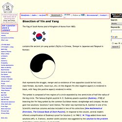
In the diagram Yin (the negative aspect) is rendered in black, with Yang (the positive aspect) rendered in white. The symbol is composed of two regions of a circle separated by two semicircles of half the radius of the big circle. The famous English puzzlist H. Solution 1 This one requires no proof. Solution 2. The Golden Ratio: a designer's guide. There's a common mathematical ratio found in nature that can be used to create pleasing, natural looking compositions in your design work.
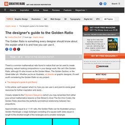
We call it the Golden Ratio, although it's also known as the Golden Mean, The Golden Section, or the Greek letter phi. Whether you're an illustrator, art director or graphic designer, it's well worth considering the Golden Ratio on any project. The designer's guide to grid theory. Applying the Golden Ratio to Web Layouts and Objects. By anthony on 10/21/10 at 5:36 pm 1.618 is a number all serious designers should know.
The nonagon (Method „A“) « Sacred geometry. THE NONAGON (Method „A“)with example of trisection of angles larger than 90° Foreword to Chapter Eight Before we say anything about the nonagon, we will „single out“ one of the fundamental laws of sacred geometry that we might have noticed in our presentations up to now and which will be deepened in our forthcoming chapters.
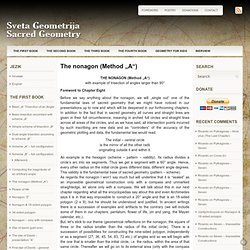
In addition to the fact that in sacred geometry all curves and straight lines are given in their full circumference, meaning in arched full circles and straight lines across all areas of the circles, and as we have said, all intersection points incurred by such inscribing are new data and as “controllers” of the accuracy of the geometric plotting and data, the fundamental law would read: The Grid System. Gestalt Principles Applied in Design. By Michael Tuck Web designers, like other artists and craftsmen, impose structure on the environment.
We enforce order and beauty on the formless void that is our blank computer screen. We do it in different ways — creating an organized layout first, writing text and content first, or even basing a design concept on an image, a color palette, or something that visually trips your trigger, whether it’s a sunset or a Song Dynasty painting. Design Work Life » cataloging inspiration daily. Design Work Life » cataloging inspiration daily. Thoughts on Developing A Design Concept. A good design begins with a good design concept.
You’re trying to solve a problem and your concept will lead the way and give you direction for your design decisions. How do you form a concept? What questions do you need to ask in order to develop one? How does your concept become the roadmap for your design? I want to attempt to answer the questions above as well as share how I go about forming a concept for a new design or redesign. What is a Design Concept? Concept (n) – a general idea used to formulate a plan. Free Texture Download and Resources Link. Textures is always a good stuff for a designer to spice out their work or masterpieces.
So today, in this article I’d like to present a list of great high resolution free paper and other textures.I've been surfing the net yesterday and made some list for you.Some of them are from my bookmark. I also have pick some of the textures from deviant art. Download and use it for your next masterpiece! 5 Reasons Why Metaphors Can Improve the User Experience. There are many ways to experience the world around us.
Especially offline, we can make use of our different senses to collect information, interpret our environment and make judgments. On the Web, however, our senses are more limited. As designers, we need to present information carefully to make sure our users think, feel and do the right thing. A great way to help your users understand abstract content, create a sense of familiarity, trigger emotions, draw attention and motivate action are metaphors. But does it float. ARAS - The Archive for Research in Archetypal Symbolism.
Download the cards - Design with Intent Toolkit. User Experience Design. June 21, 2004 I've been practicing information architecture since 1994, and from Gopher to Google have seen dramatic changes in the landscape of organization, search and retrieval.
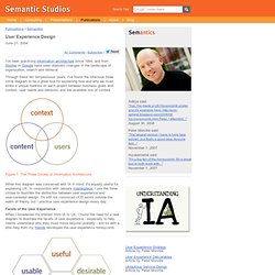
Through these ten tempestuous years, I've found the infamous three circle diagram to be a great tool for explaining how and why we must strike a unique balance on each project between business goals and context, user needs and behavior, and the available mix of content. Figure 1. The Three Circles of Information Architecture While this diagram was conceived with IA in mind, it's equally useful for explaining UX. Facets of the User Experience When I broadened my interest from IA to UX, I found the need for a new diagram to illustrate the facets of user experience - especially to help clients understand why they must move beyond usability - and so with a little help from my friends developed the user experience honeycomb.
Figure 2. Here's how I explain each facet or quality of the user experience: Useful. Persuasive Tech.