
Stroll.js - CSS3 Scroll Effects. Edit this Fiddle. Create Banner Using CSS Animation & Keyframe. A collection of best front-end frameworks with comparison. Sass - Syntactically Awesome Stylesheets. CSS Buttons Generator for your pleasure. Powerful New CSS- and JavaScript-Techniques (2012 Edition)
Advertisement Since our last round-up of useful CSS techniques1, we’ve seen a lot of truly remarkable CSS geekery out there.

With CSS3, some of the older techniques now have become obsolete, others have established themselves as standards, and many techniques are still in the “crazy experimentation” stage. Since the release of the previous post, we’ve been collecting, sorting, filtering and preparing a compact overview of powerful new CSS techniques. Today we finally present some of these techniques. Use them right away or save them for future reference. Please note that many techniques are not only CSS-based, but also use HTML5 and JavaScript. Table of Contents. Keep your CSS selectors short. 15 May, 2012 One thing I believe, as a very, very general rule of thumb, is that as sites get bigger, selectors should get shorter.
Blog Archive » Cross-Browser Debugging CSS. I was helping Laura (a developer who works with me) learn about cross-browser debugging this week, which got me excited to share my process.
The first principal is simply: Work with CSS, not against it. LESS « The Dynamic Stylesheet language. Splash and Coming Soon Page Effects with CSS3. CSS3 opens up so many crazy possibilities and today we want to show you how to go wild with splash and coming soon page effects using CSS3 animations.
We'll experiment with animation sequences and how to bring some life to some simple elements. View demo Download source. CSSTidy. CSS Sprite Generator. CSS Decorative Gallery (adding frames and overlays to images using CSS and transparent PNGs/GIFs) Did you like my previous CSS tutorial on how to create gradient text effects?
I'm using the same trick to show you how to decorate your images and photo galleries without editing the source images. The trick is very simple. Perfect Full Page Background Image. Learn Development at Frontend Masters This post was originally published on August 21, 2009 and is now updated as it has been entirely revised.
Both original methods are removed and now replaced by four new methods. The goal here is a background image on a website that covers the entire browser window at all times. Let’s put some specifics on it: Fills entire page with image, no white spaceScales image as neededRetains image proportions (aspect ratio)Image is centered on pageDoes not cause scrollbarsAs cross-browser compatible as possibleIsn’t some fancy shenanigans like Flash Image above credited to this site. Awesome, Easy, Progressive CSS3 Way. A simple, lightweight approach. Video Screencasts. #130: First Moments with Grunt There are all these tasks that we need to do as front end developers.
Concatenate and compress our files. Run our preprocessors. Optimize images. Run tests. . #127: Basics of JavaScript Templating A template is a chunk of HTML that you need to inject onto the page. Less Framework 4. I called Less Framework "a CSS grid system for designing adaptive websites".
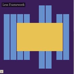
It was basically a fixed-width grid that adapted to a couple of then popular screen widths by shedding some of its columns. It also had matching typographic presets to go with it, built with a modular scale based on the golden ratio. The resources it was originally published with are still available on GitHub. HOW TO: Get Started with Less Framework. The Web Development Series is supported by Rackspace, the better way to do hosting.
Learn more about Rackspace's hosting solutions here. For the past few years, CSS grid systems have become increasingly popular with web designers. Thanks to efforts like Nathan Smith's 960.gs, designing with a grid is less complicated, and better looking sites can be crafted with ease. One of my favorite CSS grid systems of late is Less Framework. Now in its fourth revision, Less Framework takes the power of a CSS grid system and adds in support for CSS media queries to support multiple design and typography layouts. In May 2010, Ethan Marcotte's "Responsive Web Design" helped spur a movement of building websites designed to fluidly adapt to various platforms and device sizes — think mobile optimized sites and tablet-specific layouts — without the need for an entirely different design or special URL.
Knowing the Basics Visit LessFramework.com and resize your browser to see the implementation in action. Formalize CSS - Teach your forms some manners! Learn CSS Positioning in Ten Steps: position static relative absolute float. 1. position:static The default positioning for all elements is position:static, which means the element is not positioned and occurs where it normally would in the document.
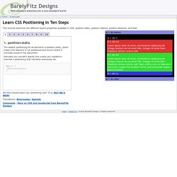
Normally you wouldn't specify this unless you needed to override a positioning that had been previously set. 2. position:relative If you specify position:relative, then you can use top or bottom, and left or right to move the element relative to where it would normally occur in the document. One list, many options - Using CSS and a simple list to create radically different list options.
CSS for Accessibility. W3C Note 6 November 2000 This version: (plain text, PostScript, PDF, gzip tar file of HTML, zip archive of HTML) Latest version: Previous version: Editors: Wendy Chisholm, W3C; Gregg Vanderheiden, Trace R & D Center, University of Wisconsin -- Madison; Ian Jacobs, W3C Copyright ©1999 - 2000 W3C® (MIT, INRIA, Keio), All Rights Reserved.
Abstract. CSS Gradient Text Effect. Do you want to create fancy headings without rendering each heading with Photoshop? Here is a simple CSS trick to show you how to create gradient text effect with a PNG image (pure CSS, no Javascript or Flash). All you need is an empty <span> tag in the heading and apply the background image overlay using the CSS position:absolute property. This trick has been tested on most browsers: Firefox, Safari, Opera, and even Internet Explorer 6. Continue to read this article to find out how. View Demos Download Demo ZIP. Math in HTML (and CSS) - presenting mathematical expressions on Web pages. Typesetting math: 100% How to present mathematical expressions using a language that has so little markup for them? Web authors often need resort to images, but there are more flexible approaches, like MathJax.
Moreover, if you need just some special symbols or simple expressions, a lot can be done in HTML, assisted with style sheets (CSS). This document mainly discusses relatively simple mathematical expressions rendered one-dimensionally (inline), though possibly with superscripts or subscripts. The word “mathematical” is used in a rather broad sense here, covering different formalisms and symbols, including the symbols of physics, formal logic, etc. What? Css.maxdesign.com.au - CSS resources and tutorials for web designers and web developers.
Step by step CSS float tutorial. Floatutorial takes you through the basics of floating elements such as images, drop caps, next and back buttons, image galleries, inline lists and multi-column layouts. General info Tutorial 1. Floating an image to the right Float an image to the right of a block of text and apply a border to the image. Tutorial 2. Float an image and caption to the right of a block of text and apply borders using Descendant Selectors. Tutorial 3. Float a series of images down the right side of the page, with content flowing beside them. Tutorial 4.