
GEX - The work of Genis Carreras. Visualize This: The FlowingData Guide to Design, Visualization, and Statistics. Introduction to Circos, Features and Uses // CIRCOS Circular Genome Data Visualization. The World Bank. DataViz. DataViz Mediaeater MMX Archive / RSS June 21 (Source: thedailywhat) May 26 April 30 December 5 (Source: mrharristweed) November 12 November 9 (Source: toukubo, via handa) November 3 September 3 August 15.
A visual exploration on mapping complex networks. Showcases on Datavisualization. Interactively Explore the YOLO Flip 12 Feb 2014 Showcases Animation, Interactive, Process, Sports In preparation of the Winter Olympic Games 2014 in Sochi, we helped the Swiss newspaper Neue Zürcher Zeitung publish a long-form article about Iouri Podladtchikov, a professional snowboarder and – since yesterday – freshly baked Olympic gold medalist.
To help readers better understand the sport, we created a series of illustrations and an interactive animation. Read more Analyzing Presidential Candidate’s Body Language 11 Oct 2012 Showcases Politics, Video The New York Times recently examined the body language of the US presidential candidates Barack Obama and Mitt Romney. The Champions Ring 18 Jul 2012 Showcases Print, Radial, Sports Deroy Peraza from Hyperakt has published a huge collection of sports championships visualizations using radial brackets. Turn Your Location Into Jewelry With Meshu 08 Jun 2012 Showcases Jewelry, Mapping Meshu is a way to turn location data into physical objects. Visualizations. Number Picture - Crowd-Sourcing New Ways For People To Visualize Data. Number Picture is a web application that enables you to come up with, easily create, and share fresh and interesting tools for visualizing data - that others can then use to visualize their own data.
These tools we call templates and they take in anybody else's data, shake it around a bit, add some sugar and spice, and then output it structured in a certain way in the form of a picture that hopefully is nice to look at, keeps the viewer engaged, and provides a refreshing change to all the millions and billions of bar graphs and pie charts that we see in our everyday lives. We provide you with the tools to easily create your own templates and it is our wish to make it as easy as possible for you to do this. All templates that are created are free for anyone to use and all Number Pictures made are freely available for anybody to view. To illustrate why: let us consider the Pie Chart. But, in 1801, William Playfair invented it. The ball is now in your court - as the Designer. City Events - Opendataday. Open-Data - tazblogs. 10 Awesome Free Tools To Make Infographics. Advertisement Who can resist a colourful, thoughtful venn diagram anyway?

In terms of blogging success, infographics are far more likely to be shared than your average blog post. This means more eyeballs on your important information, more people rallying for your cause, more backlinks and more visits to your blog. In short, a quality infographic done well could be what your blog needs right now. Designing An Infographic Some great tips for designing infographics: Keep it simple! Ideas for infographic formats include: Timelines;Flow charts;Annotated maps;Graphs;Venn diagrams;Size comparisons;Showing familiar objects or similar size or value. Here are some great tutorials on infographic creation: Creating Your Infographic Plan and research.If required, use free software to create simple graphs and visualisations of data.Use vector graphic software to bring these visualisations into the one graphic.
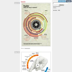
Free Online Tools For Creating Infographics Stat Planet Hohli. Infographs. PACinfo: Où sont passés les 10 milliards de la PAC? 9,94 milliards, c’est un netbook pour chaque Français.
C’est le train gratuit pour tous pendant 6 mois. C’est le feu d’artifice du 14 juillet (celui du Champ de Mars, hein, pas de Agen) tous les jours de l’année dans toutes les capitales de région. C’est aussi ce que reçoit la France tous les ans au titre [...] 9,94 milliards, c’est un netbook pour chaque Français. C’est le train gratuit pour tous pendant 6 mois. C’est aussi ce que reçoit la France tous les ans au titre de la politique agricole commune.
Malgré des sommes colossales et des enjeux qui dépassent largement l’agriculture, les contribuables ne reçoivent que peu d’info de qualité. Pourtant, l’OLAF (les incorruptibles de l’Union) a trouvé en 2006 que 48% des vaches slovènes n’existaient que sur les formulaires de demande de subvention. L’année dernière déjà, j’avais lancé un ballon d’essai pour un projet de datajournalisme sur la PAC, sans résultat. 1. 2. La base nous donne le nom et la commune du bénéficiaire. 3. 4. News, Augmented. EveryBlock. Christian Jakubetz, Ulrike Langer, Ralf Hohlfeld:Universalcode. Datenjournalist - OpenData und neue Journalismusformen. Visual Literacy: An E-Learning Tutorial on Visualization for Communication, Engineering and Business. A Periodic Table of Visualization Methods.
Golden Section Graphics. Gapminder: Unveiling the beauty of statistics for a fact based world view. Information aesthetics - Information Visualization & Visual Communication. Infographic. Search. Simple Complexity — Making Simple Sense From Complex Data. Cool Infographics - Blog. Infographics news. Visual graphics and visual histories.