

Like Knows Like. Upside Collective. Xtinaissharp : Our desks are ready for the... Upsidetweets : Notes from the dry-erase wall:... Monograms Upside Collective - Follow Betype.co for more awesome post. Google's New, Flatter Logo Has Been 14 Years In The Making. Last week, Yahoo topped off a monthlong campaign, teasing users with tantalizing glimpses at alternate-dimension logos, and finally showed off the final design.
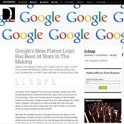
Yahoo isn't the only big tech company in Silicon Valley rolling out a new logo: Google is preparing its own logo redesign too. Unlike Yahoo, Google is choosing to run silent and deep with their new logo design, at least so far. Instagram. Steve Jobs on Branding. Instagram. Okay Type · Harriet Series. Harriet Series is a rational serif typeface — inspired by design popular in the mid-20th-century, Harriet draws from both transitional faces, such as Baskerville, and modern faces, like Century.
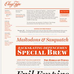
At the same time it is unburdened by these historic models, adopting contemporary features and finish. Harriet includes a set of Display styles with enough exuberance to sparkle at large sizes as well as a set of diligent and sturdy Text styles suitable for body copy. The Harriet Series was awarded a Certificate of Type Design Awesomeness from the Type Director's Club in 2012. Harriet Text Bold Italic, Text Medium, & Text Light. Photo by msrivette. Photo by msrivette. Upping Your Type Game. Note: This text was created as a talk for An Event Apart in San Diego.
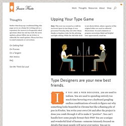
It was presented Tuesday, May 21st 2013. Many thanks to Stephen Coles for his advising and light editing. While the full slide deck is not shown below, about a quarter of the original slides are used as editorial illustrations. To send comments or propose corrections (kind and helpful tone appreciated), email me. Type Designers are your new best friends. Msrivette : Design is Everything is #Design.
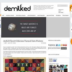
Photo by msrivette. Awful Client Criticism Turned Into Posters. EmailEmail.
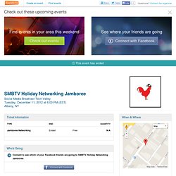
G.F.D.A. / The Passion Project. Nicholas Felton. Introducing A New Article Design — NYTimes.com. Calm.com. Adobe Photoshop: PhotoShop Touch for Phones - Interactive (image) Pentagram. Field Notes Memo Archive. YouTube. SMBTV Holiday Networking Jamboree. Invalid quantity.
Please enter a quantity of 1 or more. The quantity you chose exceeds the quantity available. Please enter your name. Please enter an email address. Please enter a valid email address. Please enter your message or comments. Please enter the code as shown on the image. Saa presents Brandon Rike. Brand identity style guides from around the world. This is great!
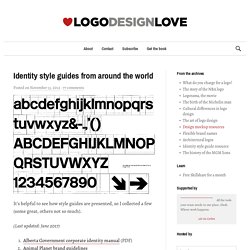
The University of Connecticut has a nice one designed by Peter Good. Web and link to PDF version. (Get the PDF version!) Dirt Poster. Dirt Poster is a Design and Graphic-Design work made by Roland Reiner Tiangco, a new graduate of a Design School, living in New York.
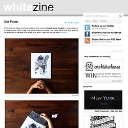
While handling the poster, your hands starts to get dirty, and this dirt allows you to see what’s the poster is all about. Check out also the artist’s Website. Dirt Poster. Kern Type, the kerning game. Fresh Impressions on Brandmarks (from my 5-year-old) DDC4568: Sitting here, getting ready to watch Massimo Vignell. Swissted. Surround Yourself With Passionate People.
Brand New Conference. Epilogue Many thanks to all who attended or streamed the 2013 Brand New Conference.
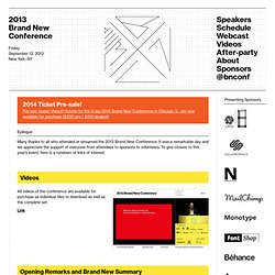
It was a remarkable day and we appreciate the support of everyone from attendees to sponsors to volunteers. To give closure to this year’s event, here is a rundown of links of interest. All videos of the conference are available for purchase as individual files to download as well as the complete set. Link The first 30 minutes of the conference, which include a roasting of the more news-worthy posts from Brand New in the previous 12 months to the conference.
Link Photos of the event, from 8:00 am to 10:00 pm, by the indefatigable Andrew Ryan Shepherd. Apple Design Chief Jonathan Ive Knighted in Buckingham Palace, Says 'Best Work' is Underway Now. BBC reports that Apple's design chief Jonathan Ive was knighted today in Buckingham Palace, with Princess Anne performing the honors.
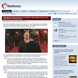
Ive's knighthood was announced in December, but the official ceremony was not held until today. Ive's knighthood was accompanied by a rare extensive profile and interview with The Telegraph in which he shares details on his background and philosophy. “All I’ve ever wanted to do is design and make; it’s what I love doing. Stock Photography: Search Royalty Free Images & Photos. Michael Rivette. Portland/CreativeMornings - Aaron James Draplin. Startups, This Is How Design Works – by Wells Riley.
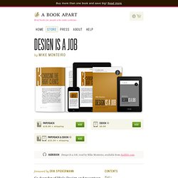
Design Is a Job. Design Is a Job by Mike Monteiro Our ebooks support Kindle, iBooks, Nook and most other readers and devices.
Brand and Website Designer from Brooklyn. Infographic: East coast vs west coast designers. Ever wondered what the difference between east coast designers and west coast designers? How designers in New York or D.C. differ from their counterparts in LA or Seattle? After all, we know all about the differences between east coast and west coast rap (and the rivalry that runs along with it). Kerning. Designing for responsiveness. Designing for responsive websites can be a bit challenging at first because the process is so different. As designers, we’ve gotten used to building pixel-perfect mockups as our web blueprints.
Keep That New Year’s Resolution and Make the Leap From Print to Web Design. You’ve been designing for print since college and have an eye for what makes visuals work. But the landscape has changed (and for some, might even look a little scary). ZeroBundle: A great bundle of freebies for designers! Media Queries. The Photoshop Etiquette Manifesto for Web Designers. Fancy Scrolling Sites. In the last year or so, there's been enough sites that do fancy things when you scroll down that it's kind of a trend. I thought I'd blog it, you know, for the sake of history. By "fancy things" I mean something happens when scrolling down besides the site scrolling down.
Elements might move around in unexpected ways or change their size/shape/color/content in some way. Method & Craft. Foundry Co. 40 Professional Examples of Letterhead and Print Work. The Internet is an incredibly powerful tool for the modern business owner. It’s possible to share contact information with people all across the world in just a few seconds. But when it comes to actually doing business you’ll always want to be working in person. This is where print design and branding effects come into play. Many professional companies will at least print some business cards for their employees, but others gather a whole set of print identity.
In the spirit of our modern digital era I have collected 40 instances of professional letterhead designs. B’seen Visual Identity. 26 Polished White Letterpress Business Card Designs. Design Instruct: A Web Magazine for Designers and Digital Artists. David Airey, graphic designer.
Free textures for your next web project. Nothing like a field of beautiful flowers. How To Create a Cool Abstract Radial Pattern Design. Whenever I’m stuck for tutorial ideas I always seem to be able to fall back on my typical ‘Chris Spooner’ style of cool abstract patterns people seem to enjoy.
List of Excellent Design & Development Sites. Free web design resources & layered PSD files on Freebies Booth. Free Premium Resources for Creative Minds. Web Design Surrey. CSS Pattern Generator. Identify fonts by appearance, find fonts by name. Gridr buildrrr. Space Ipsum. Showcasing Your Design Space. Sensational List Of 25 The Best Design Worldwide Forums. Forums always are a great place to get answers to Your unclear questions about coding, designing, SEO, marketing, blogging much faster and clearer than just googling Your answer sometimes.
Also it’s a great way to network with professionals in Your community or just people with the same interests. As a designer myself I felt in need with these kind of communities, maybe You’ll find these sites useful too. Participating in these forums not allows You to share Your knowledge with peers, but also allows to gain trust, for example, if You write a blog as I am – good user profile on popular forum linking to Your blog can be great marketing way. There are several related forum categories like typography, photography, graphic design, print design, logo design & branding identity, general 3D and more.
Excellent graphic design forum with 15,580 threads, 157,326 posts and 6,975 members already. 99,822 total posts, 13,998 total topics and 6,894 total members. 14 Essential Magazines for Graphic Designers. In spite of the tremendous expansion of the Internet, the power of the printed word remains strong and popular. 25 Examples of Perfect Color Combinations in Web Design. ICON. Vladimir Kudinov Design Portfolio. Studio Ace of Spade. Free PSD's & Resources for Designers. Tools of the Trade. In my bookmarks bar, I’ve got a folder named “Tools” where I put all the useful widgets and sites I come across. The list was getting quite long so I decided to clean it up a little, and I thought it would be interesting to share the result.
Web development blog, news and reviews - Developer Drive. What Makes Someone Leave A Website? The Infographic. 7 Essential Features a CMS for Beginners Must Have. When you are looking for a CMS, there are many factors to consider.