14 Essential Magazines for Graphic Designers
In spite of the tremendous expansion of the Internet, the power of the printed word remains strong and popular. Print media is where it all began and today we take a close look at some amazing design magazines that can really boost your productivity and expand your design knowledge. In addition to their printed versions, some magazines also offer online versions on their websites as well as PDF downloads and single issue orders. Order online or pick them up at your local bookstore. Here’s our recommended list with descriptions taken from each magazine’s website… Web Designer
Design It to Build It: What to Consider When Designing for the Web
For me, Photoshop is becoming more and more of a prototyping or blue printing tool: it's basically just a canvas for creation. When it comes to the actual construction of the site, the only things I really take from the mockup is anything that I can't create with CSS, the rest is just a map to guide me. Okay, so I’m getting to the point with CSS that I can usually design and create everything in the browser — I can’t remember the last time I sliced up a Photoshop layout and layer comped my sprites. For me, Photoshop is becoming more and more of a prototyping or blue printing tool: it’s basically just a canvas for creation. When it comes to the actual construction of the site, the only things I really take from the mockup is anything that I can’t create with CSS, the rest is just a map to guide me.
Sensational List Of 25 The Best Design Worldwide Forums
Forums always are a great place to get answers to Your unclear questions about coding, designing, SEO, marketing, blogging much faster and clearer than just googling Your answer sometimes. Also it’s a great way to network with professionals in Your community or just people with the same interests. As a designer myself I felt in need with these kind of communities, maybe You’ll find these sites useful too. Participating in these forums not allows You to share Your knowledge with peers, but also allows to gain trust, for example, if You write a blog as I am – good user profile on popular forum linking to Your blog can be great marketing way. There are several related forum categories like typography, photography, graphic design, print design, logo design & branding identity, general 3D and more.
Inspiring Examples of Symbol and Metaphor Use in Web Design
There are many creative ways of showing what a website is about: the use of images, videos, descriptions and more. Symbolic graphics and metaphorical pictures are a very interesting approach to convey a message and used in a website, they can help engage with the user and make him understand the meaning and purpose of a product or service almost instantly. There are many creative ways of showing what a website is about: the use of images, videos, descriptions and more. Symbolic graphics and metaphorical pictures are a very interesting approach to convey a message of a website. They can help engage with the user and make him understand the meaning and purpose of a product or service almost instantly.
7 Essential Features a CMS for Beginners Must Have
When you are looking for a CMS, there are many factors to consider. Obviously, the feature it has is one of them. However, you also need to consider your skill level because when you are a beginner, you can’t take advantage of all the advanced features a CMS can offer. If you are a beginner looking for a CMS, or if you are an expert who needs to recommend a CMS to beginners, here are 7 essential features to consider when choosing a CMS for beginners:
Top 10 Reasons to Use HTML5 Right Now
In order to further demystify HTML5 and help these knuckle dragging designers and developers to jump on the bandwagon I've put together a top ten list of reasons why we should all be using HTML5 right now. So you’re still not using HTML5, huh? I guess you probably have your reasons; it’s not fully adopted yet, it doesn’t work in IE, you don’t like users, you’re out of touch or you are just passionately in love with writing strict XHTML code. HTML5 is the revolution that the web needed and the fact is, it is the future whether you like it or not — suck it up and deal. HTML5 isn’t hard to use or understand and even though it’s not fully adopted yet, there are still plenty of reasons to start using it right now — like right after you get done reading this article. There are lots of articles touting the use of HTML5 and praising the benefits of it, yes this is another one of those.
Tools of the Trade
In my bookmarks bar, I’ve got a folder named “Tools” where I put all the useful widgets and sites I come across. The list was getting quite long so I decided to clean it up a little, and I thought it would be interesting to share the result. Without further ado, here are the sites, bookmarklets, and apps I use regularly in my design work. Readability Readability Read Now is a nifty bookmarklet that extracts the content of a page and displays it in a nice, readable layout.
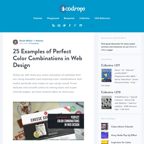
Minimal and Contrasty Color Schemes in Web Design
Making a web design with contrasty colors will allow for a better focus on certain areas of a web site. With a minimal color scheme, more contrast can be achieved and with the right complementary color, a unique and impactful visual impression is given. Creating a web design with contrasty colors will allow for a better focus on certain areas of a web site. With a minimal color scheme, more contrast can be achieved and with the right complementary color, a unique and impactful visual impression is given. We want to show you some great and inspiring examples of minimal and contrasty color schemes in web sites where only a few colors are used with a complementary additional one (or two).
How To Create a Cool Abstract Radial Pattern Design
Whenever I’m stuck for tutorial ideas I always seem to be able to fall back on my typical ‘Chris Spooner’ style of cool abstract patterns people seem to enjoy. We’ve used similar techniques on the 3 poster a couple of years ago and more recently on a colourful abstract poster. Follow this latest step by step guide to create a cool abstract design complete with radial pattern and alternating colours. The design we’ll be creating this time makes use of a radial pattern that draws in the viewer to the centre. Alternating colours give the design a cool and funky feel and textures add a touch of authenticity to the artwork.
Showcase of Parallax Usage in Web Design
The use of the parallax effect or parallax scrolling effect in websites can add a nice three dimensional depth illusion to the design and make the visit very interesting to a user. We have collected some creative examples of the parallax effect in web design. Enjoy! Rastapé Besides creating a lot of depth with the […]
Free textures for your next web project
Nothing like a field of beautiful flowers. Download Download These lovely water-colorful dots will make your designs pop.
25 Examples of Interesting and Beautiful Navigation
Designing the perfect navigation for a website it's one of the main keys to have a good outcome, to have a website that gets users attentions and make them want to browse around to check every little information (tab, image, text, etc) you have there. Navigation menus, schemes, layouts, everything has an important weight and need to be carefully analyzed to form a nice layout. Designing the perfect navigation for a website it’s one of the main keys to have a good outcome, to have a website that gets users attentions and make them want to browse around to check every little information (tab, image, text, etc) you have there. Navigation menus, schemes, layouts, everything has an important weight and need to be carefully analyzed to form a nice layout. From horizontal sliders to vertical scrolls and menu based navigations, here you will see 25 examples of navigations that will certainly get you inspired.