

Imagining Augmented Reality - Technology. Bill Gates Praises Online Education in Annual Letter - Technology. Better Choices Through Technology - Technology. Behold Tokyo's New Augmented Reality Architecture - Technology. Enterprise Software Doesn't Have to Suck: Social Network Analysis using R and Gephis. After learning the basics of R, I decided to learn something harder last week.
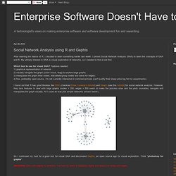
I picked Social Network Analysis (SNA) to learn the concepts of SNA and R. An App That Organizes Your City by Travel Time - Transportation - GOOD. Ecolect. Data Visualization, Design and Information Munging // Martin Krzywinski / Genome Sciences Center. Schemaball is a flexible schema visualizer for SQL databases.
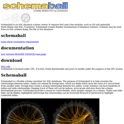
The purpose of Schemaball is to help visualize the relationships between tables. Tables are related by foreign keys, which are fields which store the value of a record field from another table. Foreign keys create a lookup relationship between two tables. Large schemas can have hundreds of tables and table relationships. Michael Burch - www.visus.uni-stuttgart.de. Fabian Beck, Martin Puppe, Patrick Braun, Michael Burch, Stephan Diehl.
Edge Bundling without Reducing the Source to Target Traceability. Tamara Munzner, UBC Home Page. Tamara Munzner InfoVis Group Professor Department of Computer Science, University of British ColumbiaImager Graphics, Visualization and HCI Lab.
WriteMaps Site Map Application: Create, edit, and share your sitemaps online. Pikko - Information visualization software. Website heat maps, click maps, web analytics. Galerie de impuregallery. Visualizing online social networks. Customizing Bar Chart. Many Eyes Log in Explore Visualizations.
A Technique for Drawing Directed Graphs. BibTeX @ARTICLE{Gansner93atechnique, author = {Emden R.
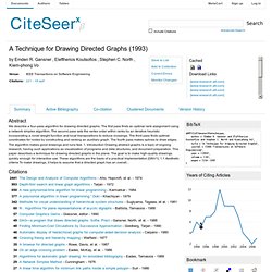
Gansner and Eleftherios Koutsofios and Stephen C. North and Kiem-phong Vo}, title = {A Technique for Drawing Directed Graphs}, journal = {IEEE Transactions on Software Engineering}, year = {1993}, volume = {19}, pages = {214--230}} Years of Citing Articles. Questions containing 'graph' The Fu Foundation School of Engineering & Applied Science - Columbia University. Cities across the globe are trying to develop plans to cut down their energy consumption and lower their carbon footprint by reducing the associated greenhouse gas emissions.
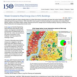
While initial efforts have focused on individual buildings by incorporating more energy efficient lighting, windows, and building systems, deeper reductions will call for changes beyond individual buildings, requiring a rethinking of how future infrastructure and energy policies should evolve. A new study by Columbia Engineering School will help urban planners, policy makers, and engineers understand the local dynamics of building energy use in New York City—where over two-thirds of the energy consumption is from buildings—and help jumpstart the exchange of ideas.
“The lack of information about building energy use is staggering,” said the study’s lead author Bianca Howard, a Ph.D. student in mechanical engineering at Columbia Engineering. Zoom into your Roof: Checking the Thermal Performance of Homes. Revealing the Energy Consumption of Each Building in New York. Estimated Total Annual Building Energy Consumption at the Block and Lot Level for New York City. MapBox. The heat map of England. National Heat Map Shows Heat Demand from Buildings. Information aesthetics - Data Visualization & Information Design. LOTR Timeline Graph. The ever-hilarious xkcd featured a comic which was very much a visualization.

It was a chart showing the interactions between characters from a handful of movies. The comic was the kick I needed to do a quick experiment with timeline-based graph visualizations. Here's the result. It's a bit of a mess, but what I've done is synchronize three components: a slider, the original comic from xkcd, and the graph visualization. You can use the slider grip or the buttons to move through the story. As time passes (or unpasses), the graph automatically shifts to reflect the data for the current time step. Geek to Live: Roll your own timeline. Kodu. Kodu is a new visual programming language made specifically for creating games.
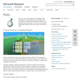
It is designed to be accessible for children and enjoyable for anyone. The programming environment runs on the Xbox, allowing rapid design iteration using only a game controller for input. Data Visualization for the Web. Santiago Ortiz portfolio. Network Visualization. Immersion by the MIT Media Lab is a view into your inbox that shows who you interact with via email over the years.
Immersion is an invitation to dive into the history of your email life in a platform that offers you the safety of knowing that you can always delete your data.Just like a cubist painting, Immersion presents users with a number of different perspectives of their email data. It provides a tool for self-reflection at a time where the zeitgeist is one of self-promotion. It provides an artistic representation that exists only in the presence of the visitor. It helps explore privacy by showing users data that they have already shared with others. Finally, it presents users wanting to be more strategic with their professional interactions, with a map to plan more effectively who they connect with. The base view is a network diagram where each node represents someone you've exchanged email with. Network Visualization. While we're on the topic of academic papers and how they're linked, Johan Bollen et. al used clickstream data to draw detailed maps of science, from the point of view of those actually reading the papers.
That is, instead of relying on citations, they used log data on how readers request papers, in the form of a billion user interactions on various web portals. Maps of science derived from citation data visualize the relationships among scholarly publications or disciplines. They are valuable instruments for exploring the structure and evolution of scholarly activity. Much like early world charts, these maps of science provide an overall visual perspective of science as well as a reference system that stimulates further exploration.
Cross-fertilization. Each circle represents a journal and edges represent connections between journals, according to Johan Bollen et. al's clickstream model. JotForm · Le Plus Facile des Générateurs de Formulaire. HTML5. A vocabulary and associated APIs for HTML and XHTML W3C Working Draft 29 March 2012 This Version: Latest Published Version: Latest Editor's Draft: Previous Versions: Editor: The Open Graph protocol. Babuinobot. What is Babuino? Babuino is a software program that combines the power of the Arduino hardware platform with the intuitive and fun Logo programming language using a click and drag GUI interface. This allows even young children to build their own programs and run them on a microcontroller. The program on the left uses only 5 blocks to make a speaker beep whenever a button is pressed.
Any child that can operate a mouse, fit simple puzzle pieces together, and has basic language skills can learn to program. Visual Programming Arduino: modkit and the others. Not long ago, our friend [Ed Baafi] told us about the amazing work he was doing on ModKit: a very interesting project in bringing visual programming on the Arduino side. Making programming as easy as building bricks is the common Quest of many different projects, aimed to work in the Educational field, teaching kids build their own programs (and toys).
Modkit is an in-browser graphical programming environment for little devices called embedded systems. Modkit can currently program Arduino and Arduino compatible hardware using simple graphical blocks similar to and heavily inspired by the Scratch programming environment developed by the Lifelong Kindergarten Group at the MIT Media Lab.Modkit is currently available by invite only. Blog Archive » Arduino in Schools (visual programming options) Modkit. Aerotwist. Upshot: Online mapping software for business & foundations. One tool. Countless possibilities. Rhiza Analytics is a powerful and elegant analytics research tool that fuses your company’s data with public and syndicated data to give you a 360 view of a situation.
Whether it’s making sense of complex customer purchasing patterns across distinct geographies or delivering the right message to the right customer at the right time, Rhiza Analytics produces deep insights about customers, operations and the competitive landscape. Actionable answers to your toughest questions. Getting Started Spring Data Graph Part 1. Graph drawing algorithms. Graphviz. Graphdrawing.org. Satellite Coverage Maps - Sat Footprint Intelsat 10-02 (Intelsat 1002, Intelsat Alpha-2, Intelsat X-02, IS-1002) / Thor 5 (Thor 2R) / Thor 6 (IS-1W) Visual Gadgets. Juice Analytics - Your data is meant for action. JuiceKit for Visual Analytics - JuiceKit™ SDK. Visualization Options. Find Data. Data Visualizations, Challenges, Community. Screensaver - visualizing the global blogosphere.
Twingly Screensaver Beta Twingly screensaver is visualizing the global blog activity in real time. Ushahidi. Learn how to code in Gephi. For developers only. Gephi, open source graph visualization software - Part 4. OpenStreetMap. CartoTalk. Atelier de Cartographie. Connecting Location Data with Decision Engines. Announcing MapBox Streets: A Global Map with Street Level Detail. Downloads.