Donations
Building a fact-based world view Gapminder is a non-profit foundation based in Stockholm. Our goal is to replace devastating myths with a fact-based worldview. Our method is to make data easy to understand.
Category/Science/scientific-visualization
From Free Software Directory Broaden your selection: Category/Science scientific-visualization (107)
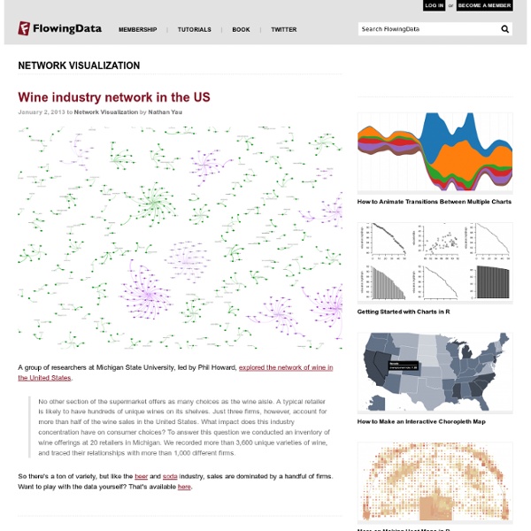
Network Visualization
While we're on the topic of academic papers and how they're linked, Johan Bollen et. al used clickstream data to draw detailed maps of science, from the point of view of those actually reading the papers. That is, instead of relying on citations, they used log data on how readers request papers, in the form of a billion user interactions on various web portals. Maps of science derived from citation data visualize the relationships among scholarly publications or disciplines. They are valuable instruments for exploring the structure and evolution of scholarly activity.
Visualize This: The FlowingData Guide to Design, Visualization, and Statistics
Visualize This is a practical guide on visualization and how to approach real-world data. A book by Nathan Yau who writes for FlowingData, Visualize This is a practical guide on visualization and how to approach real-world data. The book is published by Wiley and is available on Amazon and other major online booksellers.
Building a Kick-Ass Social Media Dashboard
If you are tasked with building a social media dashboard to track your efforts, look no further than this post. I have built many dashboards over the years and as a personal resolution to making my job easier, I decided to cut to the chase and get to the metrics that matter most. That means cutting out the everyday metrics that litter and cloud up the social media manager’s real success story. Now I am not saying that tracking followers, fans, sentiment, etc. is not important, but those are the vanity metrics that tend to give social media a bad name. These type of metrics are great indicators but they don’t really tie back to your business bottom line: driving revenue. With that being said here are the top metrics that I measure here at Marketo on a weekly basis.
Scientific visualization
History[edit] One of the earliest examples of three-dimensional scientific visualisation was Maxwell's thermodynamic surface, sculpted in clay in 1874 by James Clerk Maxwell.[3] This prefigured modern scientific visualization techniques that use computer graphics.[4] Methods for visualizing two-dimensional data sets[edit] Methods for visualizing three-dimensional data sets[edit]
HTML5
A vocabulary and associated APIs for HTML and XHTML W3C Working Draft 29 March 2012 This Version: Latest Published Version: Latest Editor's Draft:
What To Expect From Education In 2013
Guessing what the future of education holds is equal parts logic and guesswork. The logical part is simpler–take current trends and trace their arc further, doing your best to account for minor aberrations. If the majority of public education in the United States is waist-deep in adopting new academic standards, it doesn’t take Nostradamus to predict they are going to have a strong gravity about them in the education at large.
Content Curation Primer
Photo by Stuck in Customs What is Content Curation? Content curation is the process of sorting through the vast amounts of content on the web and presenting it in a meaningful and organized way around a specific theme.
Babuinobot
What is Babuino? Babuino is a software program that combines the power of the Arduino hardware platform with the intuitive and fun Logo programming language using a click and drag GUI interface. This allows even young children to build their own programs and run them on a microcontroller.
70 Tools And 4 Reasons To Make Your Own Infographics
Infographics are everywhere. Some love them. Some hate them. But however you feel, it’s fun to learn a little bit in a short period of time. Most are made so you can quickly grasp the key concepts behind them. That’s a key thing to keep in mind if you want to make your own infographics .
Full Spectrum: 10 Books on Sensemaking for the TED 2012 Bookstore
This week, I’m at TED , where I had the honor of curating a selection of books for the TED Bookstore around this year’s theme, . Here are my picks, along with the original text that appears on the little cards in the bookstore, and my blurb about the selection: I believe creativity is combinatorial — it’s our ability to take existing pieces of knowledge, information, insight, and ideas that we’ve gathered over the course of our lives, and recombine them into new ideas. Curation – the purposeful filtration of information – is what fills our mental pool of resources with the most meaningful building blocks of creativity possible. In a way, it’s a sensemaking mechanism for the world, allowing us to see not only why different pieces matter but also how they relate to one another and might fit together. Gathered here are 10 curated books on the loose theme of sensemaking, from a visual history of the timeline to a biography of information to a handmade exploration of Indian mythology.
Visual Programming Arduino: modkit and the others
Not long ago, our friend [Ed Baafi] told us about the amazing work he was doing on ModKit: a very interesting project in bringing visual programming on the Arduino side. Making programming as easy as building bricks is the common Quest of many different projects, aimed to work in the Educational field, teaching kids build their own programs (and toys). Modkit is an in-browser graphical programming environment for little devices called embedded systems. Modkit can currently program Arduino and Arduino compatible hardware using simple graphical blocks similar to and heavily inspired by the Scratch programming environment developed by the Lifelong Kindergarten Group at the MIT Media Lab.Modkit is currently available by invite only. Brian’s post has a good review about all the other arduino visual programmers.