
45 Free Calligraphy Fonts for Web Designers. #typism on Tagboard. Combining Fonts. A palette with wit Use typefaces with complementary moods to evoke an upbeat, energetic air.
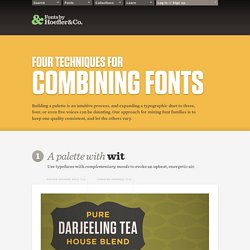
It’s the interplay between fonts that gives them energy. The more distant the moods in a typographic palette, the friskier the design will be. Here, three fonts with distinctive silhouettes have been chosen for their contrasting dispositions: the unabashed toughness of Tungsten is a foil for both Archer’s sweetness, and the cheekiness of Gotham Rounded. Hand Lettered Letterpress Stationery. I’ve been a big fan of calligrapher Lindsay Sherbondy – aka Lindsay Letters – ever since coming across an awesome gold foil baby announcement that she lettered and designed a while back.
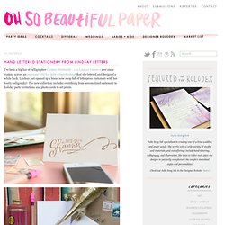
Lindsay just opened up a brand new shop full of letterpress stationery with her lovely calligraphy! The new collection includes everything from personalized stationery to holiday party invitations and photo cards to art prints. Wedding Invitation Samples. Ales Santos: caligrafia. Diamine Ancient Copper + Noodler's Konrad. Tales from the Enchanter: Calligraphy. Full steam ahead now with the Foundational text for this element of my assignment.
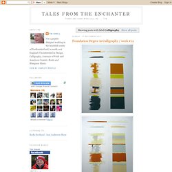
The content is chosen and I've worked out the nib size, line spacing and layout, although I may change this later. I've made some notes to refer to as I write, and I'm always aware of the particular letters that continue to give me problems, including that pesky 'l'. Caligrafía. Arte Papel. Alberto Carnero / Letters. Portfolio. Italic: Formal to Funky… “Italic Formal to Funky” starts with an in-depth review of the formal Italic alphabet.
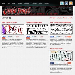
Individual attention will help to sharpen your italic hand. We will study each of the components of the alphabet – what makes it look the way it does – and use this information to determine how your personal italic can be [...] Foundation Meets Bone… The Foundation alphabet was aptly named by Edward Johnston as it is based on Carolingian, an early Humanist Roman hand and became the “foundation” for a calligraphy revival in the early 1900’s.
Fine Tuning the Fundamentals… Cards Summary. Daily Calligraphy on Behance. Seta calligraphy book. Invitations : numarta.com. Capitals : numarta.com. Italic : numarta.com. Foundational : numarta.com. Just Foundational. A Place To Flourish: Calligraphy Flourish Friday - Kuretake ZIG Pens. I recently received a new batch of ZIG pens from Kuretake.
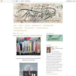
(Definitely, a good mail day!) I was most interested to try the Cocoiro Letter Pen. This is the information for the Cocoiro Letter Pen as provided to me by Kuretake. For a fiber tip pen, I was amazed at the thinness of line the Cocoiro could produce. Although it is a flexible, brush tip, it is a FIRM tip. The ergonomic pen body gives a comfortable grip. Calligraphy by 2inspire por 2inspire en Etsy. Calligraphic titles, letters by hand. SAMPLE%20BOOKLET. TV Sample Movies. Calligraphy Styles. Hand Lettering Artist and Design. Modern calligraphy & hand-drawn design. Inkwells. Tarocchi di Mantegna, c.1465 - World of Playing Cards. The so-called “Tarocchi di Mantegna” is a set of 50 copper-engraved emblematical images (c.1465) which were probably a social pastime, or an instructional or educational series.
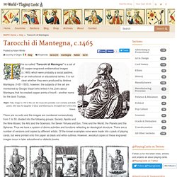
It is not clear whether they were produced by Andrea Mantegna (1431-1503), however, the subjects of the set are mentioned by Giorgio Vasari who writes in his Lives about Mantegna that he created copper prints of trionfi - another name for the tarot Trumps. Right: Talia, image no. XVI in this set. the muse who presides over comedy and idyllic poetry. She was the daughter of Zeus and Mnemosyne, the eighth-born of the nine Muses. There are no suits and the images are numbered consecutively from 1 to 50, divided into the following groups: Society; Apollo and the Nine Muses; the Arts and the Sciences; the Seven Virtues and Sun, Time and the World; the Planets and the Spheres.
Card games based around the Virtues and Vices, or Social Subjects, have of course been produced from time to time over the centuries. Weird and Wonderful: fairy-tale illustrations on Behance. Sketch Book on Behance. The Rubáiyát of Omar Khayyám on Behance. The Love Booklet on Behance. Alphabet38.2. COLENSO BBDO on Behance. Una Mosca en la Luna: Caligrafía a mano del S.XXI. Ivana, yo recuerdo el tiralíneas de mi padre, la tinta china y los grafos y también comenzar a hacer una línea perfecta, de repente una burbujita de aire y chof!
Volver a empezar… lo más aproximado que he utilizado es una pluma normal. Ros, sí, jeje ;) la verdad es que hay algunas tipografías impresionantes que imitan a la perfección a las clásicas pero bueno esto tiene su mérito. Cecilia, me pasa un poco lo mismo aunque mi letra cada año se estira más y más va a llegar un punto en el que nadie la entienda. Rosanna, qué nivel! Yo quiero ver eso de lo que hablas, si lo retomas avisa! Elisa, y tanto que inspira, la gente saber hacer una de cosas… y tan bonitas, eso sí, si le echas un vistazo a lo que cobran por sobre… es como para pensarse retomar la caligrafía ;) Mar de color, las tintas claras sobre fondos oscuros siempre nos impactan más, la costumbre de escribir en oscuro sobre claro, supongo.
Lettering Time. Caligrafía. Arte Papel. DELETRAS · Caligrafía y Creatividad. Ivan Castro, caligrafia y lettering. Atelier de Chiqui: Caligrafía. Me encanta las plumas, tengo el recuerdo de las que me regalo mi padre, en unos de sus viajes a Alemania, yo soy zurda y fue genial! Mis plumas para ser más zurda!!! , y en ese momento que las probe, pense... ... como me gusta escribir! Hand Lettering of Four Agreements on Behance.