
Create Infographics. An Interactive Visualization for Hollywood Movies. Map of Metal. Cartes publiques - MindMeister. Western Philosophy. Le mappe del pensiero: dalle mappe mentali alle mappe concettuali per il project management, il knowledge management, il problem solving, il decision making, il decision taking, l'apprendimento organizzativo, l'apprendimento rapido, il w. Prima guerra mondiale.html. <table width=90% cellpadding=10><tr><td bgcolor=ff4444><span><h1>Warning:</h1><b>JavaScript is turned OFF.

None of the links on this page will work until it is reactivated. World History : HyperHistory. Infographics & Data Visualizations. Comment on Infographie gouvernance de l’information : Une vue systémique pour comprendre le pilotage de l’information by Jean-Pascal Perrein. A visual exploration on mapping complex networks. 12 Visualizations That Will Change the Way You View Scale in Your World. Scale is a simple concept.
From a very early age, children know about big and small, heavy and light, more and less. Extreme scales, however, are another story. Try to imagine, for example, the size of the universe… or $1 trillion made up entirely of dollar bills. Exactly. Grasping the actual quantities involved in extreme scales can be difficult, which makes managing scale in visualizations an interesting problem.
Below are 12 visualizations that try to show things at extreme scales. 1. 2. 3. 4. 5. 6. 7. 8. 9. Infographic originally published on Mashable.com. 10. xkcd’s creator, Randall Munroe seems to enjoy visualizations of scale. 11. 12. Humans all fit within a small range of sizes, weights, and lifespans, and the quantities we deal with typically fit in small ranges as well.
Drew Skau is a PhD Computer Science Visualization student at UNCC, with an undergraduate degree in Architecture. ChronoZoom. Top Tech Trends of 2011 (infographic) Stay Connected with Us!
Follow TechnoBuffalo So what can we learn from 2011? Well for one, according to this infographic, it seems people en masse absolutely do not like being hardwired. On the contrary, our affinity for sharing, streaming and being mobile has become a full-blown obsession. And why not? In other words, all we want is to do more and enjoy more, absolutely everywhere we are. For the full list of 2011′s tech trends, hit up the infographic below. [via Alltop, Column Five, source G+] Click to enlarge. 50 Great Examples of Data Visualization. Wrapping your brain around data online can be challenging, especially when dealing with huge volumes of information.

And trying to find related content can also be difficult, depending on what data you’re looking for. But data visualizations can make all of that much easier, allowing you to see the concepts that you’re learning about in a more interesting, and often more useful manner. Below are 50 of the best data visualizations and tools for creating your own visualizations out there, covering everything from Digg activity to network connectivity to what’s currently happening on Twitter.
Music, Movies and Other Media. 40 Useful and Creative Infographics. Six Revisions Menu Main Categories CSS HTML JavaScript Web Design WordPress Web Development Design Inspiration UX Design UI Design Freebies Tutorials Tools Links About Contact Advertise RSS Twitter Facebook 40 Useful and Creative Infographics By Jacob Gube Information graphics (or infographics) are graphical depictions of data and information.
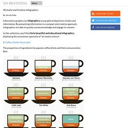
In this collection, you’ll find forty beautiful and educational infographics, displaying the uncommon spectacle of "art meets science". 1. The proportion of ingredients for popular coffee drinks and their pronunciation keys. 2. This infographic showcases the history of the Swine Flu, starting from 1976. What topics science lovers link to the most. Hilary Mason, chief scientist at bitly, examined links to 600 science pages and the pages that those people visited next: The results revealed which subjects were strongly and weakly associated.
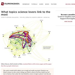
Chemistry was linked to almost no other science. Biology was linked to almost all of them. Health was tied more to business than to food. But why did fashion connect strongly to physics? The interactive lets you poke around the data, looking at connections sorted from weakest (fewer links) to strongest (more links), and nodes are organized such that topics with more links between each other are closer together. Natural next step: let me click on the nodes. [Scientific American via @hmason]