
Type Posters – Carrie Chan. Classes by seanwes. In 5 Years, Searches for “Hand Lettering” Increased Over 1000%!
Hey, Friend! Sean McCabe here. Hand lettering has experienced a massive resurgence. In just a few short years, nearly one million people have read my lettering guide! It’s no surprise you’re here: hand lettering is booming right now. Hand lettering is selling all kinds of products like prints and t-shirts too. Site of the Day Page 2. Crafting Type: Font Design Workshops For Beginners.
Lessons.pdf. TypeToy. Beautiful web type — the best typefaces from the Google web fonts directory. Lucius Annaeus Seneca60 AD Among the numerous faults of those who pass their lives recklessly and without due reflexion, my good friend Liberalis, I should say that there is hardly any one so hurtful to society as this, that we neither know how to bestow or how to receive a benefit.
It follows from this that benefits are badly invested, and become bad debts: in these cases it is too late to complain of their not being returned, for they were thrown away when we bestowed them. Nor need we wonder that while the greatest vices are common, none is more common than ingratitude: for this I see is brought about by various causes. Type@Cooper – Condensed Program in Typeface Design. Industry leaders conduct a rigorous 5-week intensive program in typeface design this summer at Cooper Union’s New York City campus.
Note: Applications for admission to the 2014 Condensed program are due by midnight of Thursday, February 28, 2014. About the Condensed Program.
Books - Typo. Ingenious Font Summons Icons With A Few Keystrokes. The littlest graphics can be the biggest pain to implement on the web.
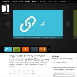
You need to either hire an illustrator or dig through clipart. Then you need to sync up with your designer (who may be different than a freelance illustrator), who, in turn, may need to toss the product to a developer to implement. It would be a lot easier if implementing such graphics were as simple as typing a word. That’s the whole idea behind Symbolset, a collection of typefaces that you generate simply by typing a word. Once you license their fonts, those pesky little images we always need for projects, from sunshine to mailboxes to social-networking buttons, can magically appear when you type keywords like “sunshine,” “mailbox,” or “twitter.” “There’s a magical moment when typing a keyword becomes an image,” Symbolset’s Mike Fortress tells Co.Design.
Expert typography tips. From developing legible body fonts to creating custom lettering for logotypes, great type design requires a rather interesting – and somewhat conflicting – mix of qualities.
It’s a craft that relies in equal parts on knowledge and instinct, on method and experimentation, and on creative flair and painstaking attention to detail. “It’s quite instinctive, but ultimately comes with practice and research into what fonts do,” says Bruno Maag, creative and managing director at font foundry Dalton Maag. Tabletto, pour la typographique handmade. Shape Type, the letter shaping game. 6 Questions You Should Ask Yourself When Choosing Fonts. The Basics of Typography. Typography is a central component of design.
It gives us an understanding of the heritage behind our craft. It’s one of the primary ways we, as a society, pass on information to others. Imagine a website, a magazine or even TV without text. Typography is a subject that raises passions and it can become a consuming obsession. Typography: Anatomy of a Letterform. Understanding the fundamental principles and concepts of typography is the first step to being a successful typographer.

The most basic component of typography is the letter, and each letter of the alphabet is distinguished by its unique shape, or letterform. Primarily the design classes which I took in college were based on anatomy and terminology of type. It’s not difficult to recognize serifs, descenders, ascenders but simultaneously it’s true that for one class one has to learn nearly 100 definitions and terms. Undoubtedly it’s necessary to possess some basic knowledge of the terminologies before we step into the arena of type. It can be puzzling if we discuss about type using informal terms like thingies, slants and squiggles. 1.
Majority of the characters sit on this imaginary horizontal line. 2. 3. 4. Typography Insight - New ways of learning&teaching typefaces. How can I provide a more instant and easier way to learn, reference, and play with typography by leveraging technological advances in tablet platform devices?
With this question in mind, I could now think about possible audiences, types of design and content. Since my project focuses on form and historical content, I defined my primary audience as students who are studying typography in design school. However, after meeting designers and typography lovers, I realized that they also love touching and seeing beautiful typefaces in large scale. How to Choose a Typeface - Smashing Magazine. Advertisement Choosing a typeface can be tricky.
The beauty and complexity of type, combined with an inexhaustible supply of options to evaluate, can make your head spin. But don’t be baffled — and don’t despair. While there are no easy-to-follow rules on how best to choose a typeface, there are many tried-and-true principles you can quickly learn and apply to make an appropriate typeface choice. If you work systematically through the options below, you’ll have a winning typeface choice in no time. What Is Your Goal? The first thing you have to do in order to choose a typeface is form a strong impression in your mind about how you want your audience to react to the text. Perhaps the hardest part of breaking down the typeface selection process is understanding which parts are more subjective and which parts are more objective.
Legibility. Web Typography: Educational Resources, Tools and Techniques - Smashing Magazine. Web typography has evolved a lot over the last years.
Today we see rich, accessible typography, a plethora of type design choices for the web and a number of remarkable, type-based web designs. It’s a great time for web design, and it’s a great time for web typography. Still, being as excited as we are, we should not forget about the foundational principles of good type design on the web and use them properly within our projects. Great choice is good, but, most importantly, we should be making meaningful typographic choices in our designs. In this post we present an extensive overview of educational resources, tools, articles, techniques and showcases all related to web typography. Ultimate Guide of Web Typography Tutorials, Tips and Best Practices. Web typography is nothing but implementing typography on web page. This is very important in order to identify oneself in the designing world. It is equally important that understanding and implementing typography successfully on your web page.
This is an evolution in web designing to stand apart from all other websites. 10 Essential Font Sites. The Typographic Hub. Font Download - Thousands of Fonts! Useful Typography Tips For Adobe Illustrator - Smashing Magazine. Advertisement Typography is not only an all-important aspect of design, it is also an art form in and of itself. Choosing the right font, the perfect spacing and even the correct shape of text can be an important factor as to whether a project fails or succeeds. Fonts from A-Z. Download them free!
Beautiful examples - Typo. Tools - Typo. Best Fonts - Typo.