
Monde – WID – World Inequality Database. Qu’est-ce que WID.world ?

Pour plus d’informations sur WID.world et son histoire, cliquez ici. Pour plus d’informations sur le réseau de chercheurs, cliquez ici. Pour plus d’informations sur la méthodologie, cliquez ici. Comment lire les graphiques de WID.world ? Cliquez ici pour apprendre comment naviguer entre les différents menus et graphiques de WID.world. Je rencontre des problèmes techniques sur WID.world. Tout d’abord, veuillez accepter nos plus sincères excuses. Qu’est-ce qui différencie les données relatives aux inégalités disponibles sur WID.world de celles de l’OCDE, de la Banque Mondiale ou d’autres fournisseurs de données relatives aux inégalités ? Seuls quelques instituts fournissent des estimations concernant les inégalités. Le site WID.world, en revanche, combine les comptes nationaux et les données des enquêtes avec des sources de données fiscales. Si vous avez d’autres questions concernant les données, n’hésitez pas à nous contacter. Ma capitale dans une bulle. Comment le TGV a rétréci la France.
World Population Prospects - Population Division - United Nations. The 2017 Revision of World Population Prospects is the twenty-fifth round of official United Nations population estimates and projections that have been prepared by the Population Division of the Department of Economic and Social Affairs of the United Nations Secretariat.
The main results are presented in a series of Excel files displaying key demographic indicators for each development group, income group, region, subregion and country or area for selected periods or dates within 1950-2100. A publication labelled Key findings and advance tables, which provide insights on the results of this latest revision, is also made available. Quick Navigation Disclaimer: This web site contains data tables, figures, maps, analyses and technical notes from the current revision of the World Population Prospects. The world as 100 people, glimpsed over 200 years of history. Max Roser, the Oxford economist behind Our World In Data, has devoted his career to spreading a statistically informed view of global development.
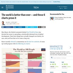
Chart how things have actually changed over history, he says, and you'll see that we've come a long way. Roser recently released a commentary on the last two centuries. It sums up world progress with the following six charts: ourworldindata.org Extreme poverty has collapsed. It's hard to think of anything that pessimists could hold up to counter those trends. While there's no guarantee that progress will continue, mankind is also in a better position than ever to deal with problems, Roser says. "Solving problems—big problems—is always a collaborative undertaking," he writes, "and the group of people that is able to work together today is a much, much stronger group than there ever was on this planet. " Why does it matter that the world is better than ever? "The story that we tell ourselves about our history and our time matters," Roser writes.
8 graphiques pour comprendre la démographie française. L’Insee a publié mardi 19 janvier le bilan démographique de la France en 2015. Et il n’est pas très bon. Si notre pays se distingue encore par sa vitalité démographique, celle-ci est en perte de vitesse, avec à la fois moins de naissance et, surtout, davantage de décès, qui ont pour conséquence rare de faire diminuer l’espérance de vie. Voici ce qu’il faut retenir de ce rapport. Free data, statistics, analysis, visualization & sharing - knoema.com. Gapminder: Unveiling the beauty of statistics for a fact based world view. Our World in Data — Visualising the Empirical Evidence on how the World is Changing. Map: The cost of living across the world. The prices of groceries, transportation, restaurants and utilities were analysed by Numbeo, the world’s largest database of user-contributed data, to draw this map of the cost of living.
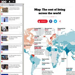
Switzerland is the dearest, India is the cheapest – and the UK came in 10th. Source: Numbeo More: These are the most obese countries in the world The prices of groceries, transportation, restaurants and utilities were analysed by Numbeo, the world’s largest database of user-contributed data, to draw this map of the cost of living. Switzerland is the dearest, India is the cheapest – and the UK came in 10th. Source: Numbeo More: These are the most obese countries in the world.
Statistiques mondiales et régionales, données nationales, cartes, classements.