
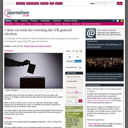
ACS Commute Map. Gun violence in America, in 17 maps and charts. Since the August 9, 2014, police shooting of Michael Brown in Ferguson, Missouri, police have killed at least 1,493 people, as this map (click to view the interactive version) shows.

Les réserves d'Apple. Ayant accumulé 202,8 milliards de dollars de liquidités, l'entreprise californienne a de quoi envisager l'avenir avec une certaines sérénité.
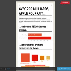
Voici ce qu'elle pourrait, en théorie, faire de ce trésor. ...rembourser 58% de la dette grecque. ...s'offrir les trois premiers concurrents de Toyota. ...acheter 7800 maisons comme celle de Johnny Depp dans le Var. La villa que partageaient Johnny Depp et Vanessa Paradis est en vente pour 26 millions de dollars. Outils dataviz. The 37 best tools for data visualization. It's often said that data is the new world currency, and the web is the exchange bureau through which it's traded.
As consumers, we're positively swimming in data; it's everywhere from labels on food packaging design to World Health Organisation reports. As a result, for the designer it's becoming increasingly difficult to present data in a way that stands out from the mass of competing data streams. Get Adobe Creative Cloud. Resources. 21 Essential Data Visualization Tools - UsabilityTools.com Blog. 322 823 108Share0 They say a picture is worth a thousand words—but in online world, a chart or infographic will enrich any designers repertoire.
Comment j’ai exploré plus de 500 chroniques de Bernard Guetta. Comme souvent pour les projets que je mène Dans mon labo, ma petite enquête autour des chroniques de Bernard Guetta sur France Inter m’a amené à utiliser toute une panoplie d’outils.
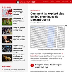
Je les passe rapidement en revue dans cet article, en espérant que ça vous aide pour vos propres travaux. Récupérer le texte des chroniques avec Outwit Hub Cette première étape a été rapide, la construction du site de France Inter le rendant très simple à « scraper ». Une page d’archives propose en effet des liens vers chacune des chroniques. Je l’ai chargée dans Outwit Hub puis ai demandé à ce dernier d’attraper toutes les URL concernés (elles contiennent toutes la chaîne de caractères « emission-geopolitique »). Toujours dans Outwit Hub, j’ai ensuite mis au point un scraper pour extraire les éléments intéressants du code HTML de la page, à commencer par le texte. Here's how to use data from OpenStreetMap for your infographics. New York, terre de dataviz. Linkurious.js graph visualization library - Linkurious - Understand the connections in your data.
7 data viz tools for covering the UK general election. Credit: Thinkstock Journalists have never had more data to work with than we do today, and there's no shortage of online tools and apps that can help analyse and visualise this data.
Many of them are free to use, or work on a freemium model where certain features can be accessed at no cost, so reporters have plenty of options for making the most of the data in their stories. And when better to test some of these tools than during election time? Here are seven (mostly) free data visualisation tools to explore next time poll results or surveys land in your inbox. 9 Must-read Books for Beginners in Data Journalism - Infogr.amInfogr.am. Statistiques. Les corrélations de l'absurde. Ce n’est pas parce que deux courbes se ressemblent qu’il y a un lien entre elles.
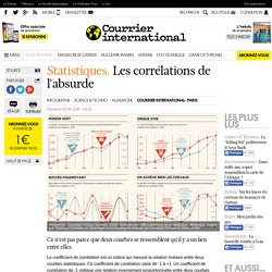
Le coefficient de corrélation est un indice qui mesure la relation linéaire entre deux courbes statistiques. Ce coefficient de corrélation varie de -1 à +1. Un coefficient de corrélation de -1 indique une relation inversement proportionnelle entre deux courbes (quand l’une est au plus bas, l’autre est au plus haut). La valeur +1 au contraire indique une parfaite similitude entre deux variables. A zéro, il n’y a aucune corrélation entre les variables. Comme le montrent nos exemples, un fort coefficient de corrélation n’établit pas un lien de cause à effet (ce n’est pas parce que A augmente que B augmente). Top 50 Data Science Resources: The Best Blogs, Forums, Videos and Tutorials to Learn All about Data Science. The field of data science is constantly evolving and ever-advancing, with new technologies placing more valuable insights in the hands of modern enterprises.
More data-driven organizations are hiring data scientists to drive their efforts to gather, analyze, and make use of Big Data in valuable ways. Because the field of data science is so broad and sometimes challenging to navigate, we’ve compiled a list of 50 of the most helpful data science resources on the web. Whether you’re a student or new professional working in the field of data science, these resources are valuable for discovering the latest employment opportunities, finding tutorials for the processes and systems you’re using on a daily basis, learning hacks and tricks to boost your performance, and connecting with other professionals in your field. Table of Contents: Cool Color Infographics; Data Visualization about Color with Color. It’s no secret that here at Munsell, we love color and know that color has many uses!
Of course, we love the recent surge in popularity that informational graphics have brought to the internet. Infographics are a visual way to take in informational data through charts and images. Since they are visual, they often incorporate lots of colors. What we like even better, are cool colorful infographics about color, so we have scoured the net to find you some of our favorites! Info-graphics Archives - Academy Class Blog. Creating Custom Bar/Column Graphs – Illustrator Graph Designs April 07, 2015 0 Comments Using the Graph Design function in Adobe Illustrator, you can add illustrations or any shape you want to spice up any column or bar graph. Any drawing you create in Illustrator can be converted into a graph design, allowing for [...] Illustrator Graph Designs: Creating a Pictogram/Unit Chart.
Guide to critical thinking, research, data and theory: Overview for journalists. Journalists constantly face the challenge of explaining why things happened: What were the factors in an election victory?
What are the reasons behind housing segregation in a city? What is the explanation for a low-performing school? In daily journalism, we are often content to quote relevant sources or officials, and let them do the “explaining.” But great journalism can do much more than that, particularly if more rigorous thinking and methods are applied. 3 Great Examples of Data Journalism Stories. Data visualisation - one issue, three representations. For some reason I thought I had done this post some time back – but I hadn’t so here it is. Sorry! The distribution of third-sector grants by London Borough of Tower Hamlets council is an issue I have been covering for quite some time on my hyperlocal site Love Wapping. I don’t want to duplicate all the content of the original blog posts here but simply highlight three different ways of visualising the same issue in different ways. 1.
NICAR 2015 Slides, Links & Tutorials // Ricochet by Chrys Wu. Vision Statement: How to Lie with Charts - HBR. Where to learn about data journalism - pudo.org (Friedrich Lindenberg) Whenever we do data journalism training, I mention many different resources where people can learn more about the techniques, tools and community that we discuss during the workshops. The links to these usually end up in the notes section my slides, which isn't very helpful. So, instead, here's a list of interesting resources for getting started with data journalism. Data journalism blogs - Datajournalistiek.nl. To make sure I never miss out on new trends, developments, tools and other cool data stuff, I follow over 350 data journalism websites. Upon Victor request I’ve made this page to share this collection of data journalism related sites.
Silk - An all-purpose tool for data journalism. 45 nouveaux Tutoriels de qualité gratuits pour Illustrator. 45 nouveaux Tutoriels de qualité gratuits pour Illustrator. 20 new data viz tools and resources of 2014. We continue our special posts with the best data viz related content of the year, with a useful list of new tools and resources that were made available throughout 2014. A pretty straightforward compilation that was much harder to produce than initially expected, we must say, since the number of mentions to include was way beyond our initial (poorly made) estimates.
So many new options out there! So, we had a hard time gathering 20 of those new platforms, tools and resources – if you’re a frequent reader of our weekly Data Viz News posts, you’ll might recall several of the mentions in this list, -, and we deliberately left out the new releases, versions and updates of existing tools, such as CartoDB, Mapbox, Tableau, D3.js, RAW, Infogr.am and others.
Of course, there’s always Visualising Data’s list of 250+ tools and resources for a much broader view of what’s available out there. For now, here are the new resources and tools that caught our attention in 2014: 20 new data viz tools and resources of 2014. We continue our special posts with the best data viz related content of the year, with a useful list of new tools and resources that were made available throughout 2014.
A pretty straightforward compilation that was much harder to produce than initially expected, we must say, since the number of mentions to include was way beyond our initial (poorly made) estimates. So many new options out there! So, we had a hard time gathering 20 of those new platforms, tools and resources – if you’re a frequent reader of our weekly Data Viz News posts, you’ll might recall several of the mentions in this list, -, and we deliberately left out the new releases, versions and updates of existing tools, such as CartoDB, Mapbox, Tableau, D3.js, RAW, Infogr.am and others. Of course, there’s always Visualising Data’s list of 250+ tools and resources for a much broader view of what’s available out there.
10 Dataviz Pinterest users that you must follow. Since it became ‘mainstream’ – sometime during 2011 – Pinterest has grown into one of the favorite Internet destinations for those seeking to explore visual content, in its various forms and shapes. Infographics, of course, are all over the place there – including a good part of our late Tumblr archive. Despite this popularity – just check the results for “Data visualization” on Pinterest -, lack of time might be main reason why Alberto Cairo, Andy Kirk and others have a profile without anything posted there. Vision Statement: How to Lie with Charts. Data Le Temps. Page. 30 must-see infographic galleries from newspapers. After last month’s article highlighting data viz galleries we recommend everyone to follow, we return to this subject not only with more amazing sources of visual inspiration, but in many ways, with the true place where you’ll find the best infographics.
And that’s because, before there was an Internet (or television, or radio, for that matter), infographics and maps were already present in several newspapers and magazines – something we are reminded of every Monday, as you saw earlier today. More importantly, journalistic infographics are bound (or should be, at least) to the same principles any journalistic piece is, namely in terms of the accuracy and relevance of the message/data presented to the readers.
Combine that with the talent of experienced illustrators, graphic designers and copywriters, and what you have is decades of history told in infographic form. (Click through the images to visit the websites) Los Angeles Times Data Desk (Image: The Los Angeles Times) (Image: USA Today) Comment nous avons enquêté avec les données d'Airbnb. Demain et dès à présent sur le site web du Temps, vous pourrez lire une enquête de notre journaliste Julie Conti sur Airbnb à Genève. Our World in Data — Visualising the Empirical Evidence on how the World is Changing. Big Picture: Google Visualization Research. Les 20 meilleurs outils de datavisualisation au banc d’essai. Que vous soyez absolument novice ou codeur amateur, il existe aujourd’hui sur le web une impressionnante palette d’outils (presque) gratuits pour réaliser des datavisualisations. Datavisualization.ch Selected Tools.
Infogr.am webinars. Infogr.am tutorials. Kdmc.wpengine. 5 outils pour créer vos propres infographies. Vous avez besoin de belles présentations ou infographies pour alimenter le contenu de votre site web ou de vos réseaux sociaux ? Social Bistrot vous présente aujourd’hui 5 outils performants qui vont libérer votre âme de graphiste. 1. PicktoChart : Picktochart se veut très simple d’utilisation, il vous permet d’accéder à 9 modèles infographiques libres. Si vous voulez aller plus loin avec cet outil, il vous faudra accéder à sa version payante. Comptez environ 29 € par mois ou 290 € par an. Infographic Designers' Sketchbooks by Steven Heller and Rick Landers reveals ... Swarmize. Guardian launches open-source data journalism tool. Welcome to the London Datastore. MobileVis. Data Visualization with JavaScript.
Creating and Utilizing Linked Open Statistical Data for the Developme… Outils dataviz. Le datajournalisme en 10 sites. NounProject. Collecter pour mieux analyser : les bases de données et le journalisme. Showcase — Information is Beautiful Awards. Visualising Data » Resources. Collecter pour mieux analyser : les bases de données et le journalisme. “Storytelling is nothing but Data with a Soul,” from the Data Visualization Summit 2014VizWorld.com. Home - datacatalogs.org. Cartographie numérique : précis de discrétisation pour les nuls. Timescape Login. Infoactive. Visualising Data » Blog Archive » 10 significant visualisation developments: January to June 2014. Dadaviz. Bakamap. Comparez votre pays de l'OCDE.
@joelmatriche » Le blog de jo. 50 Excellent Data Visualization Examples for Presentations. Veille d'un dataïste (mais pas que) Datavisualization.ch Selected Tools. 8. MediaData. Datajournalismelab. Create beautiful dynamic data driven maps. About Tableau's Products.
Business Intelligence and Analytics. The Data Visualisation Catalogue. Stats faciles. How we built Ampp3d. Accueil - data.gouv.fr. Exemple DataViz. Moteur de recherche public data US. Data.
NounProject. Piktochart : Make Information Beautiful. Foundations, Techniques, Applications (Matthew Ward. Codecademy Online Tutorials. Free Beautiful Online Survey & Form Builder. Journalisme et code : 10 grands principes de programmation expliqués. Learn how to code. Raw. Top 5 Data-Scraping Tools for Would-Be Data Journalists.
The Upshot, Vox and FiveThirtyEight: data journalism's golden age, or TMI?