27 awesome maps that will help you understand the world. Des cartes historiques déclassifiées par la CIA. Pour célébrer son 75e anniversaire, le centre de cartographie de la CIA lève le voile sur un pan de sa petite histoire – et, du même coup, de la Grande.
Depuis le début de novembre dernier, ce bras de l’agence américaine de renseignement dévoile sur Flickr de nombreuses cartes historiques. Ces documents donnent une perspective unique sur le travail de l’agence américaine. Positions russes lors de la Deuxième Guerre mondiale, sites pétroliers au Moyen-Orient dans les années 1950, emplacement des missiles lors de la crise de 1962 à Cuba : la collection recèle de nombreux trésors qui n’étaient auparavant accessibles qu’aux gens du milieu de l’espionnage. Carte du pétrole au Moyen-Orient en 1951 Les missiles à Cuba en 1962 Dans le lot, on peut aussi voir quelques photos comme celle ci-dessous, prise à Camp David le lendemain des attentats du 11 septembre 2001, où le président George W. 18 cartes qui vont changer votre approche sur le monde. Ces cartes incluent des nouvelles troublantes pour les États-Unis. 1.
32 Maps That Will Teach You Something New About the World. Our world is a complex network of people, places and things.
Maps are a great tool and can help us understand how we are all connected. Below you will find a collection of informative maps that will hopefully teach you something new and give you a fresh perspective of our amazing planet and those that inhabit it. 1. If You’re on the Beach, This is What’s Across the Ocean The map above shows the countries that are due east and west from points along the coasts of North and South America. 2. The oceanic pole of inaccessibility (48°52.6′S 123°23.6′W) is the place in the ocean that is farthest from land. 3. 4. 6. 7. 9. 11. 12. 40 Maps That Will Help You Make Sense of the World. If you’re a visual learner like myself, then you know maps, charts and infographics can really help bring data and information to life. Maps can make a point resonate with readers and this collection aims to do just that.
40 Maps They Didn’t Teach You In School. By the time we graduate high school, we learn that they never taught us the most interesting things in there.
Sure, you might be able to name the European countries or point New York on the map, but does that give a you real understanding of how the world functions? To fill this gap, we have gathered a great and informative selection of infographical maps that they should’ve shown us at school: every single one of these maps reveals different fun and interesting facts, which can actually help you draw some pretty interesting conclusions. Show Full Text What makes infographical maps so engaging is how easy it becomes to conceive graphically presented information. The best part, there are brilliant services like Target Map that “allow everyone (from individuals to large organizations) to represent their data on maps of any country in the world and to share their knowledge with the whole Internet Community.”
"Why isn't this in our history books?" Global Language Network. Putting Canada on the map. For a different perspective on Canada, Maclean’s went to the maps.
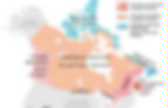
Drawing on a variety of sources, from government statistics to various online databases to tweets, here are some maps to illustrate Canada as you’ve never seen it before. RELATED:Stunning images of Canada from aboveMapping Canada: View our full map series It’s been said many times that hockey is Canada’s religion. Inspired by this, we asked FullDuplex.ca to do some data-crunching. Drawing on a year of tweets geotagged to specific cities, they tracked the number of references to “church” and “hockey,” and we compared them to see where people tweeted the most about one over the other. For the next map, to find out where Canadians cursed the most, we also asked Full Duplex for assistance. It’s always a surprise when people first learn that the very tip of southwestern Ontario is at a lower latitude than parts of California—which got us wondering: How do other parts of the country line up with the rest of the world? Canadian Geographic: Historical Maps 1905. Between 1901 and 1911, Canada's population increased from 5,371,315 to 7,206,643.
The economy also grew at an unprecedented rate during this time, except for two brief downturns in 1907 and 1913. The economic boom was partly due to a great deal of foreign investment and in part due to the incredible success Canada was having in selling wheat overseas. The booms in population and the economy led to two new transcontinental railway projects in the early 1900s. In 1907, the National Council of Women of Canada made a new demand that would become very familiar over the coming decades: "Equal pay for equal work. " Tensions between Canada and Britain rose after Britain sided with the U.S. in a 1903 dispute over the Canada-Alaska border. Boundary Changes Newfoundland: In 1497, John Cabot called it "newfounde isle".