
The Problem With Our Maps. Maps shape our understanding of the world—and in an increasingly interconnected and global economy, this geographic knowledge is more important than ever.
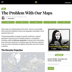
Unfortunately, billions of people around the world have a skewed perception of the true size of countries thanks to a cartographic technique called the Mercator projection. Used just about everywhere, from classroom wall maps to navigation apps, the Mercator projection is the way most of humanity recognizes the position and size of Earth’s continents. Map - Real Size. 40 Maps They Didn’t Teach You In School. By the time we graduate high school, we learn that they never taught us the most interesting things in there.
Sure, you might be able to name the European countries or point New York on the map, but does that give a you real understanding of how the world functions? To fill this gap, we have gathered a great and informative selection of infographical maps that they should’ve shown us at school: every single one of these maps reveals different fun and interesting facts, which can actually help you draw some pretty interesting conclusions. Show Full Text What makes infographical maps so engaging is how easy it becomes to conceive graphically presented information. The best part, there are brilliant services like Target Map that “allow everyone (from individuals to large organizations) to represent their data on maps of any country in the world and to share their knowledge with the whole Internet Community.” Trust us, these are way better than the ones they taught you at school! 40 Maps That Will Help You Make Sense of the World.
If you’re a visual learner like myself, then you know maps, charts and infographics can really help bring data and information to life. Maps can make a point resonate with readers and this collection aims to do just that. Hopefully some of these maps will surprise you and you’ll learn something new. A few are important to know, some interpret and display data in a beautiful or creative way, and a few may even make you chuckle or shake your head. If you enjoy this collection of maps, the Sifter highly recommends the r/MapPorn sub reddit. You should also check out ChartsBin.com. 1. 2. 3. 4. Pangea was a supercontinent that existed during the late Paleozoic and early Mesozoic eras, forming about 300 million years ago. 5. 6. 7. 8. 9. 10. Westmoreland County Tax Maps. The Westmoreland County Department of Geographic Information Systems helps Westmoreland County to fulfill a statutory requirement that all taxable property needs to be mapped to aid in the tax assessment process.
Using cutting age technology, Westmoreland GIS is able to provide a layout of properties, at and below the surface, both in the past and present. This information is made available in a variety of formats to the paying and public requestors via the GIS Tax Mapping website and a secure file transfer site. New GIS Tax Mapping Site with No Subscription FeesMonday, November 18, 2013, Westmoreland County launched a new GIS Tax Map Parcel Application.
Those who pay for subscriber access will no longer be charged for added features beginning on the first of November. Other subscription services that Westmoreland County offers will not be affected. Feel free to email any questions, comments or concerns. The Map Room. The Map Room is a blog that points to maps, map collections, map-related resources, and material about maps on the web.
Anything that fits under that rubric, from medieval mappæ mundi to satellite imagery, and from topo maps to Tolkien, is fair game. Launched in March 2003, The Map Room is aimed at a broad audience. While cartographers and people in the geospatial industry seem to enjoy reading it, it’s meant to be accessible to anyone with nothing more than an interest in maps. Need more information? Consult the FAQ. About the Author I’m Jonathan Crowe, and I’m not a map expert. Google Street View. Virtual Turnpike. Rumsey Historical Map Collection. New York Public Library Puts 20,000 Hi-Res Maps Online & Makes Them Free to Download and Use. When I was a kid, my father brought home from I know not where an enormous collection of National Geographic magazines spanning the years 1917 to 1985.
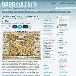
I found, tucked in almost every issue, one of the magazine’s gorgeous maps—of the Moon, St. Petersburg, the Himalayas, Eastern Europe’s ever-shifting boundaries. I became a cartography enthusiast and geographical sponge, poring over them for years just for the sheer enjoyment of it, a pleasure that remains with me today. Whether you’re like me and simply love the imaginative exercise of tracing a map’s lines and contours and absorbing information, or you love to do that and you get paid for it, you’ll find innumerable ways to spend your time on the new Open Access Maps project at the New York Public Library.
The NYPL announces the release with the explanation below: The Lionel Pincus & Princess Firyal Map Division is very proud to announce the release of more than 20,000 cartographic works as high resolution downloads. Related Content: Neighborhoods.